Take a stroll through an internet search for "2016 Paint Color Trends" and you'll discover a fairly mixed bag. Color giant Pantone selected the pair of pastels, Serenity and Rose Quartz, for the 2016 Colors of the Year, but leading paint manufacturers like Benjamin Moore and Sherwin Williams are leaning even further to the neutral end of things by highlighting off-whites as this year's trending paint color. While it's true that we've seen a rise in white backdrops on our Pinterest home design image searches, we've noticed an even greater interest in the mixing of neutral colors in the homes we've had the pleasure of working on for several years now. It's a trend mentioned on Houzz that seems to be gaining more momentum into 2016.
To highlight what we mean, here are examples of neutral color palettes from four of Neal's Greater Cincinnati remodeling projects completed just this past year.
Mixing Neutrals with Low Contrast
Ask any interior designer, and they'll agree that low-contrast color mixtures help small rooms feel larger. The concept is actually fairly straight-forward: if the majority of colors in a space are similar in shade or tone, the eye has a harder time locating the boundaries of the room, which tricks the brain into thinking there's more space in the room than there really might be. (The thing to remember about this is that low-contrast can be created with any starting color- light or dark. The idea that a dark paint color makes a small room smaller is now mostly considered bunk.) Low contrast color palettes, therefore, are perfectly suited to bathrooms- generally the smallest rooms in our homes.
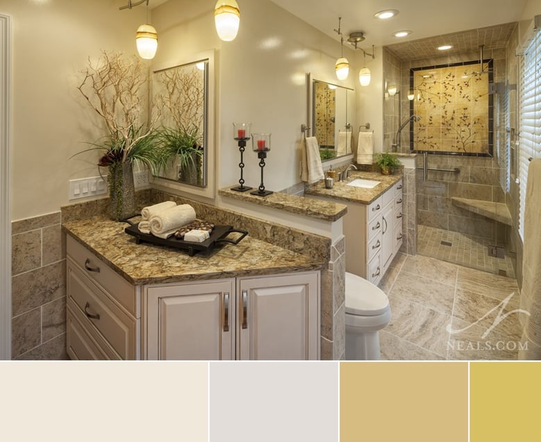
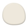 In this bathroom, which has an unusually small footprint for a master, the low contrast mix of off-whites and creamy yellows creates an airy space in which the confines of the walls are less noticeable. The on-trend off-white walls, similar to Sherwin William's "Creamy", create the blending point between the slightly whiter off-white cabinetry and the custard-like yellow of the granite countertops and hand-painted tile mural in the shower. This low-contrast mix of pale colors is far from boring- each surface adds a different note to a fairly mellow composition. The result is a space with very few visual boundaries in which the materials of the room - the granite, tile and cabinetry- create a soothing, but interesting space.
Don't Forget Focal Points
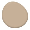 In the master bathroom below, several shades of a sandy-beige, starting with Sherwin William's "Nomadic Desert" on the walls, are combined on all the major structural elements, including wall color, tile work, and vanity countertop. This produces that low-contrast, neutral base that helps the room feel larger, but also highlights the cherry cabinets. Since the rest of the room blends, any element that's different becomes a focal point for the eye. It doesn't take long for the eye to gravitate toward the cabinetry in this bathroom. Cleverly, the brown is carried across the room to the accent tile in the shower - helping the eye move past the vanity rather than fixating on it.
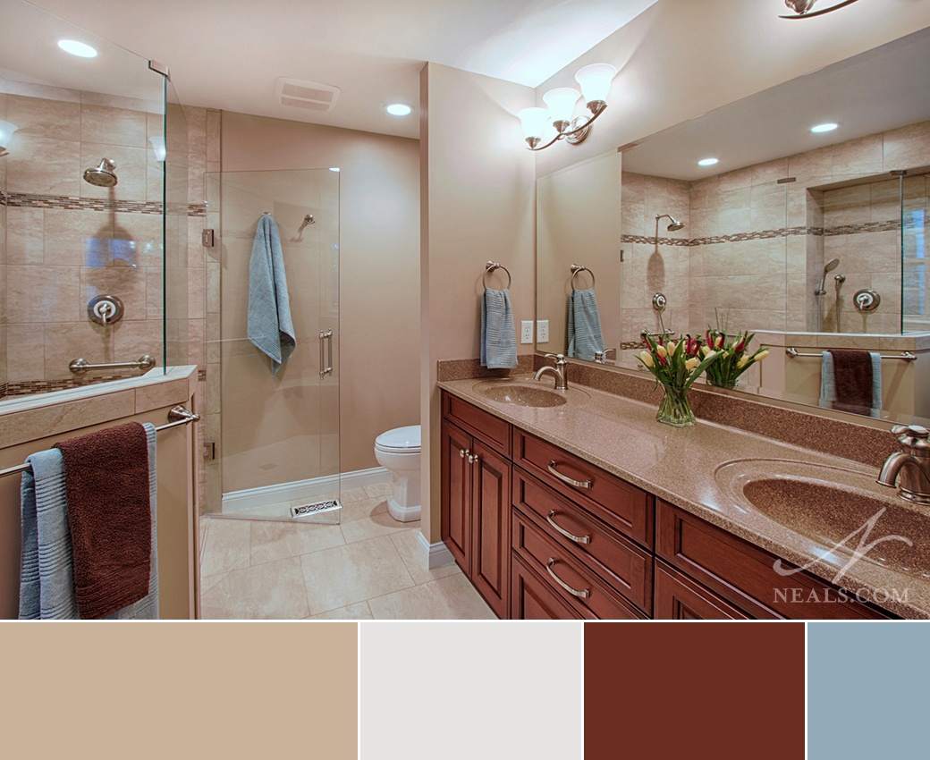
The color story here is far from complete, though. The homeowner's selection of towels plays a key part in moving this neutral space into one worthy of the "spa-like" adjective. By contrasting the tan with hits of steel blue (in a different, softer texture than the rest of the room), the room is given just a bit more interest without taking away from all that mellow, blending tan. It's the old color wheel trick- matching two colors across from each other on the color wheel to create a balanced palette. In the end, this "desert with a slice of sky" bathroom takes the lessons of high school art class seriously with amazing success.
Create Contrast Pairs to Fill a Room
So we've seen how to make a small room feel large with low-contrast, but what's the neutral-palette solution when you have a large room? The concept of contrast works here as well, just from the other direction. Rather than relying on a shallow set of colors to allow elements to blend together in a large space, we want each of the elements to stand out and take its fair share out of the visual size of the room. To do that, adjacent elements should contrast with each other, creating an overlapping series of "contrast pairs" throughout the space. In a neutral environment, however, we're not talking crazy, bold colors. Instead, we want to choose soft neutrals from opposite ends of a single color's spectrum. This is known as "tone" - the lightness or darkness of a color.
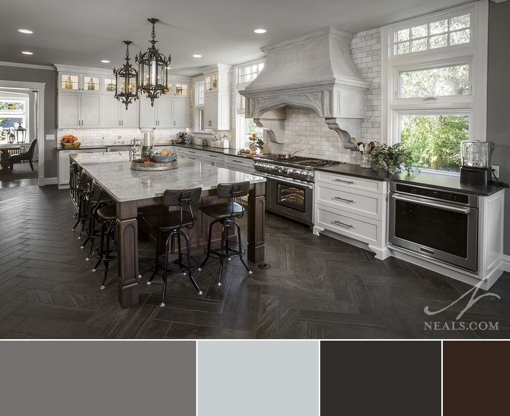
 Let's look at our winning 2016 Local Contractor of the Year Residential Kitchen remodel above to see how contrasting neutral tones can be used in a space that could use a bit of visual minimizing. In this case, the palette starts with Restoration Hardware's "Charcoal", a middle-of-the road gray. (You can see it on the edges of the photo above on the walls.) To create contrast without sidetracking into more colorful territory, shades of gray that are darker as well as lighter create the next layer in this room. A very dark ash gray is the dominant color in the herringbone floor tile, while the cloud gray of marble and cast stone own the walls above. This generates a framework for the elements of the kitchen itself- the cabinets, counters, island, appliances, etc.- to fill in on either end of the tone spectrum. For example, the cabinets on the perimeter are white with black counters- combining the very extremes of the color scale.
This room is high-contrast, just not typically so. The colors are as neutral as they come (you can't get much more neutral than gray), but they are paired with their opposites in nearly every place. You may have noticed, however, that there's another color at work here- the darkly-stained brown oak of the island. The color plays into the larger room very effectively, which you can see in this project's additional photos, but in just the photo above, that brown does something pretty key. As much as gray is an on-trend neutral, prized for its usefulness in just about any context, it's a cold color. The addition of a warm brown in this space counteracts that in a very subtle way. Remember: wood tones almost always have the affect of personalizing, or humanizing a room.
Embrace the White Trend
Spend any amount of time on a "home design" related search on Pinterest, and you'll see that Benjamin Moore's choice of off-white as 2016's color of the year is pretty accurate. Whether your design tastes lean traditional or bohemian, a case can be made for including shades of white in the modern home. We've seen more and more homeowners opt for white in their remodels in the past three years as this trend has taken off, and it doesn't appear that white is just a passing fad. So why not embrace the potential of a space founded on shades of white?
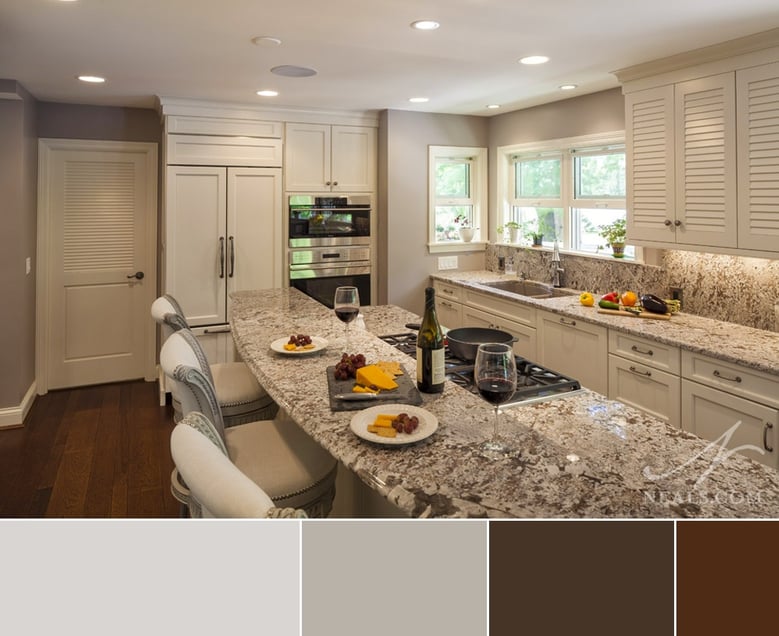
 In the kitchen above, an abundance of Bianco Antiquo granite, used for the counters as well as the backsplash, creates the jumping off point for a neutral, off-white-based room. Everything at eye level here is some variety of the cream-white found in the granite. Alpine white cabinets, off-white trim, a grayer shade of white, similar to "Silver Fox" by Benjamin Moore, on the walls. Even the stainless steel appliances reflect these beachy shades of white. This room is not bland, though. The granite provides color contrast on its own, preventing the room from looking like a blank piece of paper. Patches and veins of a gray-brown with small flecks of a pearlescent brick red not only create breaks for the eyes in all that off-white, it provides a way to help the brown of the wood floor (used throughout the adjacent spaces) to marry the white without creating too much visual conflict or stark contrast between the floor and the walls. All this visual texture is crucial in pulling off this off-white kitchen.
Need more inspiration? Follow Neal's Design Remodel on Pinterest and Houzz.


