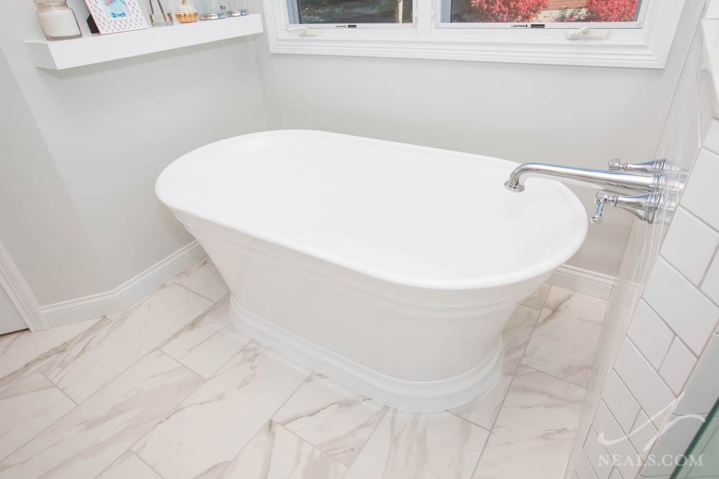
A common thread among many of the master bathroom remodels we undertake is the homeowners' general feeling that their existing bathroom is simply under performing. Large tubs that go mostly unused; small showers that are not comfortable to be in, and often times, simply not enough or the right kind of storage to go around. These same issues existed for this Bridgetown master bathroom, almost as if the space was a cardboard model on a bathroom rather than a space that could actually be used and enjoyed. The new design's goal was to create a new space with a foundation of functional considerations with timeless appeal.
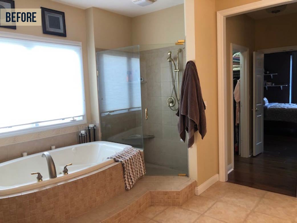
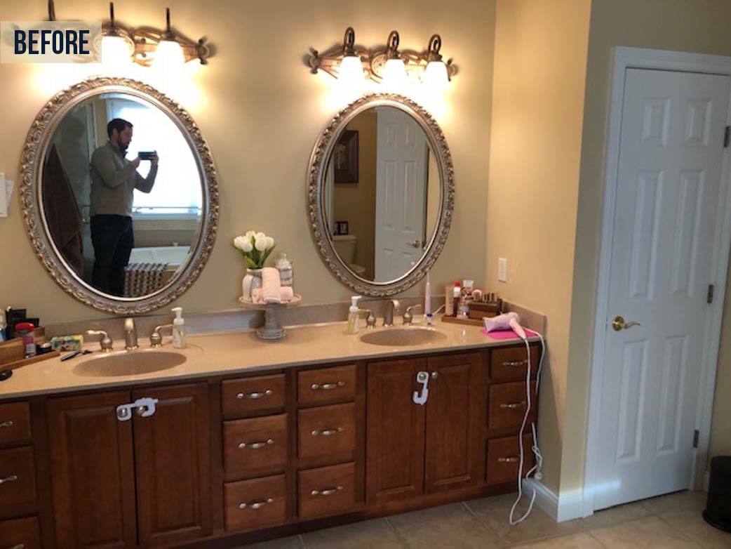
Originally, the general layout of the space was suitable as everything was in essentially the right place, which is often the case for newer-built master bathrooms. However, a miss-matched collection of browns and yellows coated the bathroom leaving it bereft of style and cohesion.
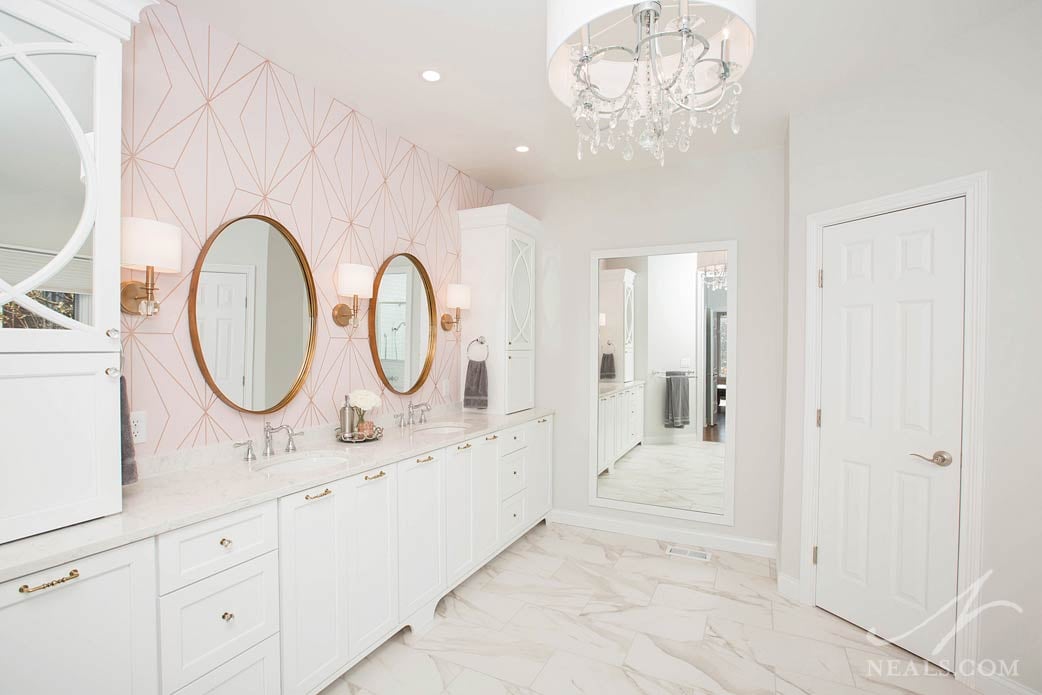
In an attempt to inject style into the bland space, traditional vanity light fixtures and large traditional style mirrors had been installed, but looked grafted on and only served to overpower the space. The double vanity was short on storage as well as quality. With nowhere else to go, makeup and toiletries had found space on the counter, creating visual clutter.
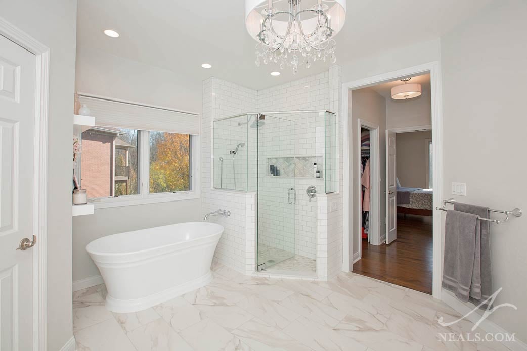
The new design was created around the homeowner's primary request: make it timeless, or easy to change if it becomes dated. To do this, Neal's Designer Laura Webster worked with the homeowner to select materials that worked with an all-white scheme, rather than one that relied on brown tones. By basing the design on white, the room instantly taps into a classic design trend for high-end bathrooms from the past two centuries. With such a history behind them, white tile and the look of traditional marble are instantly timeless.
The design takes the homeowner's other factor into consideration as well with the inclusion of a wallcovering behind the vanity. A rose pink and gold geometric design may not be instantly classic, but in this space it adds a hint of romantic whimsy and interest. Should the homeowner tire of this accent, it's easily replaceable and the remainder of the room won't need to be touched. For now, however, paired with stylish round mirrors and rose gold sconces, the wall provides some trendy and eye-catching interest against the white backdrop.
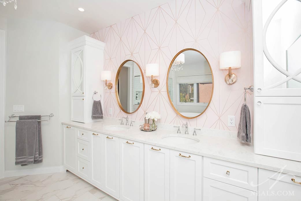
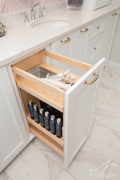
A linen closet was removed to expand the vanity. While the linen closet was technically usable bathroom storage, wire shelving inside allowed items to fall through and didn't serve the homeowner's needs. By using the full length of the wall, a symmetrical double vanity was installed that offers the couple plenty of storage options for their various needs. This includes organized areas for toiletries, pullouts for hampers, and a "hot" storage pullout for electric hair tools.
Rounding off the remodel, the homeowner's admitted to never having used the existing tub in the 8 years they'd lived in the home. Rather than removing the tub altogether, it was determined that the old tub's format- a jet tub installed in a tile deck- was the offending characteristic. To make that fixture useful again, a new free-standing soaker tub was brought in. The new tub is a stylish choice that adds to both the romanticism and timelessness of the space. Combined with a new, enlarged shower, the master bathroom is as functional as it is beautiful.
