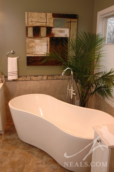
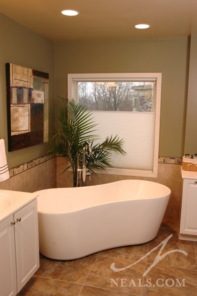
Despite the unique and comfortable free-standing tub, which replaced an old whirlpool tub in this master bath, the real star of this remodel was a reworked floor plan. Removing a commode room and swapping that space with a walk-in shower allowed the shower to increase in size and utility. The overall feeling of the small space goes from claustrophobic to airy with attention to space details. White features allow the natural-tone tile to act as a style statement, rather than a background, and the chrome fixtures helped create a contemporary vibe. This project was a 2013 NARI Contractor of the Year Local Residential Bath winner.
With a nearly wall-to-wall combination of vanity, tub deck and shower, the previous bath was crowded and angular. A separate commode room (and its wall) took up a sizable portion of the available space. The challenge was to create a space with more functional square footage, without enlarging the overall space. Using the commode room space for the shower, and bringing the commode into the room removed the under-used space, and provided for a larger shower. The floor space was allotted for better overall usability.
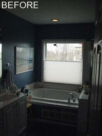
The existing space had a heaviness, with bulky fixtures and dated finishes. A major part of this feeling was the tub and surrounding tiled deck. A large air vent, required for the whirlpool tub motor, had center stage prominence, since the tightly packed room had left no other accessible options. The entire tub was removed and replaced with a curvy free-standing tub with a contemporary shape. Set at an angle under the window, the open areas around it eliminate the heaviness.
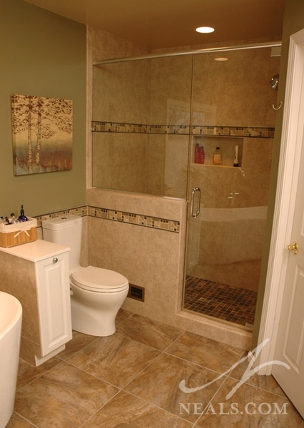
While the existing vanity had a slightly more traditional door style than what the homeowners wished for the modern style of the new room, it was in good condition. Salvaging the entire piece was also a budget requirement. In order to blend the white vanity into the new design, the faucets were updated to a new chrome model that tied into the new mirrors and light fixtures above. A new narrow cabinet was also matched to the vanity and placed across the room next to the commode. The smaller cabinet addition replaced the half wall removed from the tub deck, and provides another place for storage.
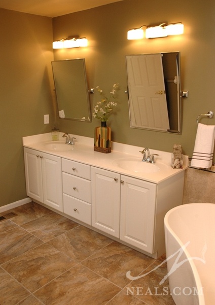
An HVAC vent was sited on the floor, just inside the door of the commode room in the existing bathroom, but with the update, the vent needed to be relocated. The half wall on the shower front, which also doubles as a privacy wall with a bench behind it, allowed the former floor vent duct to shift upward to a new wall vent.
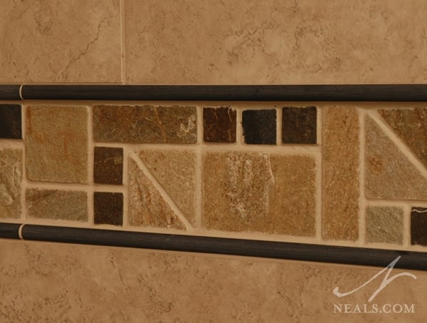
The introduction of curved lines, combined with a bold palette of stone neutrals throughout the space, work to update the bathroom with an almost Art Deco touch. The white and chrome features throughout the space act as the neutrals. A wainscot-inspired tile treatment allows the floor to visually float up the wall, adding a much-needed airiness to the once weighted space.
See more photos of this bathroom and kitchen project.
