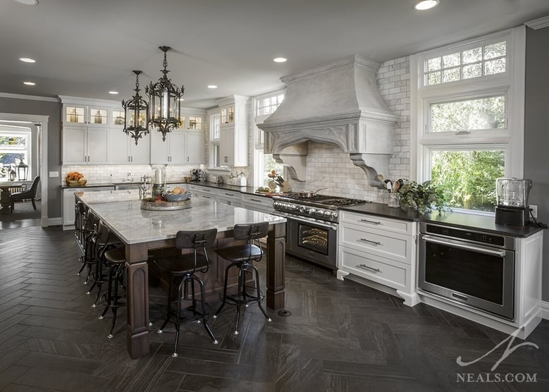
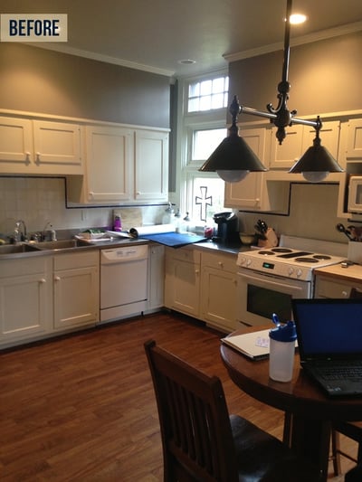
Gothic-revival design dominates in this 1925 home, but the kitchen space was lacking in similar character. The kitchen was awkwardly arranged and felt like it belonged with a different house. That section of the house was divided up into four individual rooms, the main kitchen, a narrow butler’s pantry, a mudroom, and a second pantry. The kitchen renovation sought to combine these four spaces into a new space that matched the scale and character of the rest of the first floor. This project is a National Association of the Remodeling Industry (NARI) 2016 Local & Regional Contractor of the Year Residential Kitchen Winner.
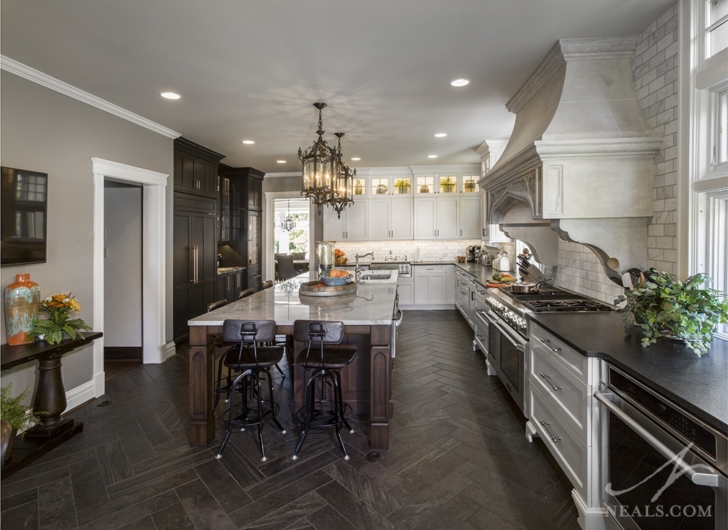
With this kitchen remodel, the homeowners hoped to achieve a style in the kitchen that was consistent with the Gothic-revival style of the home. The design and traffic flow of the remodeled space needed to be considerate of how they use their home for entertaining, including an arrangement designed to handle cooking for parties, as well as cleaning up afterward. They also desired the addition of a bar that was conveniently located in relation to the other areas of the first floor.
Challenges
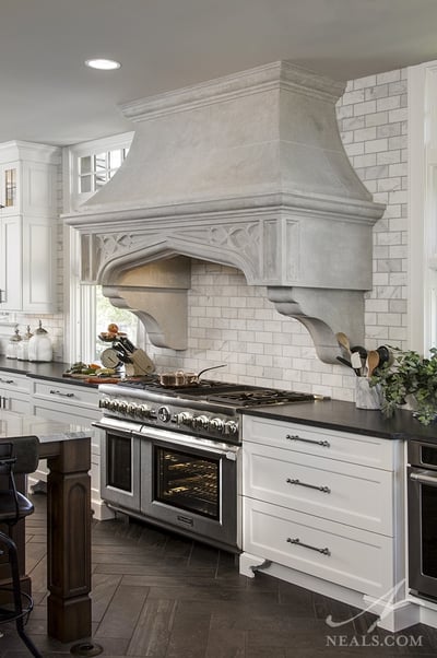
Once the walls between the four spaces came down, it was clear that each space was not level or plumb with the next. In order to move forward with the renovation, all the wall studs needed to be plumbed, and the ceiling and floor leveled. In order to accommodate the homeowners’ entertaining needs, space had to be located for a 48” range, a third oven, a wine fridge and refrigerated drawers, 3 sinks, 2 dishwashers, and a microwave drawer. Our local source for appliances is Custom Distributors. The massive cast stone hood chosen for the new kitchen required equally substantial installation considerations to ensure that it was secure to the wall properly and safely. The radiant heating system in the floor required a layer of light-weight concrete. This meant that the kitchen layout could not be changed once it was laid down.
Materials and Design
In terms of design, the biggest challenge in the new large space was to balance the function and style of the modern kitchen the homeowners wanted, and the look the home dictated. To keep everything consistent, all the cabinetry is recessed panel with full overlay, but the three areas, the perimeter cabinets, the island, and the bar were given three unique designs.
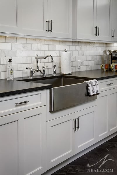
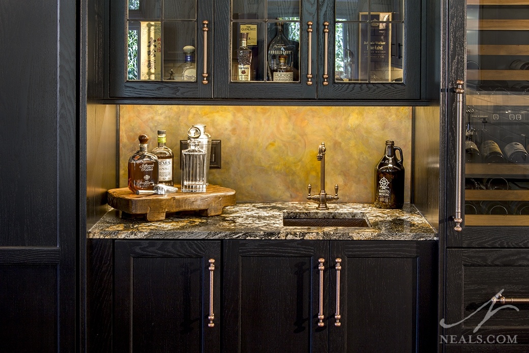
The perimeter cabinetry, along with additional storage cabinetry added to the far end of the room, is Brookhaven in Nordic White paint on Maple to match the homeowners’ preference for a kitchen that feels current. The bar was completed with Brookhaven ebony stain on oak to allow the wood grain to show through for some textural interest. The dark color differentiates the bar area from the working areas of the kitchen, and introduces black into the space. The island was influenced by the style of the home’s main foyer. Woodmode's cherry cabinetry with Matte Antique Sienna stain with distressing was used to match the foyer’s rich original paneling. Gothic arches in the island’s chunky legs help carry the home’s style into the new space. Leaded glass windows in the cabinets mimic those in the home.
To create balance, counters were selected that directly relate color-wise to one of the other elements in the kitchen so that all three cabinetry colors feel integrated. Black Cambria Granite was placed on the perimeter. Super White, a granite and marble hybrid, was placed on the island. On the bar, Petro Magma granite, which has black and brown coloring, pulls in the brown from the island.
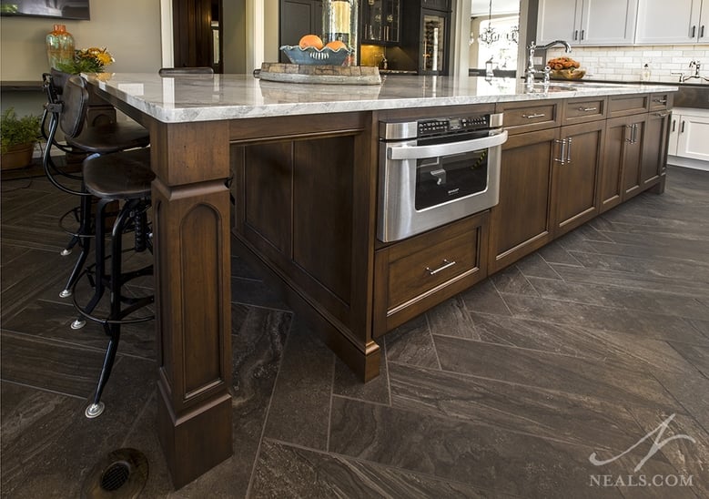
While the perimeter and island utilize pewter and chrome for the hardware and faucets, along with the stainless steel of the appliances, the bar uses copper. The bar backsplash is a panel of antiqued copper, and the sink is an under-mount single bowl in hammered antique copper. The hardware throughout the kitchen matches in basic form, again for consistency.
Marble tiles were selected for the backsplash, and arranged in a traditional staggered pattern. This application felt right not just for the color scheme but for the age of the home as well. To pull the darker elements together with the much lighter perimeter, a charcoal gray tile was chosen for the floor. The porcelain tiles were laid in a herringbone pattern using 6” x 24” tiles, and feel like a classic detail that could have plausibly been original. A light gray paint on the walls pulls everything together without darkening the space.
