An arrangement of small spaces, the original kitchen in this Clifton home lacked sufficient working areas and ample storage. The breakfast room was cramped and isolated. Combining the spaces allowed the kitchen to be more open and accommodating. The style of the kitchen was updated to a modern-minded transitional style suitable to the home’s character and age. This kitchen project is a NARI 2019 Local Contractor of the Year Award Winner.
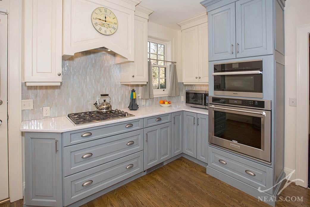
The goals of the project were to add more counter space and storage while also provide an eat-in option since the breakfast room would be lost in the remodel. It was also important to the homeowner to update the kitchen’s style to a friendly and casual design suitable for the home. The request was for a blue kitchen that didn't overwhelm the space. The project also required that the new kitchen work with the locations of the kitchen’s existing doors and windows.
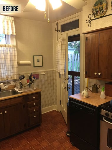
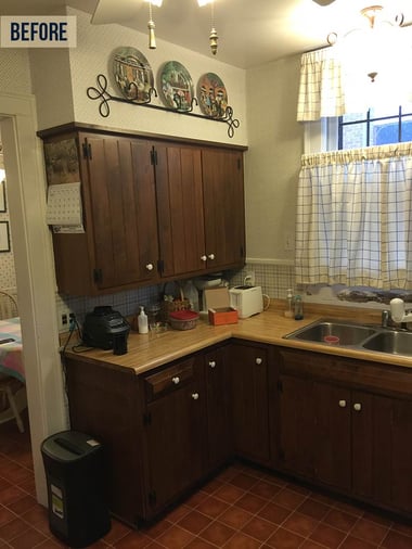
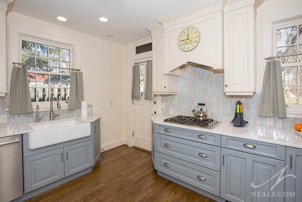
Each of the kitchen’s major work areas or appliances was given a wall to allow the entire kitchen to function as one room without feeling too heavy in any one area. Since the room is too small to fit an island, and the three doors required adequate space for the traffic flow, the sink, fridge and cooktop form a wide working triangle that holds the room together.
Removing the wall between the breakfast room and kitchen provided more space for a longer counter. A peninsula takes the place of a kitchen table and adds the requested eat-in function. Tall pantry cabinets and the fridge replace the old pantry and icebox storage to form a core around which the new kitchen is grounded.
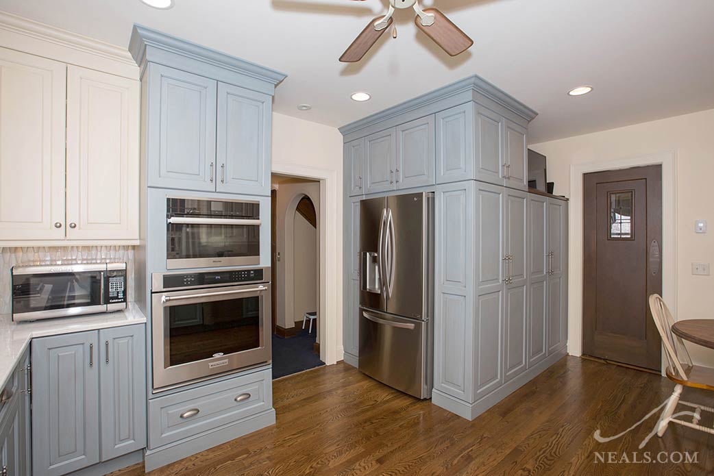
The homeowner requested blue in the design of the new kitchen. One of the first selections was a pale, blue-based pearlescent glass mosaic tile for the backsplash. Using this as a springboard, a light gray-blue vintage finish was chosen for the base and tall cabinets. To prevent this choice from becoming too kitschy, a cream finish was used on the upper cabinets, pulled from the cream elements of the tile.
The counters are LG’s Viatera Minuet quartz, which is an alabaster color with cool grey marbling to further balance the blue. Countering these soft cool tones and helping to pull out the pink shades in the tile backspash are a striking artisan glass pendant and the warm wood tones of the peninsula tabletop and flooring.
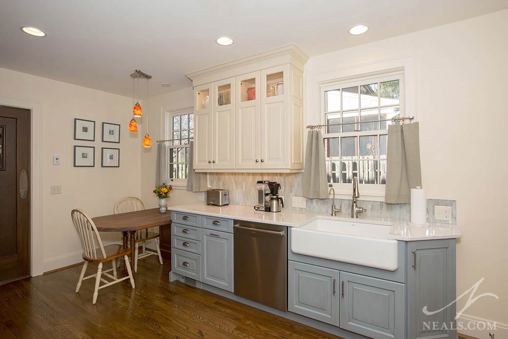
The cabinetry and details are traditional in feel, with raised panel doors and layered moldings that elevate the room's vertical scale by going all the way to the ceiling. These are tempered by the casual vintage cabinet finish, farmhouse sink, and country-inspired cup-style drawer pulls. These elements together create a cozy and curated space that’s both elegant and relaxed.
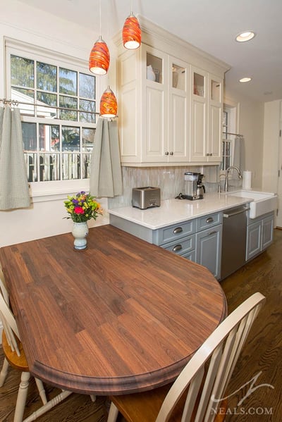
The space is lit with a combination of can lights placed over task zones, under-cabinet lighting, in-cabinet puck lights in the high display cabinets, and the stylish pendant light. A ceiling fan, a key component of proper airflow in the aged home, takes the center.


