Color trend predicting is a fairly important part of the design world. For interiors, having an idea of what is considered a "current" color helps to ensure that new designs in our homes feel well-suited to the present. Color trends look for shades that offer versatility, but also capture the mood or style that seems to be most popular in today's society. Last year's colors were fairly light. Whites and pastels dominated, reflecting the trend toward more unisex design (fewer overtly masculine or feminine spaces), and the continued embracing of a more minimalist lifestyle. This years colors, however, take a decidedly bolder turn. As we enter 2017, sophisticated, dramatic colors feel on-point.
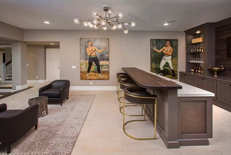
Several of the 2017 color trends can be seen coming together in this Indian Hill project by Neal's.
For this post, our designers looked at the Color of the Year selections for some of the more popular paint manufacterers. Then took a stroll through Pinterest to discover a popular paint color that turned up over and over again, often touted as the "best" universal paint color. Finally, we sought out what Pantone, the color specialists, had to say about color for 2017.
In recent years, cool, pale grays have been an overarching trend. Now it appears that the starkness of the basic gray lacks the personality, or even the risk that more and more homeowners are seeking for their homes. In the past year, home design bloggers have begun to feature more homes with dark colors, adding contrast to the white paint trend that's been going on for at least the last five years.
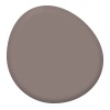 |
Poised Taupe (Sherwin Williams) A warm gray with a lot of brown undertone moves away from the sterile neutral gray, but isn't quite in the beige category. It pairs well with a large range of wood tones as well as white, making it a versatile color without creating too much of a statement. |
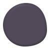 |
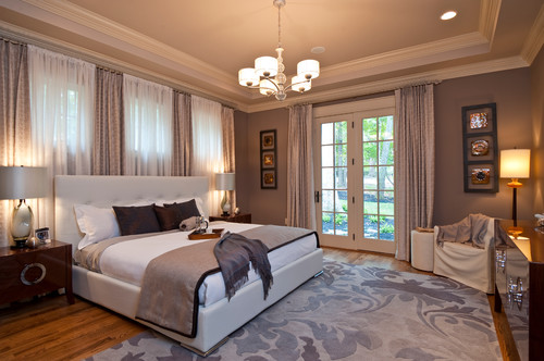
This deep purple is a cool color with a lot of grayness. Depending on the light, it can read as a rich charcoal or a soft amethyst. While it's tempting to call in purple, it's much more nuanced than that, and can work well in small doses, or as one large style statement. |
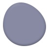 |
Another purple tone, this gray sits almost exactly opposite Poised Taupe above on the warm to cool scale. It can be styled in a feminine direction, or tempered with darker colors to create a dramatic and luxe space that appeals to both men and women. |
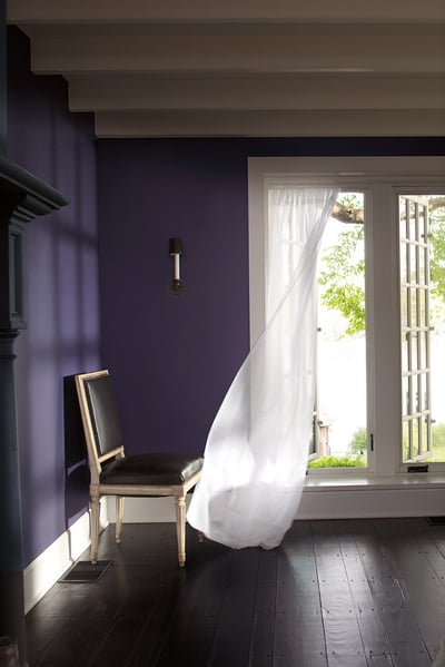 Shadow by Benjamin Moore | Source
These bold neutrals would add a style statement to any space, and that may be a little too risky for those who have been enjoying the white trend. As an alternative,Pinterest has served up a clear winner in the neutral paint color category.
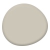 |
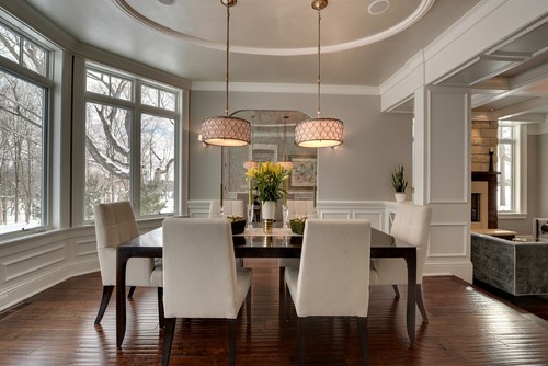
Revere Pewter (Benjamin Moore) A warm, soft gray, this paint color is a universal shade that may very well be the ultimate neutral. Depending on the colors used elsewhere in the room, the color may stand out as a pale tan, or it may blend into the backdrop as a dark off-white. |
Finally, each year, Pantone chimes in with a color they believe exemplifies the year ahead. It's not necessarily that the color will suddenly appear everywhere and in every home, or even that it's the right choice for your space. Instead, Pantone's color of the year sets a tone or theme that interior professionals can play off in their designs throughout the year.
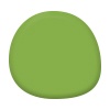 |
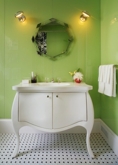
Greenery (Pantone's Color of the Year 2017) From Pantone: "Greenery is a fresh and zesty yellow-green shade that evokes the first days of spring when nature’s greens revive, restore and renew. Illustrative of flourishing foliage and the lushness of the great outdoors, the fortifying attributes of Greenery signals consumers to take a deep breath, oxygenate and reinvigorate." |

