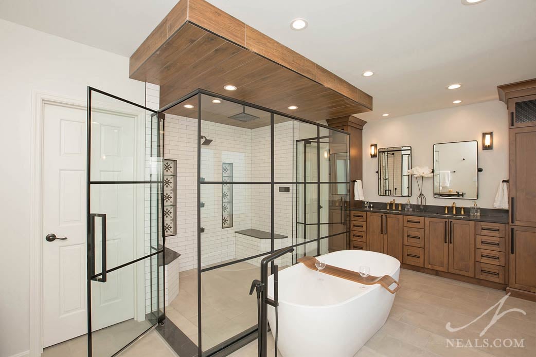
This master bathroom remodeling project, located in Symmes Township, perfectly marries a variety of style notes, creating something unique, beautiful, and functional. The new space can be described as transitional with elements of both urban loft style, and rustic traditional style. Everything comes together for a warm and inviting place to start and end the day.
Before the Remodel
Even with all the elements of a typical master bathroom, the original room had a cramped-feeling layout. Two closets flanked the door, forcing all the other elements to crowd around the walls of the remaining space. In order to accomplish this, angled corners were used, one of which provided access to the fully enclosed shower. Basic cabinetry and fixtures added no interest or style to the space.
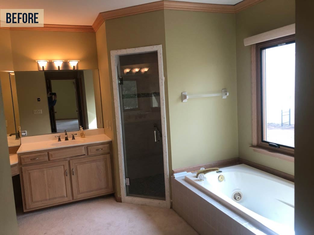
Neal's Designer Laura Webster's design plan created space by removing the two smaller closets and utilizing the entire space- including the floor space in the middle of the room. A new walk-in closet was created from a bonus room now accessible through a door new the vanity. Essential to the master bath design is that the space feels perfectly sized and accommodating for two users at once in addition to being a stylish space they love to use.
Shower Enclosure
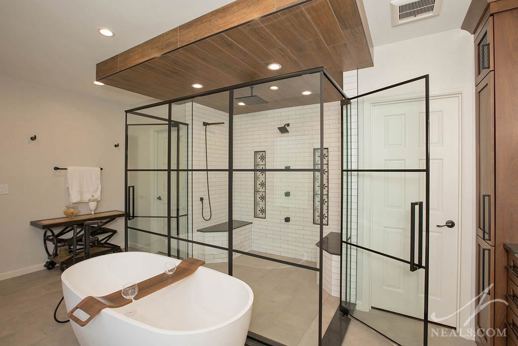
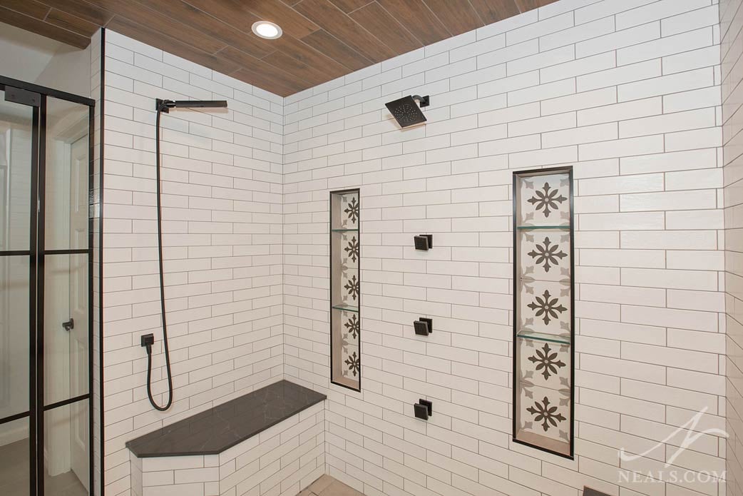
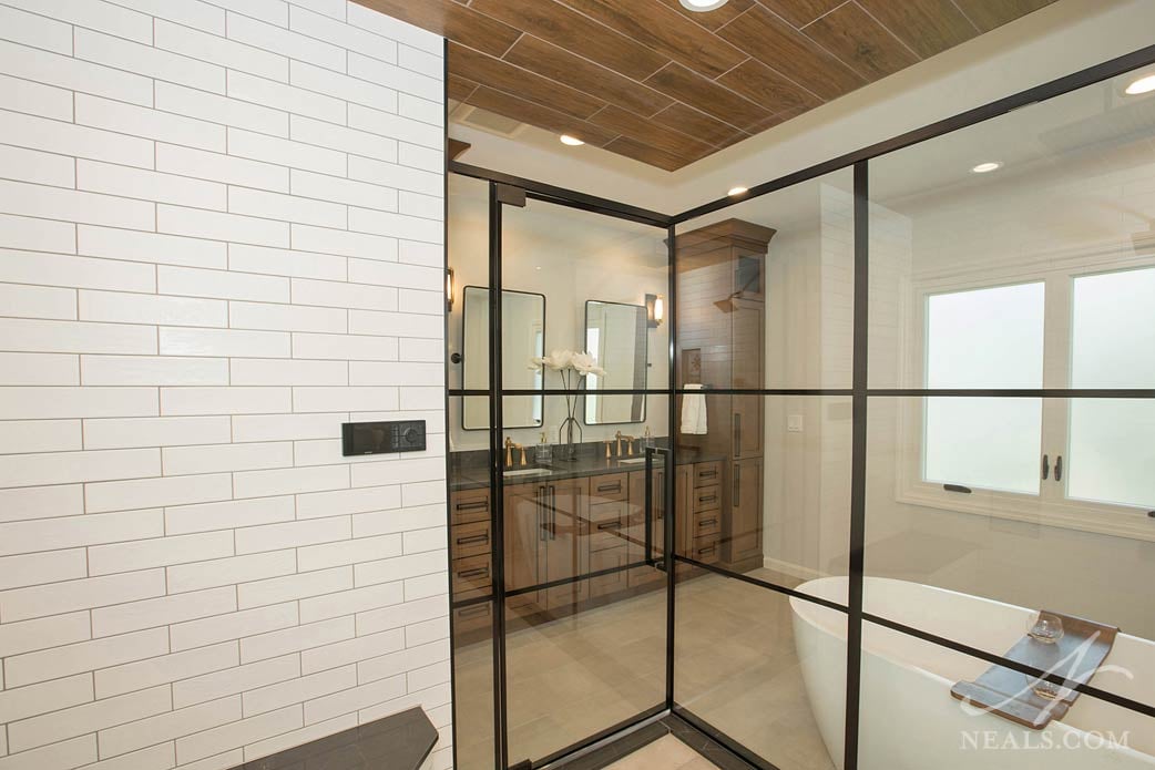
There's a lot to notice about the new bathroom, but the shower takes center stage. The glass enclosure is detailed with black bands that simulate the look of a large factory window, automatically injecting a sense of urban style. It's tempered with the way Webster paired it with classic transitional subway tile and printed tile niches. Wood-look tile on the ceiling forms a visual box that helps the shower feel intentional and grounded. This tile also ties perfectly with the nearby vanity. The shower features two doors, two benches, and an array of showerheads. The shower is connected to U by Moen, a smart shower system that can be controlled through a smartphone app or via voice command to Alexa.
Vanity
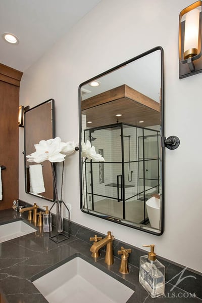
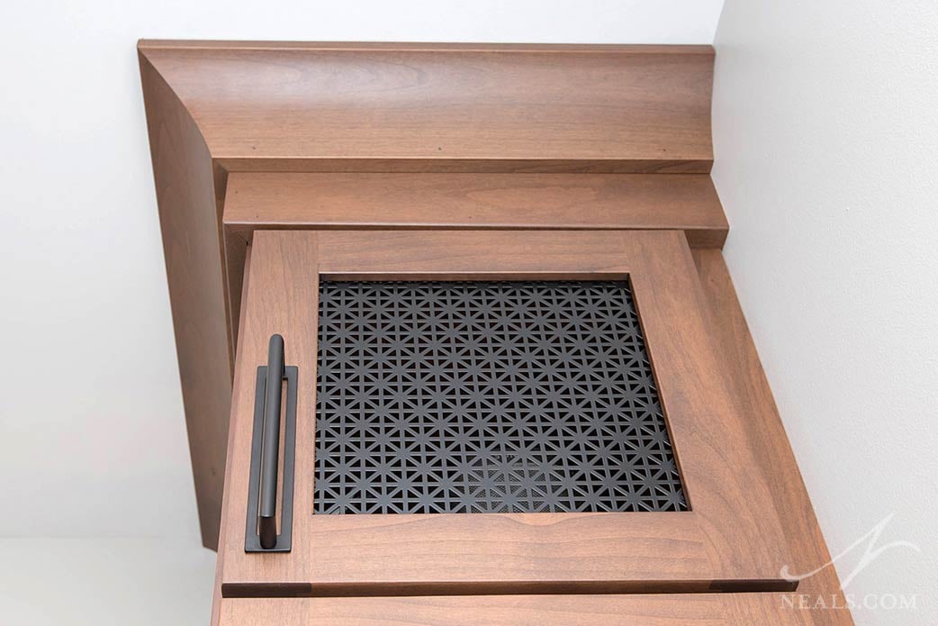
Many times with master bathroom remodels, vanities are enlarged from the original to add more space. In this case, Webster and the homeowners were able to find a vanity solution that had a smaller footprint than the original but functioned better for their needs. This was achieved by carefully planning the cabinets to include more usable space with drawers and narrow, tall cabinets to fit their belongings without wasted space. The vanity is a transitional element with a rustic tone that counterbalances the lighter shower enclosure and tub. The vanity mixes brushed gold and black hardware, adding to and complementing the room's color scheme. At the top of the tall cabinets, stylish black screen inserts give a usable and concealed space to speakers attached to the home's sound system.
Bathtub
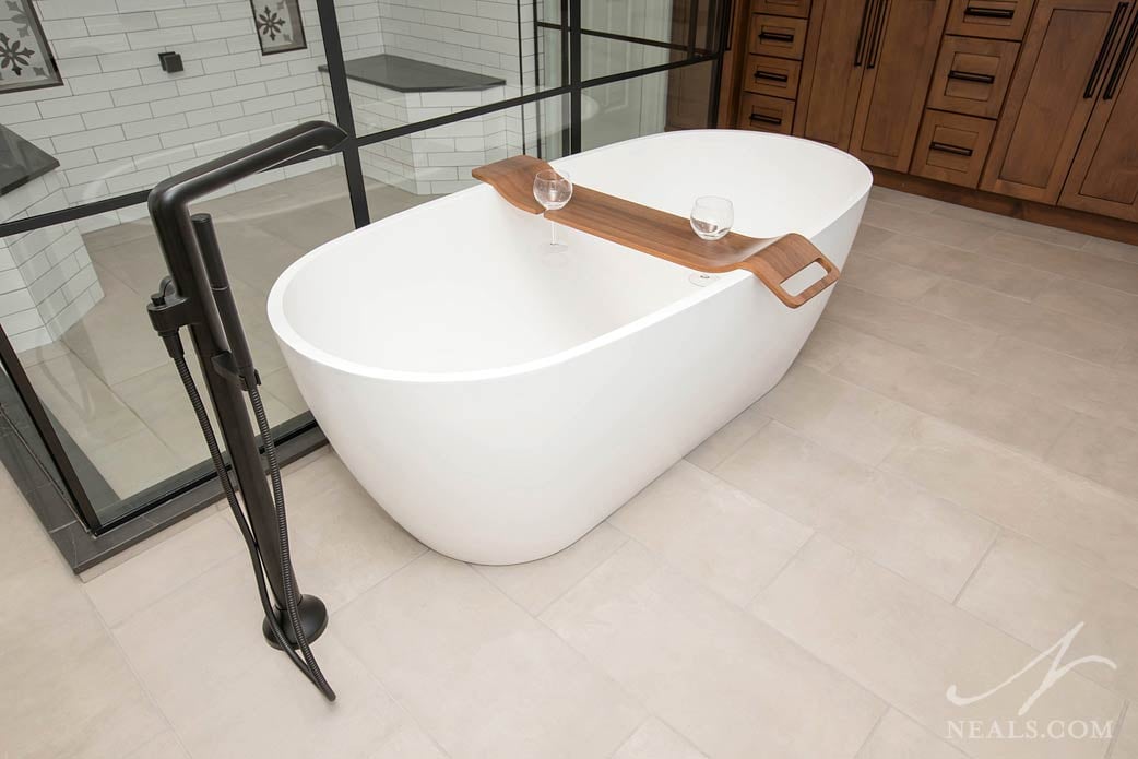
The new tub sits at the center of the room, making full use of the bathroom's square footage. The Signature Hardware Ocala tub is a 66" free-standing bathtub with a minimalist and rounded silhouette. Here, the white tub (paired with a black industrial-looking faucet) adds another color element that helps bring the entire scheme together. Where the vanity has a more bold and masculine style, the tub conveys an understated, soft, and romantic style that meshes well with its surroundings.
To see more photos of this project, view the slideshow here.


