When given the opportunity to move back into a childhood home, the homeowners of this Montgomery project saw the potential to turn the house into one that could serve the next generation with new memories. "I know it brings my parents a lot of joy to have us living there," the homeowner said. Not balking from the work of remodeling the house to fit their needs, the project scope was set at the grand goal of renovating the entire home. In this outstanding remodeling project, every room, and nearly every surface, was reconsidered, re-imagined, and redesigned into a truly transitional space- a traditional home with a modern feel. Trends and classic techniques are blended seamlessly throughout the home, tied together with unique and clever design touches with the help of Neal's designer Amanda Morehart.
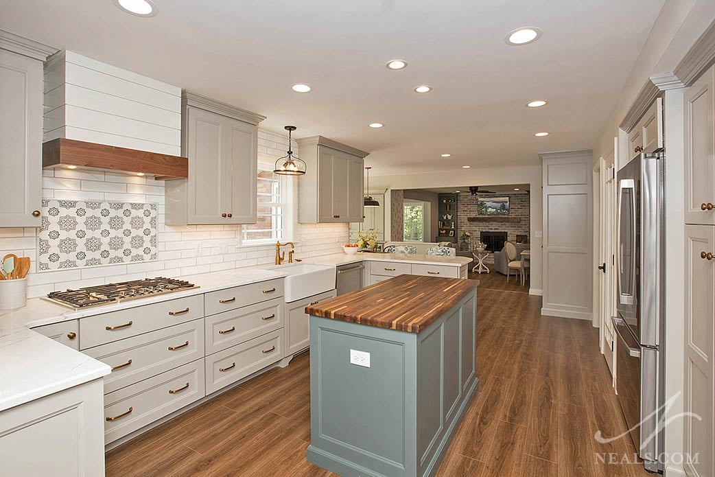
Throughout the original home, a standard array of typical finishes and details worked to make the house feel dated and dark. These included soffits, out-dated cabinetry, tired wall treatments, and bland flooring. To revive the design, the homeowners and Neal's created an over-arching color scheme of neutrals, cool tones and pops of warm wood to make the home feel more open and cohesive. Walls and soffits were removed to create more flow between the various rooms on the first floor. In the kitchen, the hub of the space, the key elements of the design come together. These include warm wood tones, soft grays, and the mixture of chic, modern farmhouse details with a classic feel.
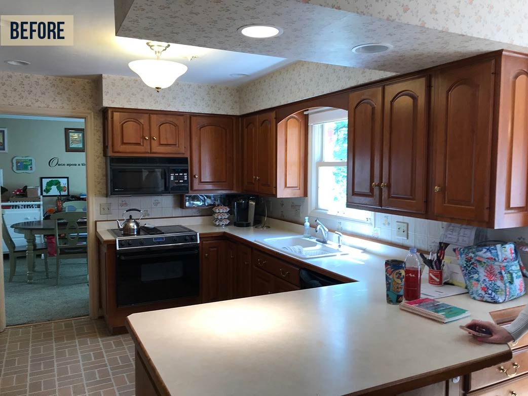
With a new floorplan that blended spaces together, it was important that each new room felt like it belonged with those adjoining it, but still retained an interest that was specific to that room. This prevents the home from feeling boring or predictable. As you step from the kitchen into the living areas, the spaces transition from being slightly more traditional to slightly more modern, but always within a range of transitional design in keeping with the classic and chic theme. In addition to allowing each room to fit into this limited range of design styles, the home is pulled together by thoughtful touches such as the use of repeating motifs and materials. Some running motifs found throughout the new home are various takes on the quatrefoil (a 4-lobed shape), board and batten accents, and brick patterns.
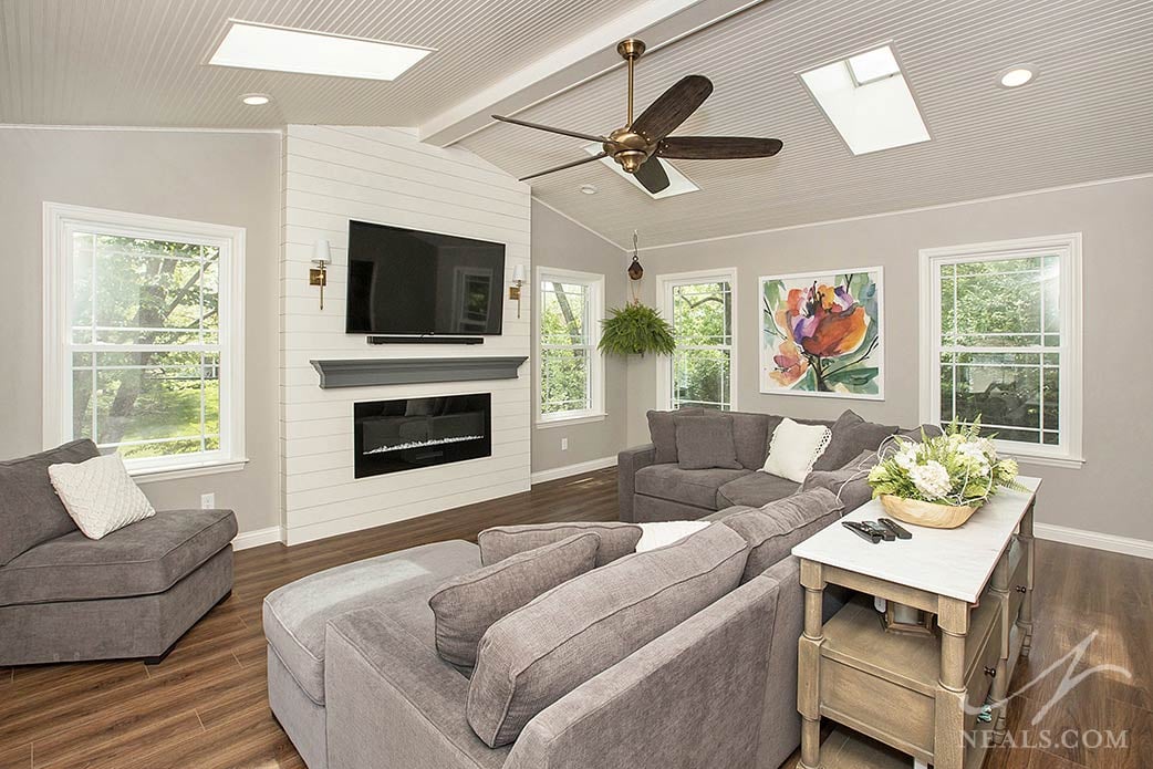
The new family room, once an underused bonus room, pares the design theme down to a modern-leaning selection of materials and products. That's not to say the room is contemporary, however, as craftsman details like decorative mullions on the windows, a shiplap accent wall, and the dark-toned flooring (luxury vinyl tile with an oak style woodgrain) all help ground the room into the same transitional style as the rest of the home.
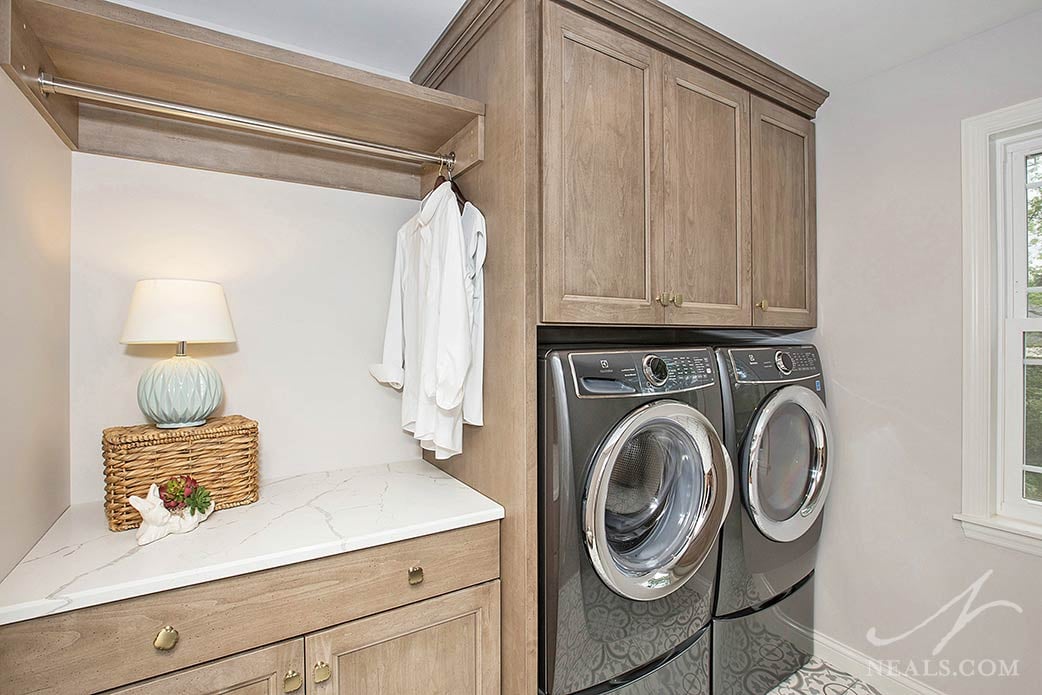
Beyond the home's new design, the remodel tackled several practical needs as well. Utilizing a dining room that wasn't needed, a new laundry room was created on the first floor adjacent to the kitchen. Built in cabinetry was also added to the breakfast room, the front entry, a butler's pantry, and a new home office. Upstairs, closets were reconfigured to add space or maximize efficiency. In each of these areas, these changes added valuable new storage to the home where there previously was none; a major remodeling wish-list item for many homeowners.
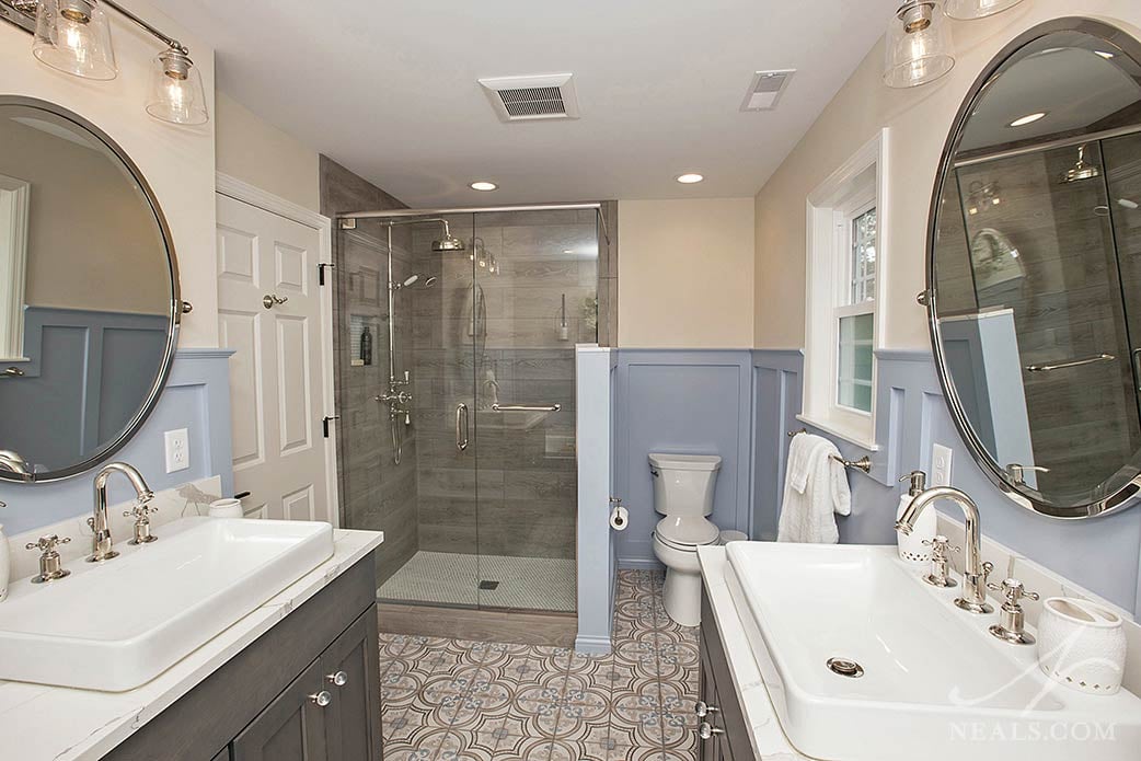
In most cases, the changes to walls were minimal throughout the home, which allowed the budget to be funneled into the aesthetic and functional improvements. This meant that smaller areas had to be well-considered in terms of fitting in what was desired. For projects such as the master bathroom, the space had to be reconsidered as an empty box to be filled with a new layout and fixtures. This allowed the small bathroom to be outfitted with all the hallmarks of a luxury space- his and her vanities, custom walk-in shower, and a soaking tub- without having to add any square footage.
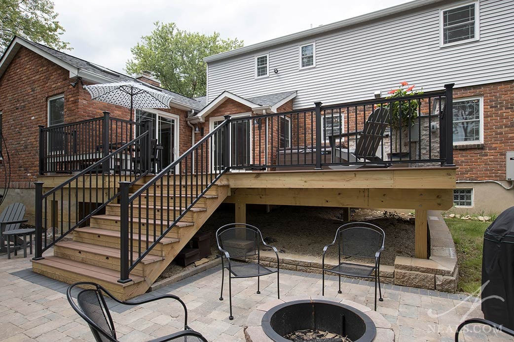
The remodel included all the interior spaces, including the lower level, as well as exterior updates. In the backyard, the deck and patio were remodeled to include a grill area, fire ring, and a spot for the kids' trampoline. The front also received a minor facelift. These changes, though minor in the grand scheme of all that was changed in the home, help to bring to entire property into alignment with the family's needs now, and to keep it feeling fresh for the next several decades to come when, perhaps, the next generation will make the home theirs once again.
To view more photos from this robust renovation, including a before & after slideshow, click here.


