It is sometimes the case that one or two poor design choices aren't enough to negate the overall good qualities of a home, and so homeowners will live with a terrible kitchen, bath or other room for a long time, justifying that the rest of the house is perfectly fine. While a remodel can often be considered a luxury, for these types of situations, the improvements made to rooms with bad style, storage, or layout choices can dramatically improve not only the home, but also the homeowner's daily quality of life. This was the case in this kitchen remodel in Indian Hill, where an ugly, cramped and outdated kitchen stifled the family's character and needs.
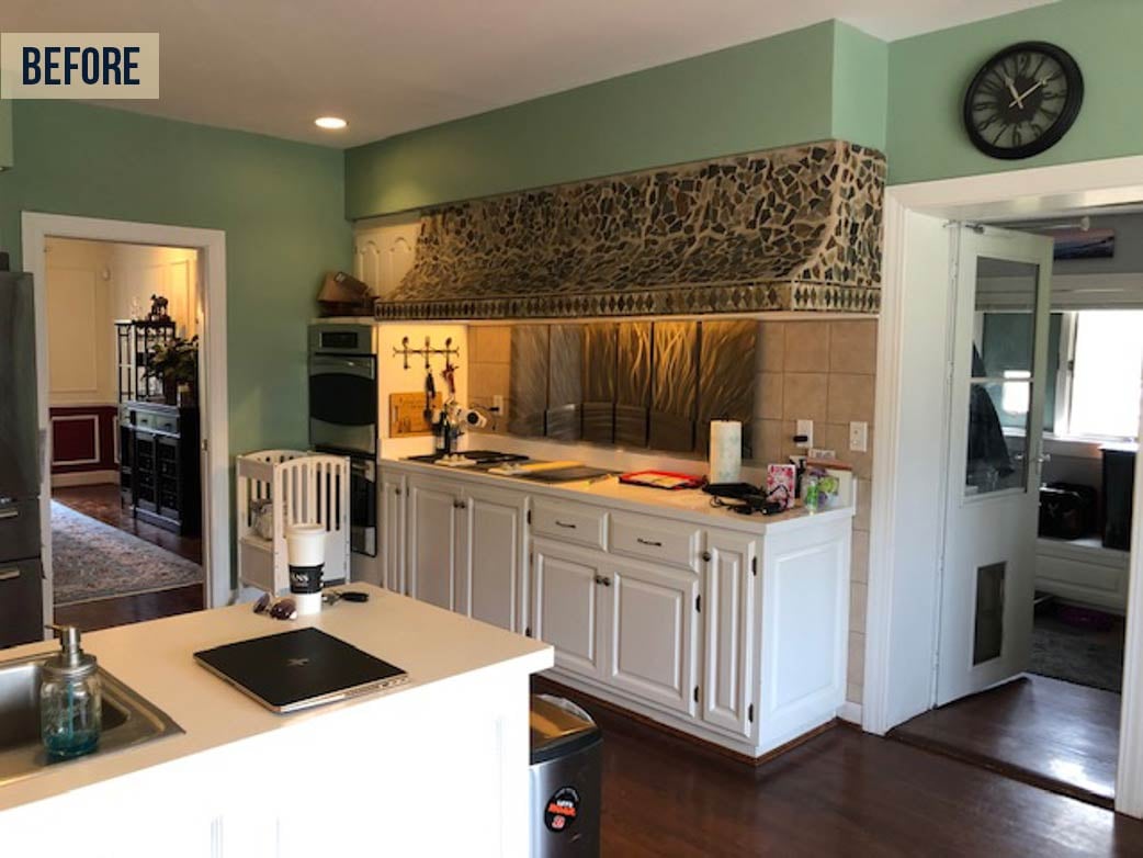
The "centerpiece" to the original kitchen (below) was an oversized hood with a DIY-style mosaic covering that was an eyesore to the homeowners. To add to the issue, the hood stretch across several feet which eliminated upper cabinetry space. Storage space was a major issue as a result. Cut off from the dining room by a wall on one end, and not extending past the mudroom door on the other end to give space for a breakfast room, the kitchen was both cramped and dark.
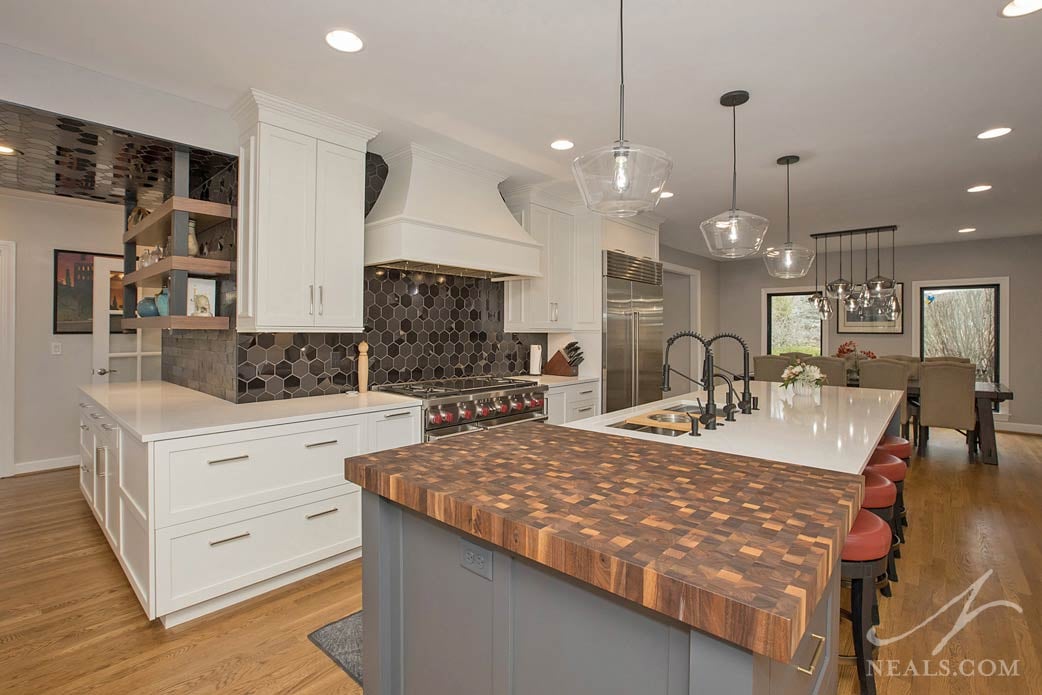
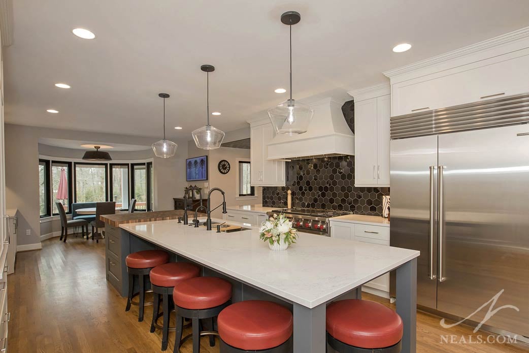
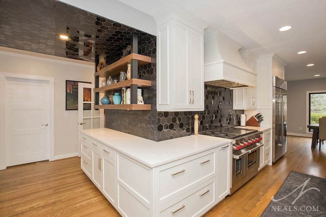
Opening up the kitchen to the dining room to be able to use the entire length of space allowed Neal's Designer Christina Temple to design a modern-feeling, practical kitchen that more than doubled the storage space. With natural light now available from the windows at both ends (along with improvements to the lighting scheme), and a lighter color scheme to the cabinetry, the new kitchen is an open and bright space that feels anything but cramped.
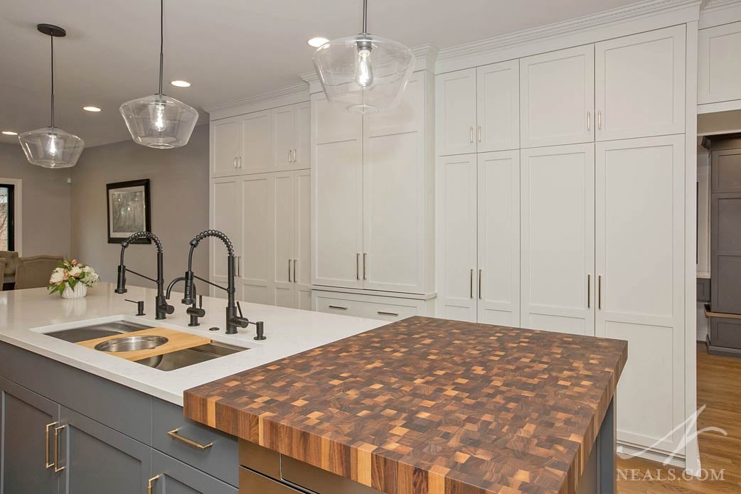
The kitchen's style is a transitional mix that favors the contemporary style end. Versatile recessed panel cabinets with crown molding trim helps the design feel correct for the more formal nature of the home's overall style. Mixing in gray, black, and gold accents in the design creates a bold style that suits the homeowners' tastes and personalities, while also elevating the design from something more typical (without swinging too far back into kitschy). Stainless steel appliances and transitional style glass pendant lighting round out the design.
A standout feature of the kitchen is Temple's backsplash design that ties the kitchen together with the side entry. Here, the hexagon tile mix of gray and black meet up with a fun and unexpected black leather tile, then carries across the ceiling of the vestibule. Standing in the space, the tile wrapping overhead creates a sense of drama that manages to not look serious or formal. Opening up to the kitchen, where a substantial butcher block counter takes center stage against the white cabinets and counter, the overall feeling of the kitchen is fun and functional.
For more images from this entire remodel (including other parts of the home) visit the project page.


