For this Lebanon, Ohio, master bath project, the homeowner was looking for updates to the space that enhanced the portions of the room that they enjoyed. Since this was a partial remodel, the project focused on finding solutions for both look and function that fit within the confines of both the room and the existing elements the homeowners tagged to remain. The resulting bathroom is a traditional space that pulls together the existing elements, includes some of the homeowner’s wish list items, and adds new materials that elevate the room’s style.
Main Vanity Area
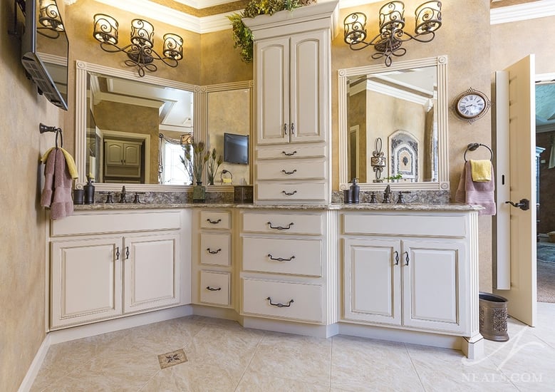
The existing cabinets, which were basic and builder-grade, were retained. However, to accomplish the goal of elevating the room’s overall style, the doors were painted and refinished with glaze and distressing to convert the plain white cabinets into a more traditional, shabby chic style befitting the room’s European design.
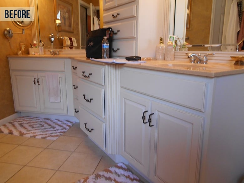
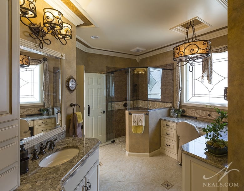
The center cabinet stack was capped with new crown molding to increase the height and make it look more grand. The beige counter was replaced with Nevern Cambria quartz with an ogee edge, which was also used as a backsplash. New vanity lighting with romantic scroll designs replaced existing lighting that was out of the room’s style vein. Since the old lights were mounted on the mirrors, new mirrors were installed with custom framing that matched the cabinet’s fluted detail.
New Vanity Area
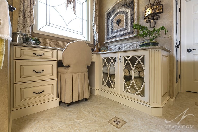
As is the case in many modern bathroom remodels, the tub was removed. It was not being used often enough, but more than that, it took up a lot of space. Rather than a tub, this corner space now contains an L-shaped custom vanity that preserved the custom tile work already existing on the walls, which the homeowners loved. The cabinetry on the left is suited to the homeowner’s getting-ready routine. Inconspicuous but accessible power strips along the back give her ready access for her hair dryer and other powered items. The cabinet on the right is for towels. The Gothic arch mullions play into the old-world look of the room, which works to tie the tile work into the entire design scheme. The cabinets are closely matched in color and finish to the re-finished main vanity cabinets.
Shower
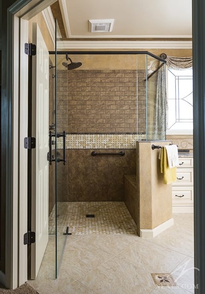
The biggest eyesore in the existing bath was the low-quality shower which was barely large enough to function. Directly across from the bedroom door, the shower makes the first impression in the space. The width of the shower was not increased, but the walk-in shower was deepened, giving the enclosure more space to move.
Originally, the tub deck extended into the shower to create a bench. This concept was reinvented in the crook behind the half wall. Niches for bottles and soap are concealed in this wall as well, keeping them out of sight from the rest of the room. Three different tile types were used in the shower to increase the design quality of the space, as well as to help tie the look of all the materials together into a rich pallet of texture and neutral color.
Additional Details
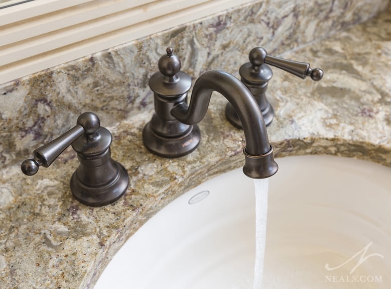
An interesting challenge with this bathroom is that the room is not a square box, so any element with a grid had any number of walls to align to. In the case of the floor, the exterior wall was used as the base, and the tile was set at a 45 degree angle to that. Mosaic inserts in the floor are another element that ties the existing tile into the revised room. Throughout the bath, oil-rubbed bronze hardware and fixtures were used to create a consistent note befitting the European style.
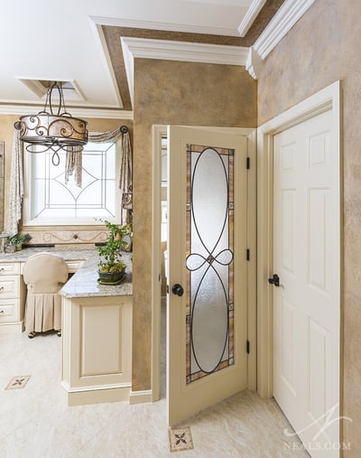
The homeowner’s selected a large pendant light they wanted installed in the bath. In order to make the light work, a column was created up into the attic space that allowed the fixture to hang at the right height. The column is a unique detail, almost like a belfry, that adds a whimsical quality to the space. The door to the commode room sports an artistic leaded and stained glass insert with the same type of scrolled design seen on the lighting.


