Sometimes a remodeling project seems to have limitations to the untrained eye. A wall, soffit or plumbing location may appear to be immovable, so when you dream about a new space, the ideas you envision become limited. This is the exact situation in which consulting a team of remodeling professionals can offer many advantages. In this master bathroom remodel, elements that seemed like barriers were identified and addressed, paving the way for a complete renovation with many more options and possibilities than the homeowners realized they had.
The original master bathroom was made up of two spaces. The larger room directly off the bedroom housed the vanity and a tub and the smaller room beyond that held the shower and commode. This division was significantly in favor of a large tub deck that the homeowners didn't feel was necessary to their lifestyle. It was unclear if the columns flanking the tub held a functional purpose, such as being load-bearing or containing duct work or electricity. Additionally, dark green tile created a dim cavernous showering experience, and looked dated.
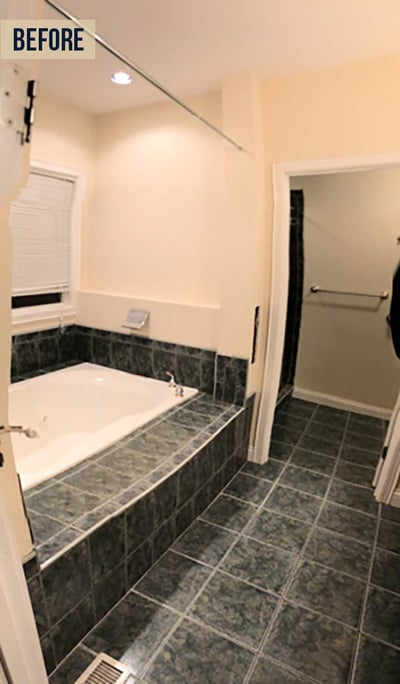
After the remodeling team came in and evaluated the columns, it was determined that they were not functional. This meant that the entire bathroom could be gutted and rebuilt in nearly any way the homeowner wished.
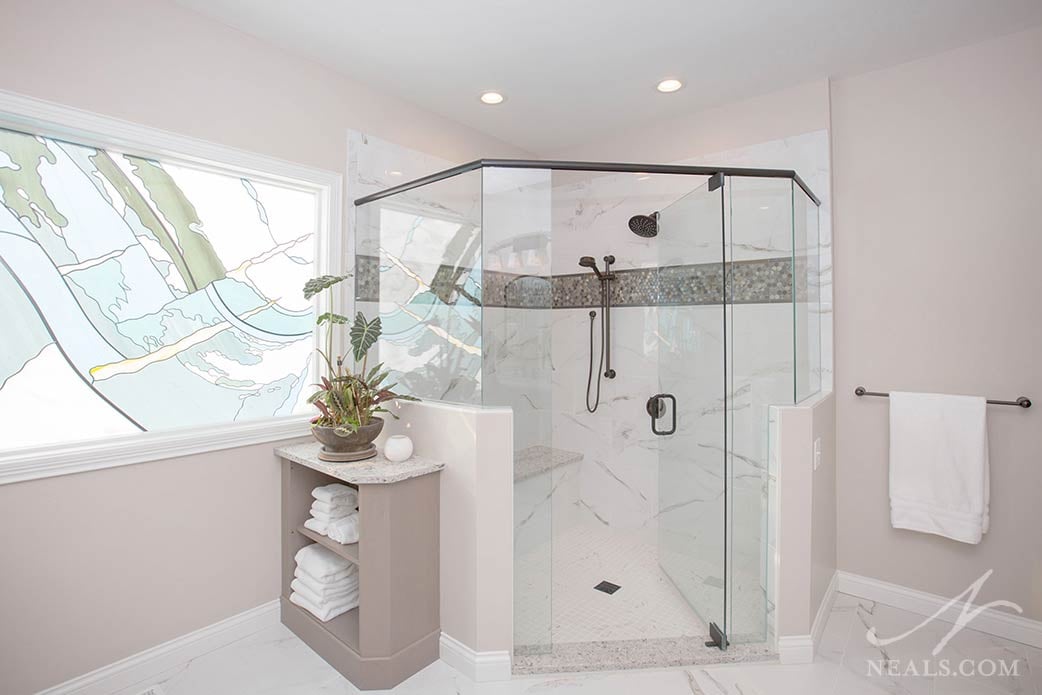
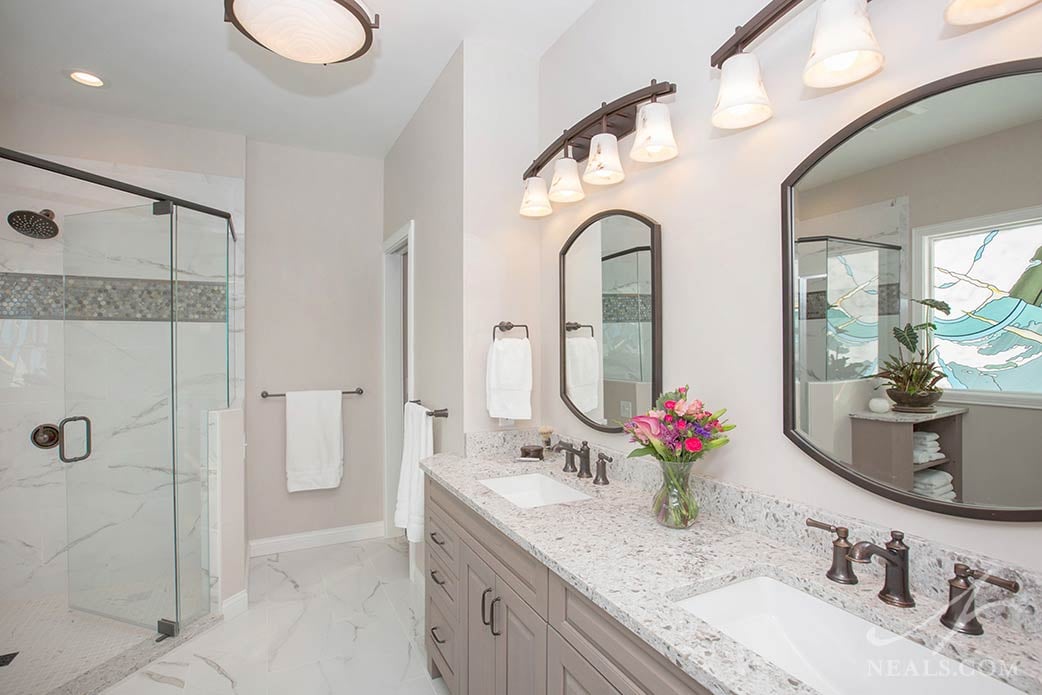
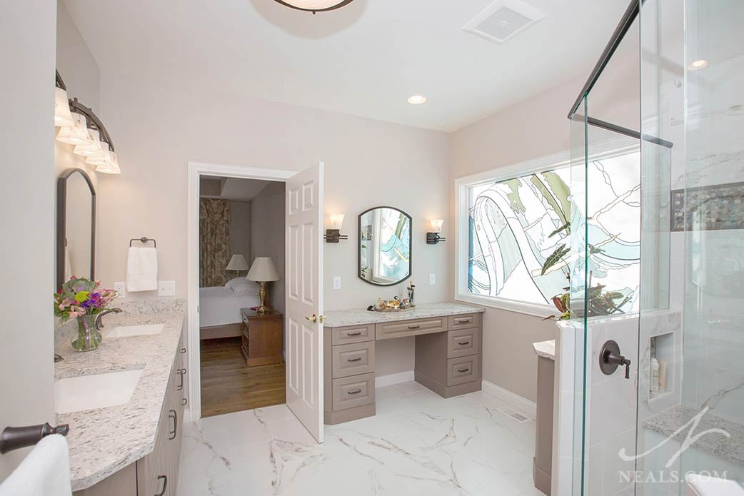
The new space follows a growing trend in bathrooms- the removal of the tub. In this project, eliminating the tub provided more room for a larger shower and a second vanity. The large picture window over the old tub deck was retained, but a stained glass overlay easily converted it into a work of art that adds character and additional color to the spa-like new bathroom.
The design of the bathroom is a balanced transitional style, with traditional elements executed in a way that feels modern. The new double sinks and makeup vanity cabinetry use raised panel doors, a staple in traditional design, with a warm gray finish that, in here, has a contemporary effect. The pale Snowy Cliffs Caesarstone quartz countertops are paired with oil-rubbed bronze fixtures and hardware to create a minimal but striking color contrast in the room. The overall gray color palette, rendered in various shades, patterns and textures throughout, creates the calm and cozy feeling of a luxury spa.
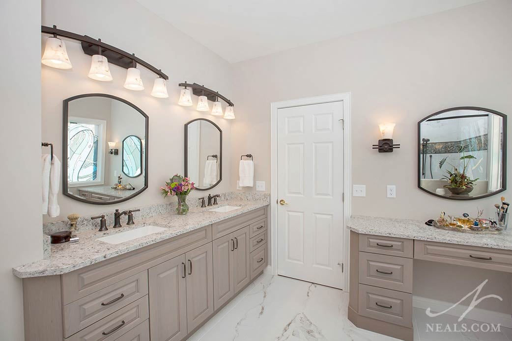
The reworked floor plan in this bath is a masterful use of the available square footage. Privacy is maintained for the homeowners with the retention of a separate commode room as well as the use of half walls around the walk-in shower. The double vanity is perfectly symmetrical and spacious, and the additional vanity and cabinetry are functional additions that offload storage to more tailored and intuitive locations. The result is a bathroom that is balanced and practical as well as comfortably beautiful.
