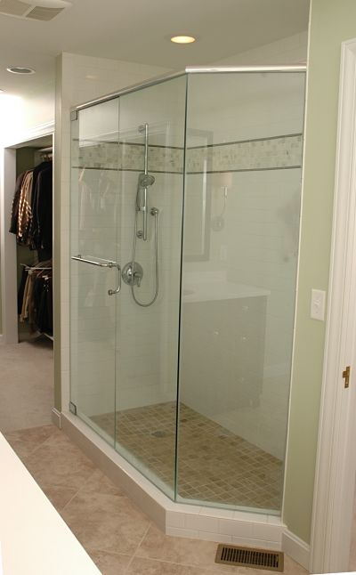
A second floor addition was built onto a vintage 1918 home in the late 1970’s to add more space for a master suite, but it didn’t match the original architecture or decor. The design of the bathroom addition failed to address both privacy and style. The re-design and remodel of this bath addressed both of these issues by creating a new floor plan within the long narrow space, restoring elements of a home built during the “American Progressive Era 1890-1920” and adding modern amenities to the renovated bathroom.

Homeowners’ Objectives
- Address the need for privacy. An open partition wall and an open entryway from the master bedroom to bathroom created an open bath space. A door could not be closed to provide privacy for users.
- Incorporate design décor and elements that might have been seen in homes in 1918 but with modern conveniences.
- Create space for a separate tub and shower.
- Replace the existing flooring with new tile.
- Move the commode away from the shower.
- Leave much of the master bedroom space intact.
Design Ideas
- Extend the wall of the partition upward to enclose the bathroom and install a door to enclose the entryway.
- Include period-style cabinets and fixtures with chrome, glass accents and finishes that may have been used in 1918.
- Create a new walk-in shower in the narrow space.
- Feature a stylish new free-standing tub under the existing window.
- Install new tile throughout.
- Use the old shower space and plumbing for the new private commode room.
- Rework the interior wall placement for a more open space.
Challenges
1. Lack of privacy between the bathroom and bedroom. The existing master bath lacked privacy and noise-control from the bedroom primarily because the walls separating the closet from the bedroom did not reach the ceiling. Additionally, there were no doors in the space leaving every portion of the bath essentially open to the others.
2. Poor interior design. Modern cabinets of the 1970s installed in the addition, harsh lighting, and a space-age all-in-one tub and shower clashed with the other rooms of the home.
3. Inconvenient, outdated shower. The existing fiberglass all-in-one shower was inconvenient to use, cramped, ugly and located in the back of the room.
4. Central placement of fixtures. A bidet and a commode placed centrally in the room occupied valuable floor space and created problems for users who needed privacy.
5. Unifying the flooring. Though the carpeting was in good condition, it felt awkward underfoot in the vanity area. The contemporary, dark tile in the shower area was a sharp contrast.
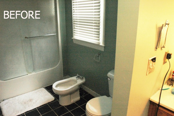
A narrow master bathroom addition built in the 1970s was neither functional
nor tasteful for the owners of this 1918 vintage home.
Solutions
1. Establish privacy between the bathroom and bedroom.
The short walls of the partition were extended several inches to meet the ceiling, and a new door was installed between the bathroom and the bedroom, reducing noise between the two rooms and giving the homeowners much needed privacy.
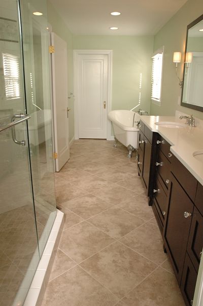
In this photo the walls of a partition were extended to the ceiling to close off the bathroom from the adjacent bedroom. Doors were added to the entryway and to close off a commode.

2. Restore the interior to reflect the era and add modern amenities.
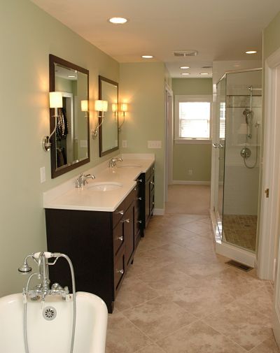
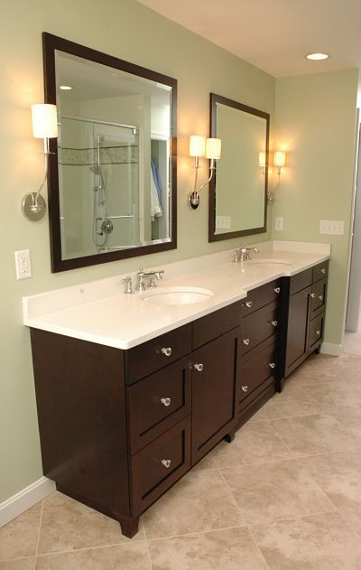
- Replace the vanity. A new 9-foot long, dual sink vanity, with plenty of storage and handsome glass knobs characteristic of the period, is a focal point in the room. A white marble-like surface, a popular element in homes of the early 20th century, was used for the counter.
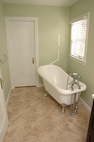
- Add a claw foot tub. Chrome faucets trimmed with porcelain handles, and an especially noticeable hand-held faucet on the tub, bring instant classic style.
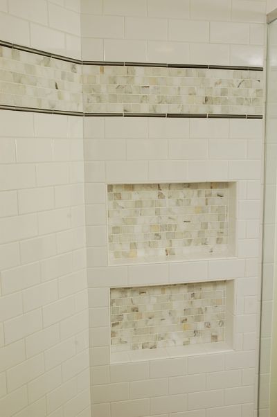
- Use tile design of the era. White ceramic subway tiles and marble mosaic tiles in the walk-in shower blend the new with the old.
In the photo below, the simple clean lines of the dual sink vanity with its dark finish and white quartz counter blend the old with the new. Shaded chrome sconces, cut glass knobs and two framed wall mirrors create a focal point in the room.

3. Install a custom walk-in shower with glass surround.
- Create space for the shower. An angled wall, created by shifting the new door a few feet and taking some space from an adjacent walk-in closet, provided just enough space to fit a shallow walk-in shower.
- Add accessories. A chrome handheld showerhead matches the faucet on the new tub. A towel bar added to the surround, places towels within easy reach.
- Optimize the small space. A glass surround allows for light and creates an illusion of spaciousness within. White subway tile and a linear mosaic tile border add to the illusion of space and to the aesthetics of the bath. Two nooks in the angled wall of the walk-in shower offer space for shampoo and bath products.

4. Relocate fixtures and install a free-standing tub.
By eliminating the bidet and placing the commode in a separate room, the space under the window could be reused for a new, statement-making soaking tub. A claw foot tub, with chrome plated feet, set at a slight angle, was ideal. To conform to safety regulations, the window was replaced with a new, tempered glass window.

5. Unify the flooring.
The flooring was removed, except in the closet area, and replaced with a limestone-looking porcelain tile. To help visually widen the bath, the 18-inch square tile was set on a diagonal. To fill the threshold of the new door, because a match could not be found for the carpet, 2-inch square mosaic tiles (also used on the shower floor) were installed, giving the entrance to the bath a sense of drama.
