The homeowners’ goals with this kitchen remodel were to update the look of the kitchen to better reflect the style of the home and their personal style preferences. Creating better flow and improving the functionality of the working triangle were important considerations as well. The new kitchen needed to handle the homeowners’ needs in daily life, and their entertaining needs. The remodeled space needed to accommodate parties, particularly focused on cooking. The homeowners also desired more closed storage to alleviate the cluttered look of glass-fronted cabinets. This project is a 2018 Local Contractor of the Year Residential Kitchen winner.
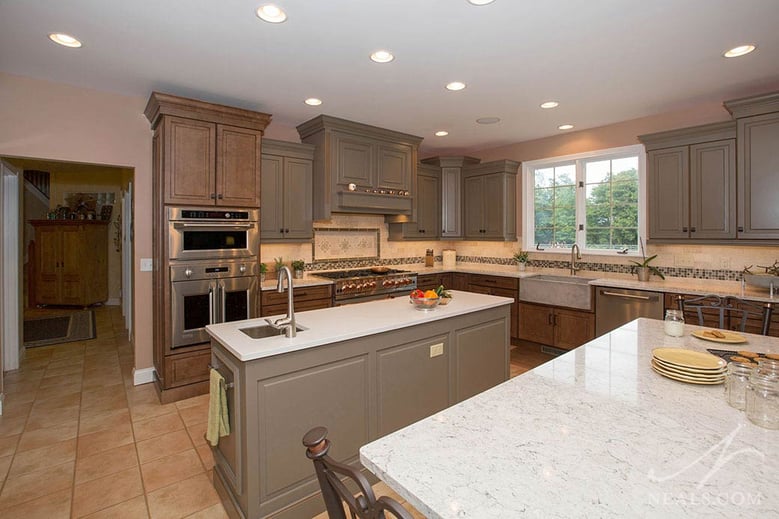
The design for the new kitchen is eclectic in concept, and favors traditional details. The cabinets are installed in a mixture of finishes- a warm medium brown stain, and a painted warm gray. A cream-toned tile on the backsplash pulls the color from the tile into the rest of the scheme. The traditional style comes through in the trim and molding details. The kitchen also features several major appliance upgrades that help to create a modern feeling to the kitchen without overpowering the traditional look.
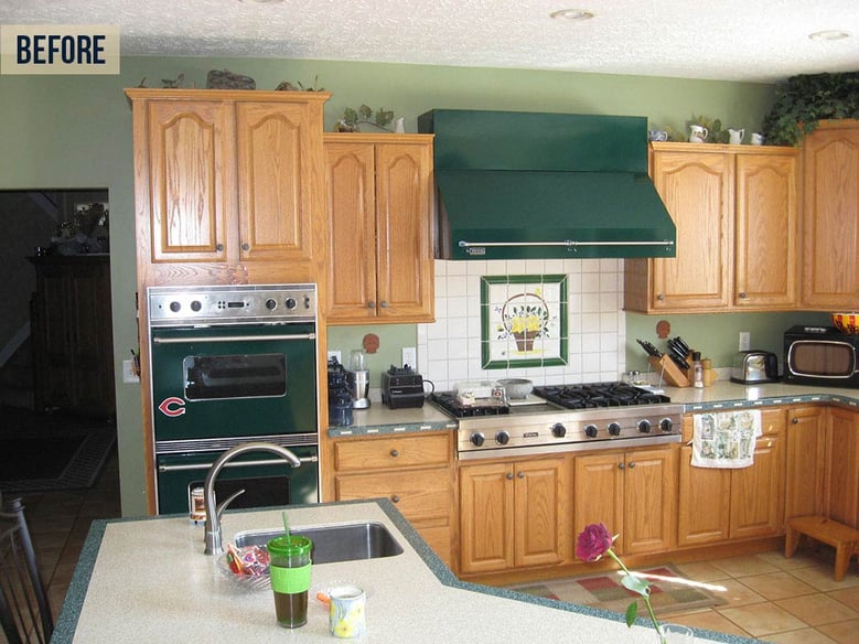
Flow and working efficiency were an issue in the existing kitchen. The main reason for this was the placement, scale and shape of the island. The angled island, with wings on either side creating a semi-horseshoe shape, was large and cut the kitchen off. It was also placed several steps away from the range and sink, creating an efficiency problem and limiting the actual usefulness of the counterspace there. The size of the island also made sitting to socialize or enjoy the homeowners’ parties awkward and crowded.
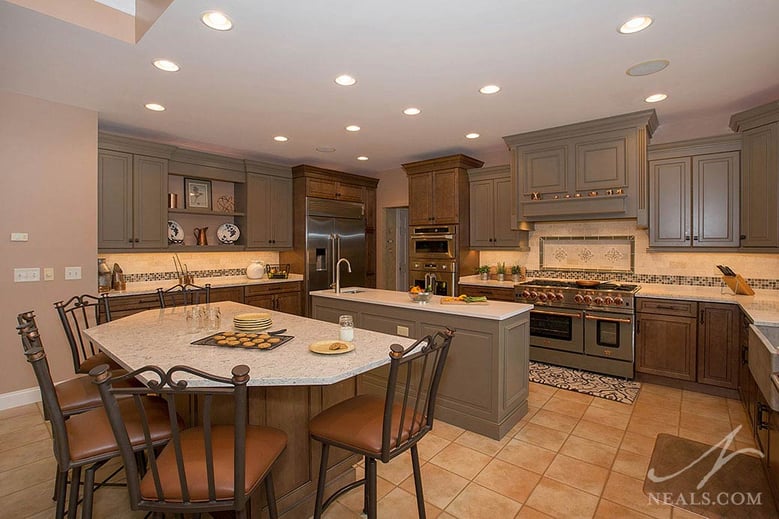
The new islands solved these problems by splitting up the two functional purposes of the island. One island was designed for gathering and group experiences. The other was designed for food prep. By creating these two islands, the two new zones could be better placed for their actual purpose. The prep island reduced the working triangle to a more useful and efficient scale. The seating island gives the family and their friends dedicated space to socialize and eat, without being a part of the main working zone.
Overall, the kitchen is traditional. The kitchen’s color scheme is primarily a combination of medium brown, soft cream, and warm gray. A mixture of black, bronze, copper, and silver toned accents then helps to create a more eclectic feel. The effect is a design that is cohesive, but with a sense of unexpected character.
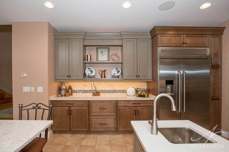
The cabinetry changes color primarily according to the zones. The brown and gray cabinets are a near half and-half mix, playing off each other around the room. For example, the cabinet around the fridge is brown, but it gives way to the gray wall cabinets in the display and secondary storage area. Heights were also played with. In some areas, the wall cabinets sport a mix of heights, such as around the range hood, but in others, the cabinets keep a consistent height. These choices were made to draw the eye to certain points in the room. Straight on, the varied heights point out the range hood, the corner cabinet, the double oven. Over on the display wall, the consistent heights allow the open shelving to take more of the focus.
The appliances were updated throughout. In the existing kitchen, the appliances were a deep green, which dated the kitchen’s style and did not work with the look the homeowners were hoping for. A highlight of the appliance changes was a new Blue Star range. The stainless steel and copper combination of the range acts as the main driver for combining the two metal tones in other areas of the kitchen.
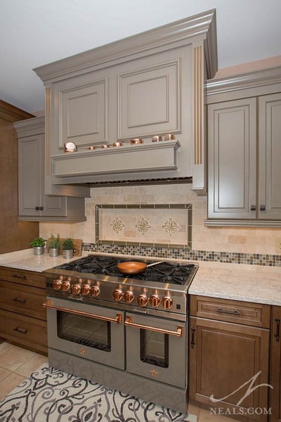
There are modern touches in the kitchen as well. Most of the appliances are clean-lined stainless steel, which brings a modern look to the room. Also, the new sink is a faux concrete farmhouse-style sink. In addition to being much lighter than conventional concrete, the angular, industrial look adds yet another modern layer, without going too far.
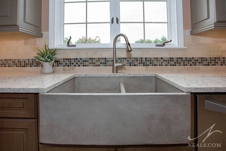
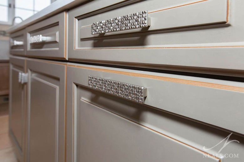
The backsplash is tumbled natural stone, with an accent band. This band is natural stone in gray and brown combined with glass and silver metal pieces. The metal tiles are decorated with traditional motifs. This is played up in the larger versions of glazed tile over the range. The main drawer and cabinet hardware is a black and bronze design. On the prep island, however, polished nickel hardware with textured face that looks like tiny glass mosaics help make that island feel like a separately-added piece. The faucets are also nickel.
Lighting was updated throughout. The new lighting scheme uses recessed can lighting in the ceiling and under-cabinet LED lighting.
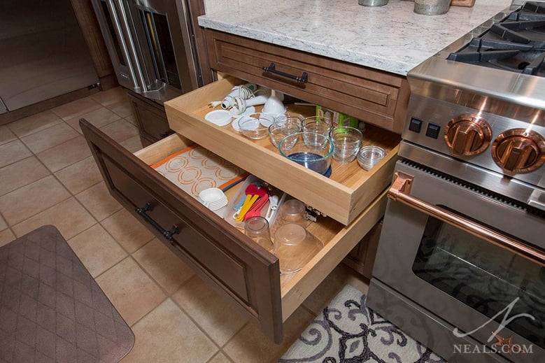
Cabinets were selected and placed for their interior function as well as their exterior aesthetics. Since the homeowners were looking for everything to have a home behind closed doors, the interior fittings became a crucial component to the functional design of the new kitchen. Interior organizations include layered drawer systems, corner cabinet lazy Susans, and baking dish storage over the ovens.
