Watching how her husband, who had been wheel-chair bound, consistently have difficulty using their master bathroom left this homeowner thinking about her own future needs. Instead of continuing to deal with the space as it was, she made the choice to upgrade it to fit her style, and to work for her long-term needs. The result is a spectacularly crisp and modern universally-designed bathroom. This bath is a NARI Local Contractor of the Year 2015 Winner in the Universal Design Category.

Homeowners’ Objectives
The primary goal for this project was to increase accessibility throughout the room, particularly in the shower. The homeowner also desired to create a modern design that would not need to be altered further as she continues to age.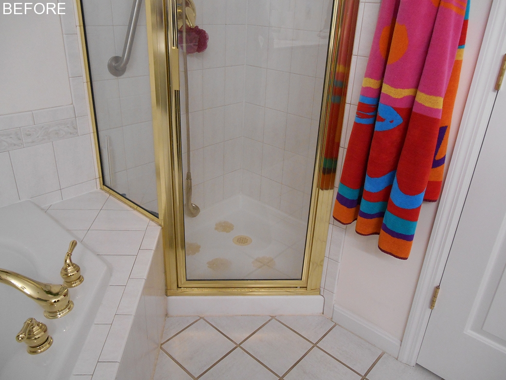
Existing Issues
- The existing tub and shower were rarely used. Not only were they dangerous for the older homeowner to navigate into and out of, they were hard to keep clean.
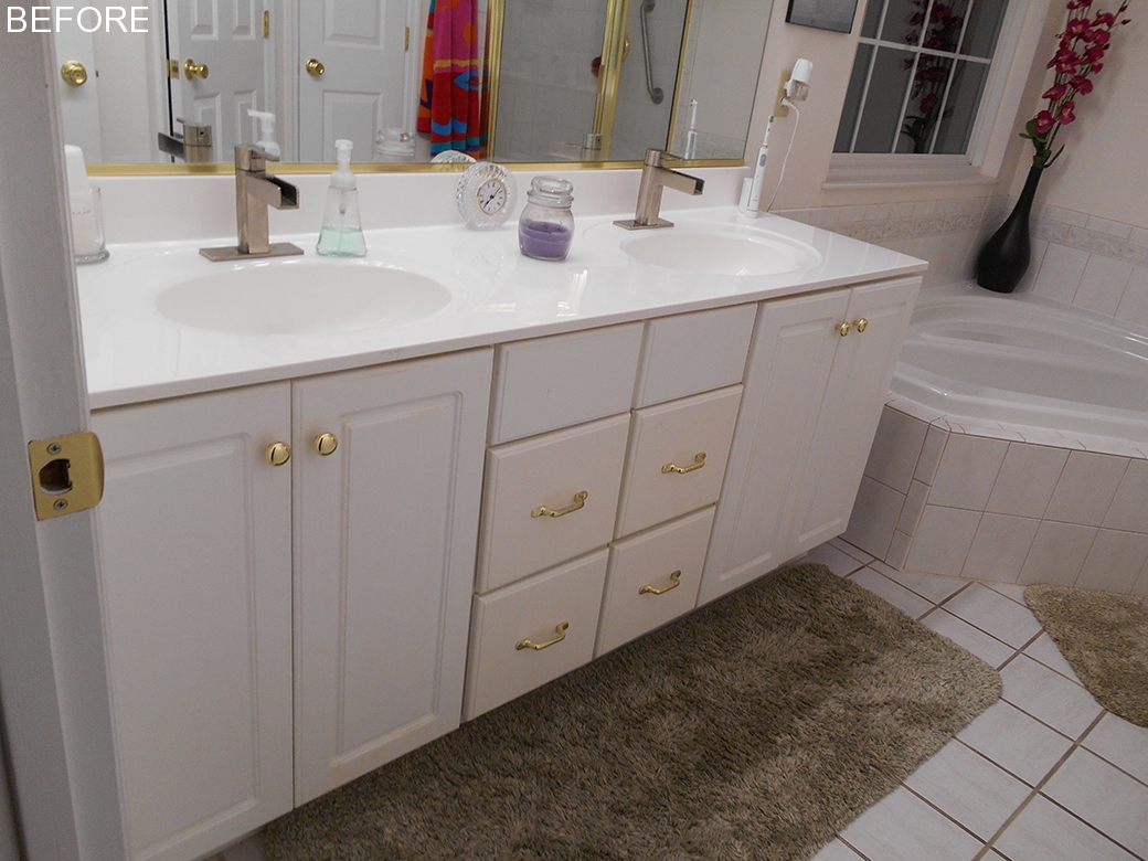
- There was very little open floor space. The commode was located in a separate room (completely inaccessible by wheelchairs), and the linen closet, shower, tub and vanity took up the rest of the room’s perimeter, leaving only a small amount of room at the center.
- The builder-grade materials and traditional brass finishes did not match the homeowner’s tastes.
Solutions
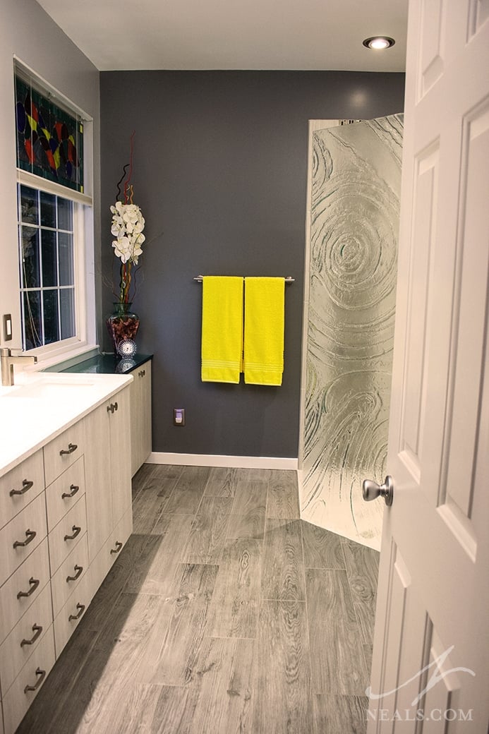
1. Maximize floor space without adding square footage.
To maximize floor space for increased mobility through the room, the commode room and linen closet were removed. The corner tub was also removed.
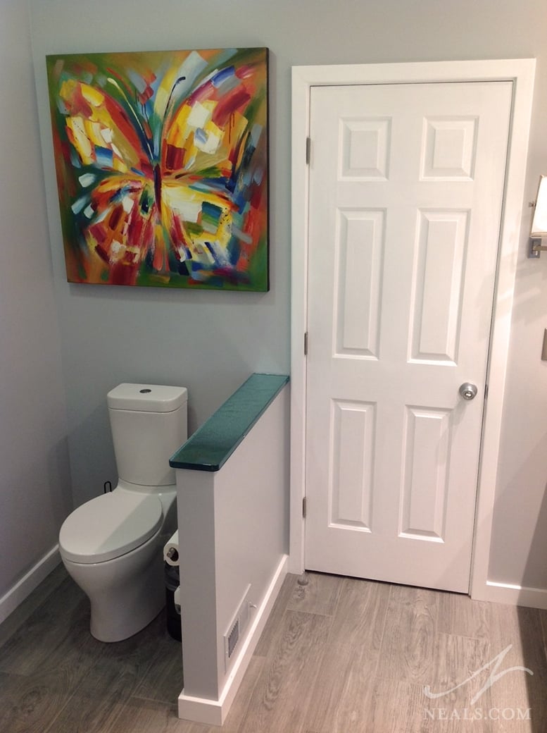
A knee wall provides a barrier and privacy for the new toilet, a Kohler Persuade® Comfort Height model with an elongated seat and two-button flush. The toilet paper holder is situated on the knee wall so that it does not detract from the room’s overall look when standing at the vanity. The commode is a sleek-look, easy-maintenance selection.
The linen closet was replaced by two sections of cabinet storage. A tall cabinet is situated opposite the commode, and a low bank of cabinets sit under the window. All cabinet interiors, including those in the vanity, were arranged according to the homeowner’s specific needs.
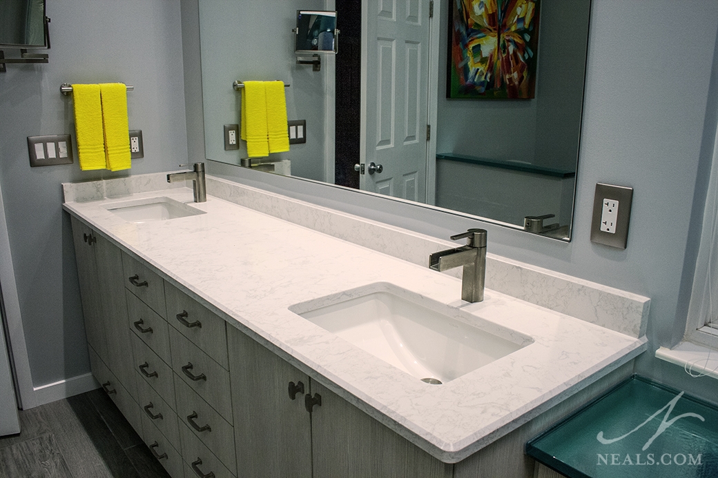
2. Install stand-out, easy-care materials.
Creating a space that the aging homeowner can enjoy without worry meant focusing on material selections that not only accomplished the contemporary design goals but were easy to care for. Cambria Torquay quartz is an easy-care counter material that was installed on the vanity as well as the shower seat.
The homeowner liked the idea of a bamboo or cork floor, but through due diligence, decided instead on a nonporous porcelain tile in a woodgrain texture that offers a similar look without the hassle of up-keep and with much better long-term durability.
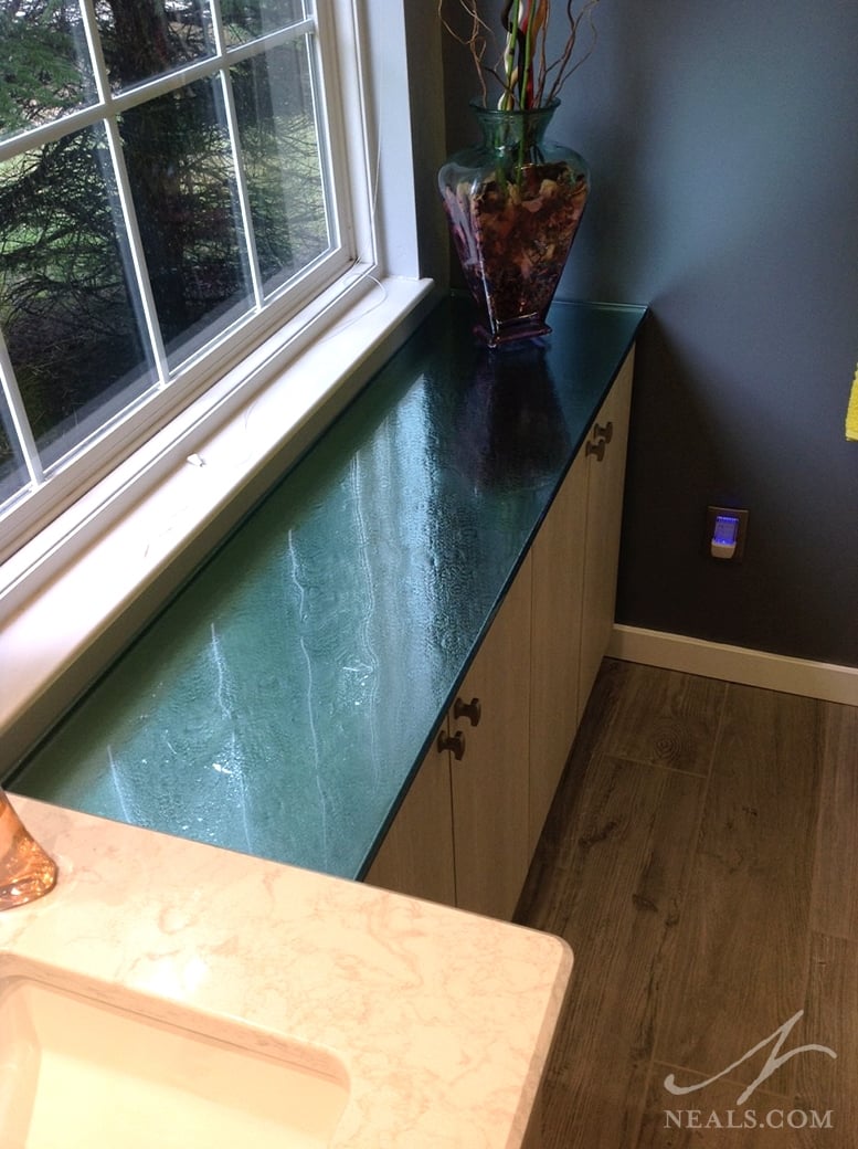
Glass was also used in the space in a few formats including low-ore cast glass tops, glass mosaic tiles in the shower, and a dramatic piece of “Storm” glass from Cardinal Industries.
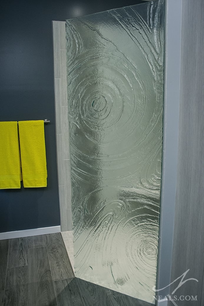
3. Create a safe, accessible shower without sacrificing design.
In the space opened up at the end of the room, a new, larger shower could be installed. It is doorless and curbless, allowing unhindered entry. Inside, a bench was situated in the corner for easier washing. The bench face is a full 30” wide. It is constructed of an aluminum frame (secured 4” into the wall) that was then filled with mortar so that it will not warp or break from the shower moisture over time. A single niche in the shower provides a place for toiletries. The shower head is a hand-held 90 Degree Moen fixture.
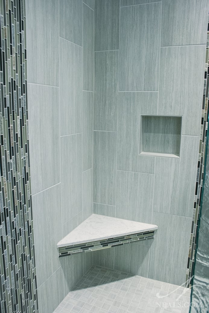
The main shower tile is similar in texture to both the main floor and the cabinetry. On the floor, four medallions accent the tiles cut into squares and arranged in a faux-basketweave pattern. The mosaic tile includes blue, gray, and butter squash glass as well as a few elements of natural stone.
The main shower wall is secured with brackets concealed in the wall or by the tile.
4. Create a well-rounded, universal design.
Aesthetics were very important to the homeowner. This included ensuring that the finished design of the room complimented a colorful, traditional stained-glass window already existing in the space. The selection of the blue-green Studio L glass tops (with a stainless steel underlayment) was a major tool for tying that window into the modern design. Paint colors and decor were also selected as part of the project to add bold but complimentary elements.
The oversized vanity mirror is combined with a tall mirror on the opposite wall to provide an easy and safe way for the homeowner to check herself from multiple angles.During framing, supports were installed for the addition of grab bars in two locations in the shower and one location near the commode for when the homeowner is ready to install them.
