With the revitalization of the downtown Cincinnati residential community, modern design concepts are taking root around the existing traditional character of the area. This mixture of classic architecture with contemporary style is seen to great effect in how the homeowners of this OTR row house brought contemporary design into their home with this remodel. It's also a fantastic example of modern design. Here are four contemporary design lessons we can learn from this project.
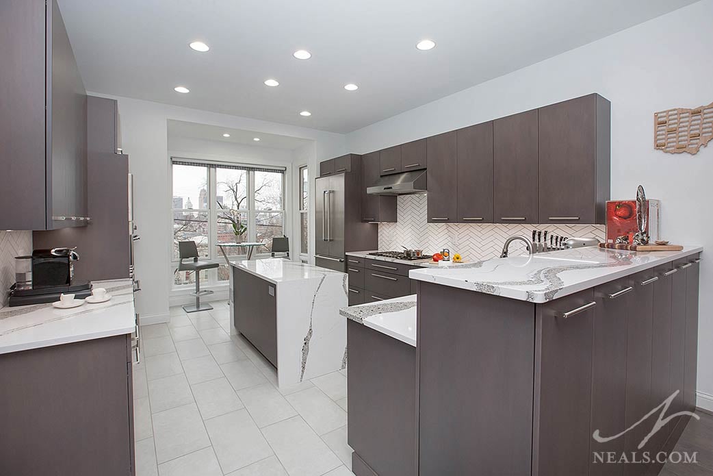
Balanced High Contrast
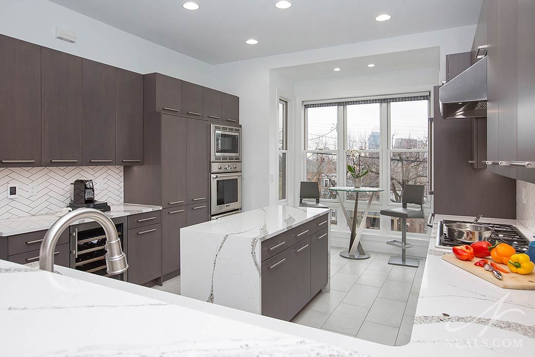
Contemporary design is fueled by bold choices, so it's no surprise that the use of high contrast can set the tone of a modern space. High contrast is the pairing of two colors that are at opposite ends of the spectrum from each other in terms of being light or dark. That kind of color combination is essentially the palette in this kitchen design. While the cabinets aren't true black- which could potentially make too harsh of a contrast- there is very little use of gray tones in this design. This creates a clarity between the elements, making each surface easy to distinguish from those around it. The key to success when using high contrast is to keep each color in balance with the other. Too much of one color skews the contrast in that direction, disrupting the bold visual clarity. In this space, balance was achieved because all the cabinetry is the same dark finish, and that color is not repeated entirely on any other surface.
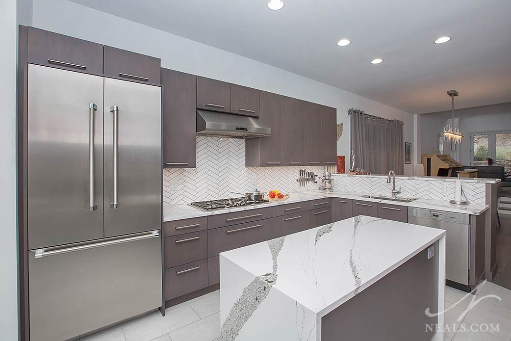
Playful Patterns
The use of pattern and texture isn't the sole property of contemporary design, but using these elements in ways that are not typical can immediately create a more modern feeling to the space. In many cases, this pattern play can be easily created by using materials that are inherently interesting and unusual on their own. In the case of this kitchen, the Cambria countertops used throughout, a pattern called Annica, creates that sense of unique contemporary playfulness. The wave-like pattern, made up of dark gray elements that mimic the cabinet color, create what is known as "movement"- the feeling that the counter isn't a static element because the eye follows the obvious lines as they travel across the surface. While movement, or any kind of bold pattern, can be added to a space, the key to making it work for contemporary styling is that it isn't just a haphazard choice or a funky mix that has no regard for aesthetic appeal. The patterns and textures used in the space should feel intentional and curated for how they align with all the other elements to create a kitchen that feels cohesive rather than at odds.
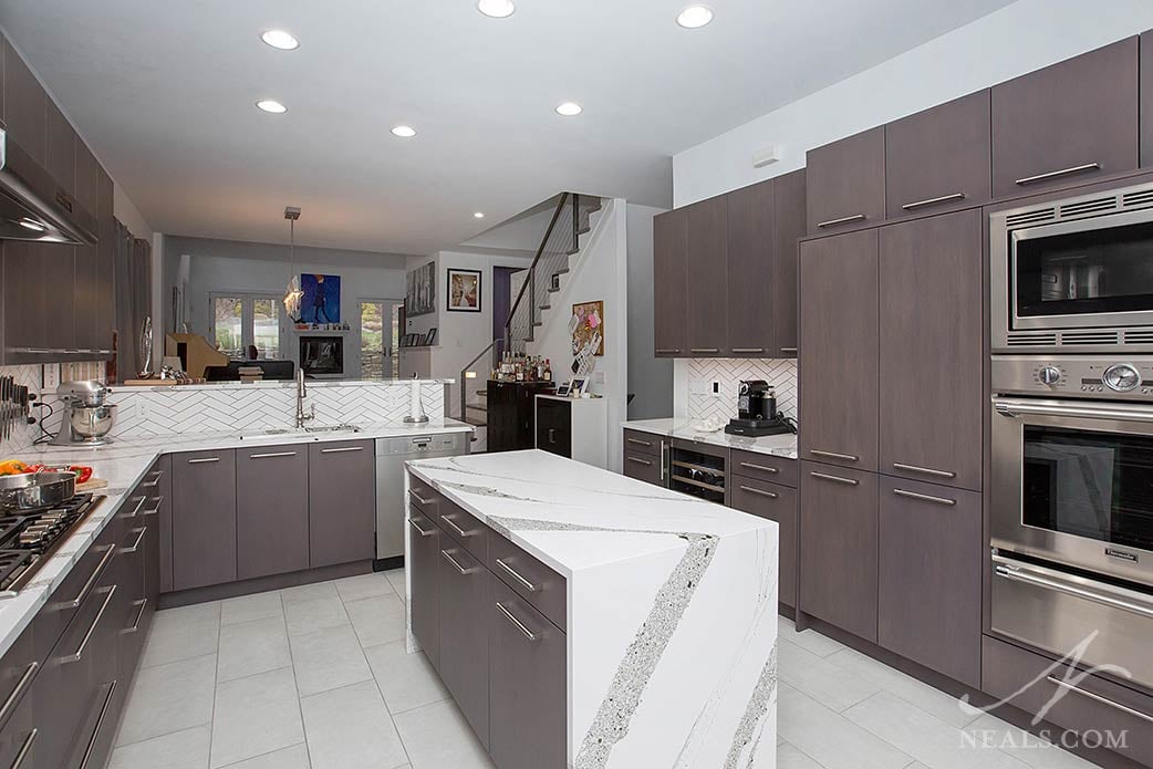
Unexpected Twists
Along with pattern and texture, contemporary spaces can be distinguished from other styles because something in the design feels unexpected or a material has been used in a way that isn't typical. In this kitchen, we can see this feature in two forms. First, the island uses a technique known as a waterfall edge. This is created by extending the countertop material vertically down the two ends of the island. This treatment feels like a surprising use of the countertop since it's no longer being used as a functional surface. The second unexpected feature here is the use of a herringbone tile backsplash. Herringbone is an ancient pattern that brings a huge amount of classic style pedigree. Instead of feeling traditional in this space, though, it creates a fun juxtaposition against the modern elements that surround it. In a way, the pattern has become appropriated in this design to be more modern in style than it would inherently be otherwise.
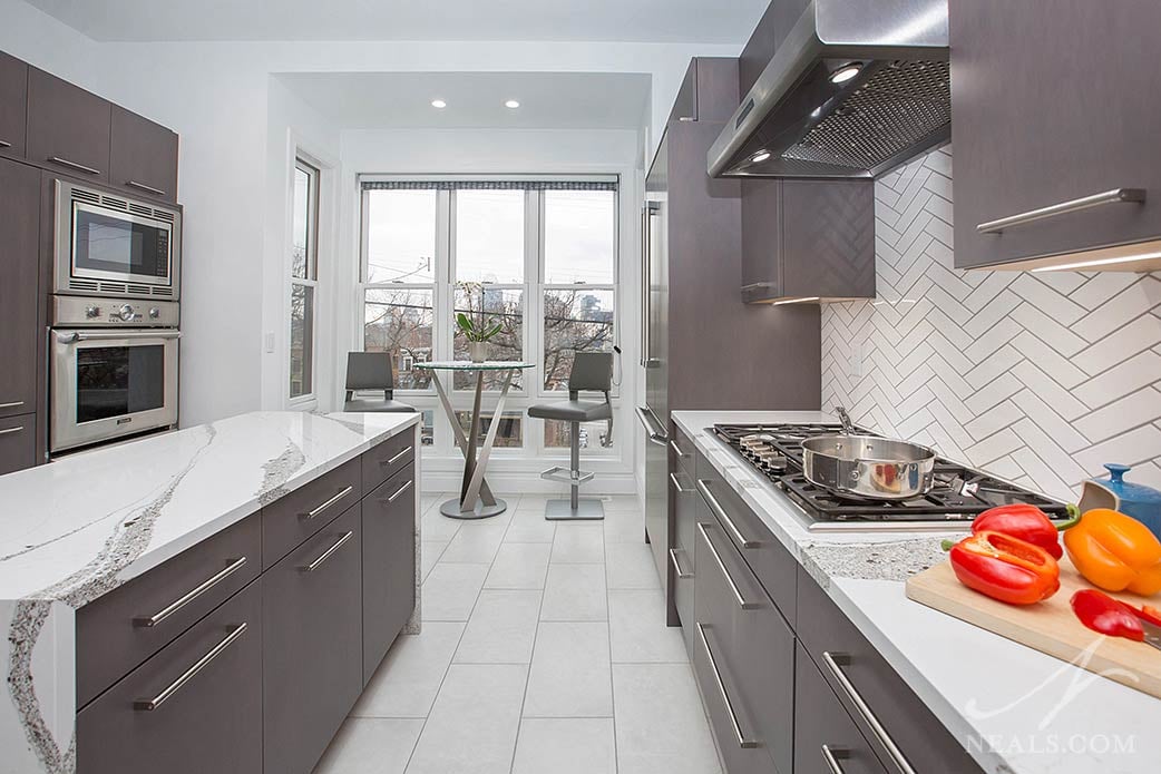
Intentionally Minimal
Taking a step back to look at the kitchen as a whole, we can see that it isn't made up of very many different elements. This is also a hallmark of contemporary design, and can also be known as minimalism. Though we often tend to think of minimal design as stark and cold, it's really about making specific, intentional choices for what's required, then not adding any extras. This idea is seen in many contemporary kitchens with features such as bar-style drawer and cabinet pulls, stainless steel appliances, non-custom range hoods, and practical flooring. All of these features can be seen in this kitchen, and work to pull the design together in functional ways around the more obvious material selections.
To see more images from this remodeling project, view the before & after slideshow.


