One of the challenges we see often in bathroom remodels is when the existing design is passable, but off for the homeowner. This master bathroom in Indian Hill is one such example. Spacious and well-appointed, the bathroom lacked a style direction and the room's various finishes and materials were a little too mix-and-match. Designer Cyndi Kohler helped the homeowners pare down and refine the room's design to create a new master bath with classic appeal.
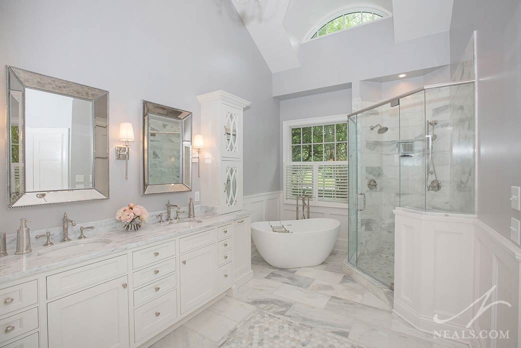
In the original bath (below), his and her vanities were placed across the room from each other and were just different enough in style that they added a layer of visual confusion in the space. The tub deck and shower enclosure sat heavy in around the window, reducing the sense of open space in the room. The tile, counters, and flooring combination felt dated and tired.
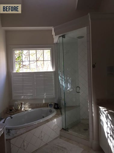
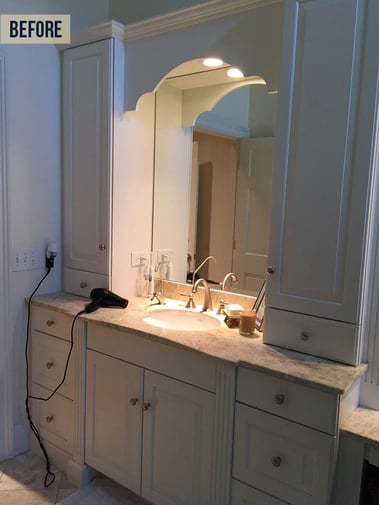
The biggest change to the layout of the space was achieved by joining the two vanities into a double vanity, taking advantage of one of the only uninterrupted long walls in the space. With the second vanity out of the way, the shower was able to expand outward to become roomier.
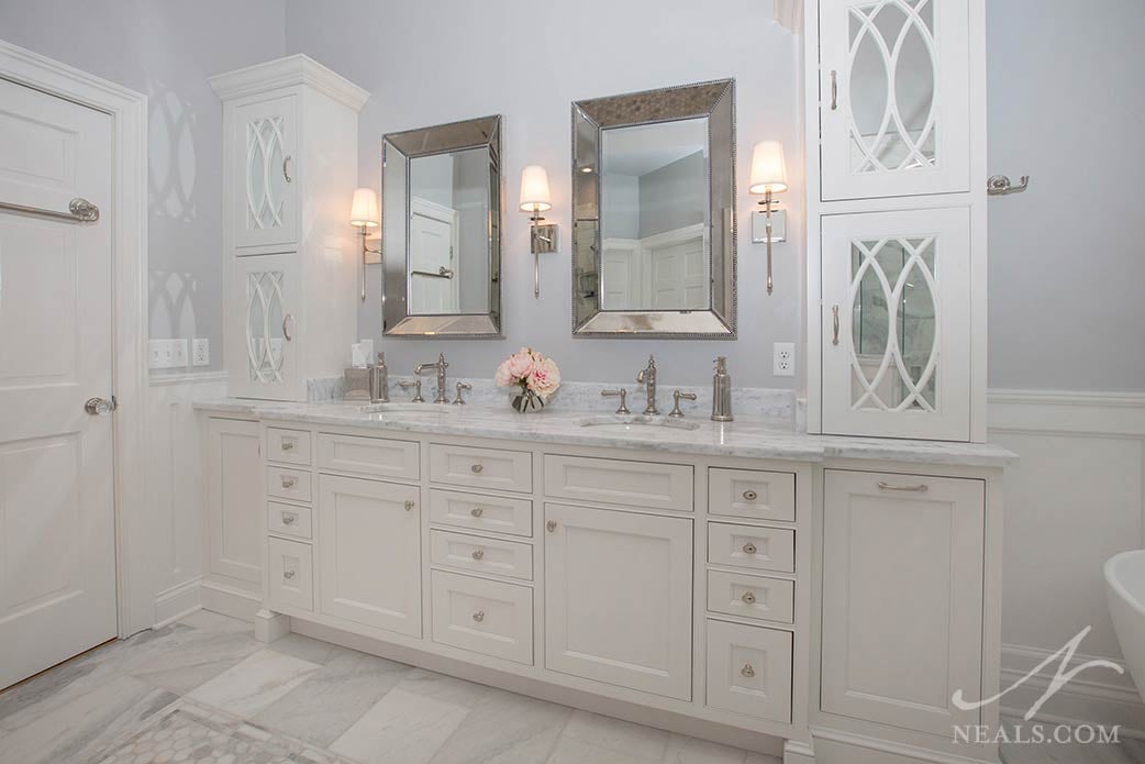
The vanity is a turn-of-the-century inspired installation with traditional recessed, inset doors. Tall cabinets on the counter mimic the look of old curio cabinets, but the glass has been replaced with light-enhancing mirrors. The counter is a slab of First Snow marble. The vanity is loaded with custom storage solutions. Special shelving for bath and styling products, wire baskets for laundry, and plenty of drawers for essentials mean the vanity is as functional as it is beautiful.
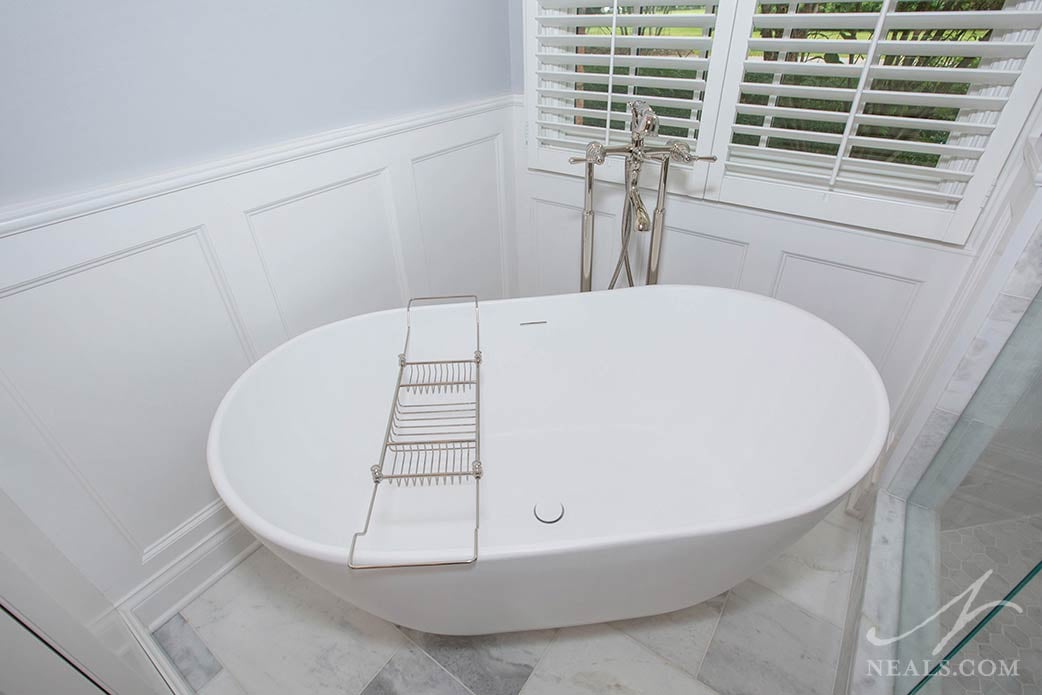
A free-standing soaker tub in the corner creates a focal point without the weight of a tub deck. This minimal tub, the Winifred model from Signature Hardware, adds an element of modern flair that offers a nice place for the eye to fall without being overwhelmed by details. It's joined by a polished nickle standing faucet, true to the Victorian-inspired style of the space.
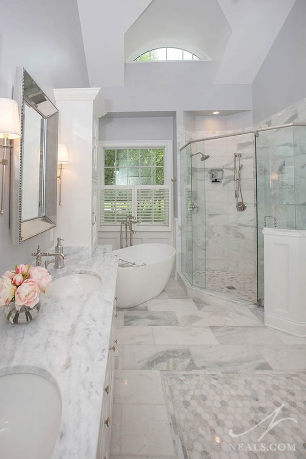
Rather than using a mix of different materials for the floor and tile, the new design is a study in marble. A mixture of marble colors in large tiles, hexagon mosaic tiles, and slim border tiles creates a consistent but interesting look across the floor and into the shower.

The new glass shower enclosure opens the corner up, allowing the eye to follow the line upward to the high ceiling. A half-wall assists with privacy in the large room.
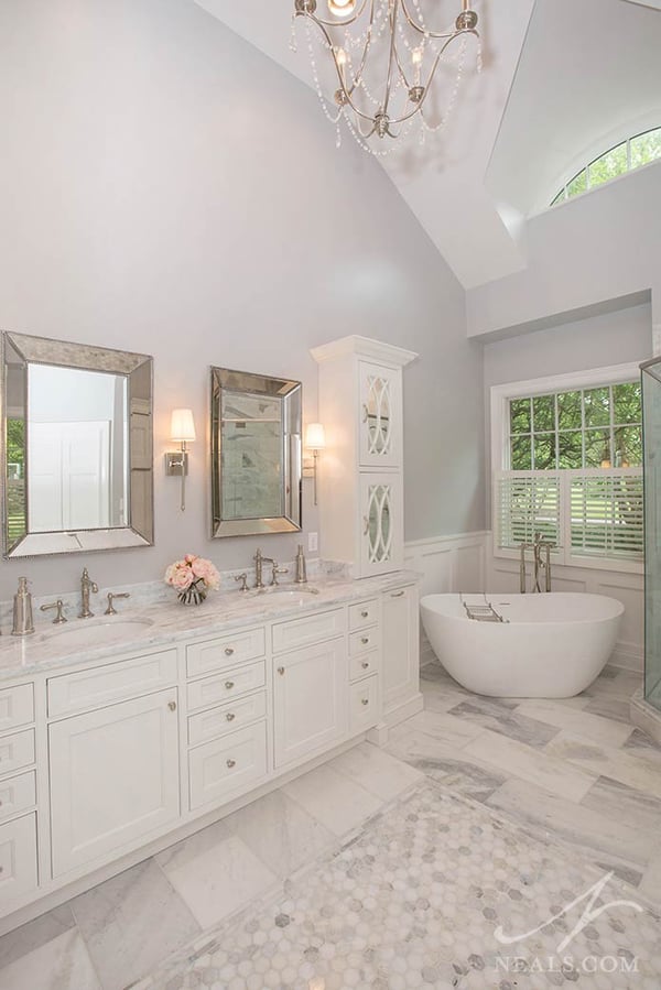
The hardware throughout the bath is polished nickle, a traditional and glamorous choice that adds a bit of shine to the space. Beveled mirrors and slim sconces with romantic fabric shades compliment the hardware and pull this gray and white design together.


