Over time, things stopped working in this kitchen. First, there were small inconveniences in the layout and inefficiencies in the work triangle. Then the cabinets started to fall apart. Eventually, it became difficult to keep up with the maintenance – too many little things. Until the oven stopped working. That was the last straw. This kitchen remodel was faced with the task of tackling a wish list compiled from over a decade of dealing with a dysfunctional space. Read on to find out how we did it.
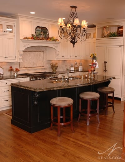
The goals for this project started with a desire to open and lighten up the entire kitchen area. The redesign then focusing on how to rework the space to accommodate a larger island and to create a more functional work triangle and traffic flow around the room. Finally, the homeowners wanted to see visually appealing elements in each direction, in keeping with their aesthetics and the overall design of their home.
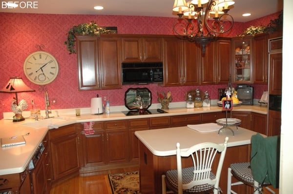
The project came with a handful of initial obstacles. Finding a balance between the lighter design theme the homeowners desired and their penchant for visually heavy traditional design was the key to a successful remodel. All additional surface decorations were weighed against the the overall goal for the look of the new space. To make the room feel more open without adding additional square footage, it was clear that walls would need to be removed from the adjacent family room, adding structural challenged. Finally, in order to provide enough practical storage in the kitchen without compromising the goal of appealing vista’s throughout, some clever cabinet solutions had to be employed.
Range/Hood
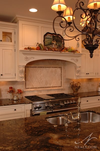
A priority on the homeowner’s wish list was to have the range and hood be a major focal point in the new design. In order to accomplish that, the designer started with the scale of that area. A custom hood was designed to sit over a 48” gas range. The designer started with the corbels to ensure that they felt tied into the hood’s design, then designed the rest of the space around those. In the base cabinets, posts on either side of the range help carry the focal point all the way down. The placement of the range affected the placement of the island. In order to have enough space for the oven doors, but not take too much space away from the traffic flow on the other side of the room, the island was placed perfectly inside the optimum dimensions.
Cabinetry/Storage/Display
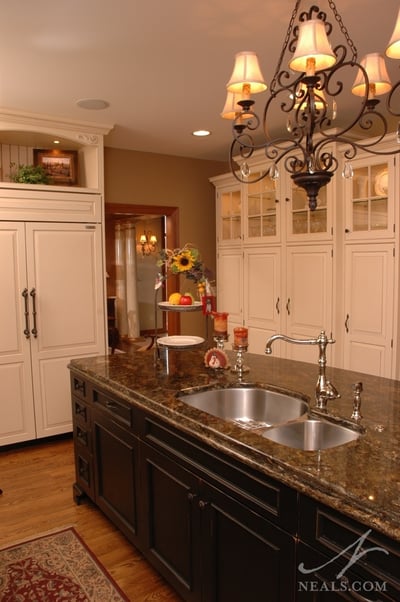
While the design theme was geared toward a lighter look, the homeowner requested the integration of black in the design as a personal style preference. The designer accomplished this by choosing black cabinetry for the island. This also worked to make the island look larger in the room- another item on the homeowner’s wish list. The island houses the sink and dishwasher. The double-thick granite counter is supported by a concealed bracket on the back side. On the perimeter, antique white, glazed cabinets provide the light scheme. To balance visuals with practical storage, display cabinets, either open or with glass fronts were situated at the top of all the cabinets, reserving the lower portions that are used daily for concealed storage.
Wall Removal
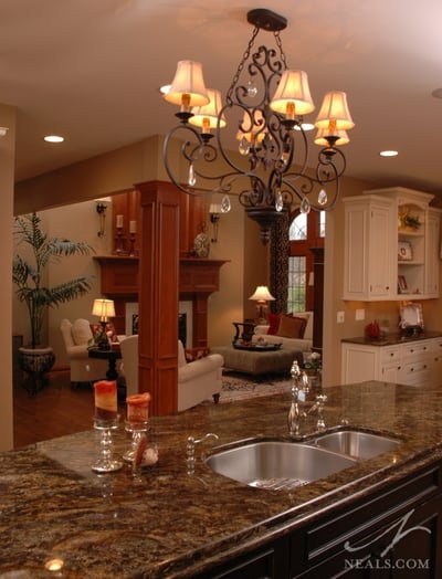
A key element of the remodel was to open the space physically as well as visually. Removing the existing peninsula to allow for the larger island was one physical change that opened the flow through the entire kitchen. In order to open the room more literally, the design called for the removal of the walls separating the kitchen and breakfast area from the adjoining living room and hallway. This proved to be a challenge when it was discovered that the support points for the load in the ceiling and floor did not exactly line up, leaving the column sticking out several inches at the top. To correct this visually, extra bracing panels were added at the top of the support column, which were then painted to match the wall to help conceal them.
Details
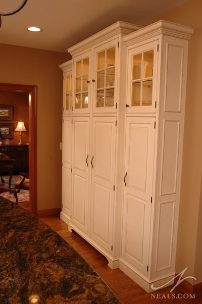
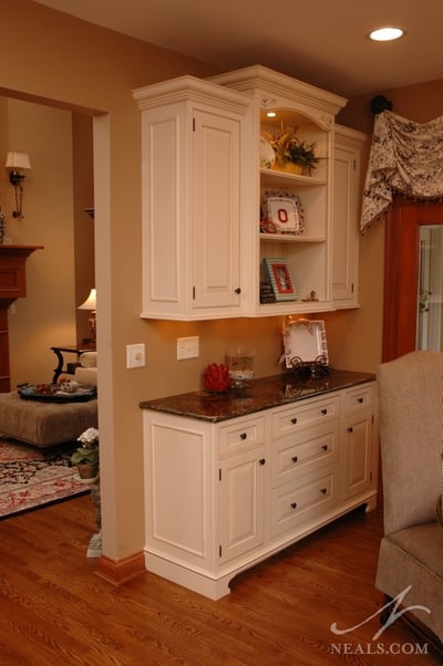
The pantry, a new addition to the space, was designed to look like an armoire to increase that wall’s visual appeal. Cianitus granite is used for the counters (on both the perimeter and the island). The gold tones of the stone help pull the warmer browns from the now visible living room into the kitchen’s design. A polished nickel faucet on the island helps the stainless steel sink and range fit in. Rust finish handles and knobs were used on the perimeter cabinetry.
