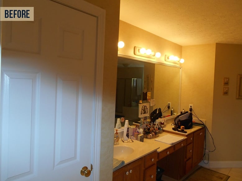
The homeowners had this house built while they were still living in England. Much of the finished master suite design, therefore, did not turn out as well as they had hoped. For starters, the bathroom, a long, awkward space, felt empty, lifeless, and most of all lacking in function. The bathroom remodel focused on solving the issue of using the space to its fullest potential without crowding it up with unnecessary features.
Primary Challenges
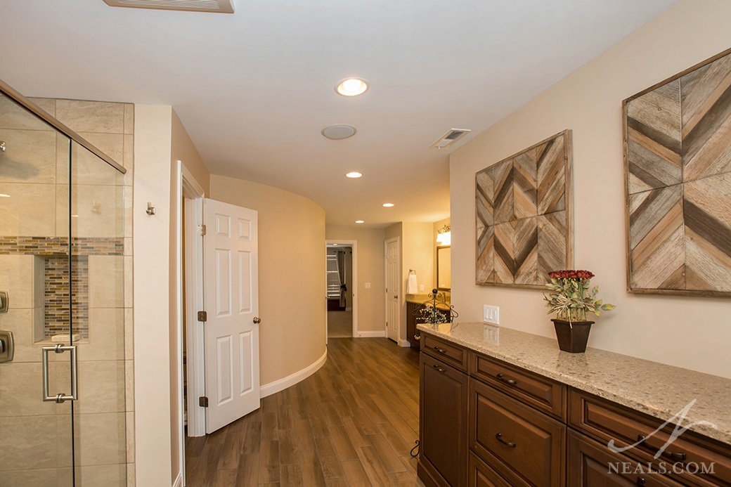
Address the room’s awkward layout: The space has the unfortunate quality of being both long and narrow, and feeling like two distinct spaces. The new plan’s first challenge was to mitigate that feeling through the use of scale and cabinetry.
Provide functional storage: Due to the scale of the room, the homeowners felt that they wanted to get the most out of the space by requesting highly functional, specialized cabinetry. The challenge was to design these solutions to fit the space in ways that made sense.
Create a soothing environment: As the bathroom is part of a suite, it was important that all the design decisions made in this space felt right for the home so they could be carried into the bedroom itself. The challenge was to create an interesting design scheme that was easily repeatable.
Solutions
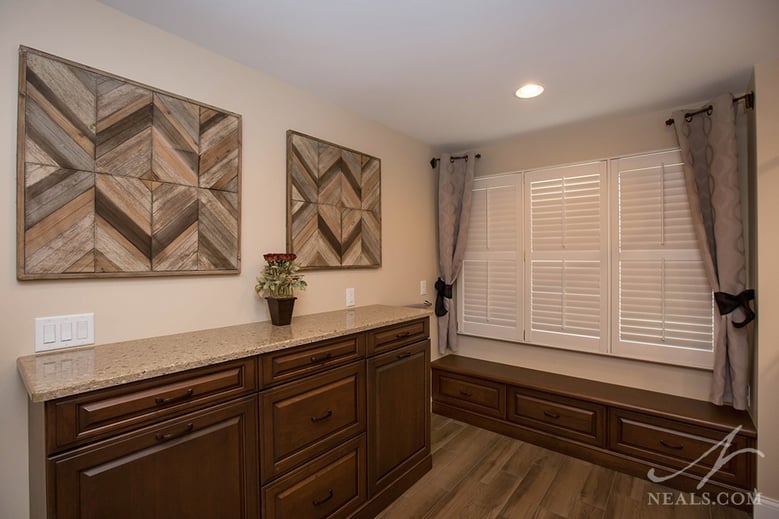
The first obstacle was to find a way to outfit the back end of the room without a tub. The existing tub wasn’t being used, so while it took up space in a room with plenty of space to spare, it did nothing for the function or aesthetics the homeowners desired. To make use of the space outside of the shower, the tub was replaced with a bench that spans the space under the existing window. Not only does this bench function as storage, it provides a comfortable spot to sit. It’s a feature that elevates the space to that of a luxurious spa-like room.
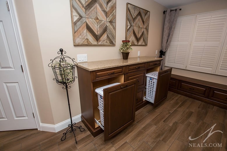
With the tub gone, there was more space in that area of the bathroom. The homeowners also needed a solution for keeping things tidy, since that area would be used before and after showering, as well as for daily dressing. A custom cabinet was installed that houses pull-outs for hampers. This provides an easy, within-reach spot for towels and dirty clothes, so none of those things need to be out and in sight. The hampers easily slide up and out for laundry day.
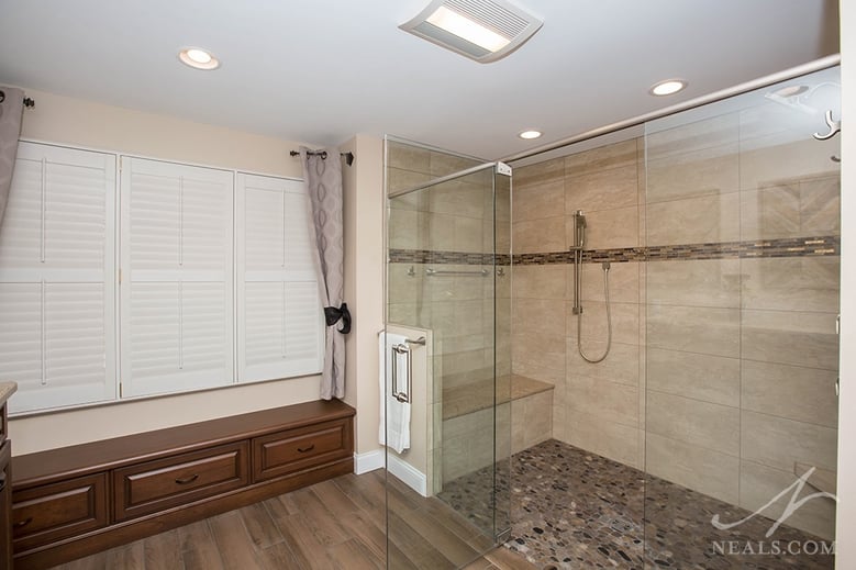
The small, sub-par shower was not the right scale for the room. It was also not fit to handle the couple’s needs. The new, over-sized shower fills the entire wall at the end of the bathroom. It is divided into two halves, each with a different showering scheme. On the left, a wide bench is paired with a hand-help shower head. On the right, a smaller bench accompanies a fixed head. The shower is also barrier free and a wide door and plenty of space at the center, making this shower a universally-designed solution that will serve the homeowners well over the next several years.
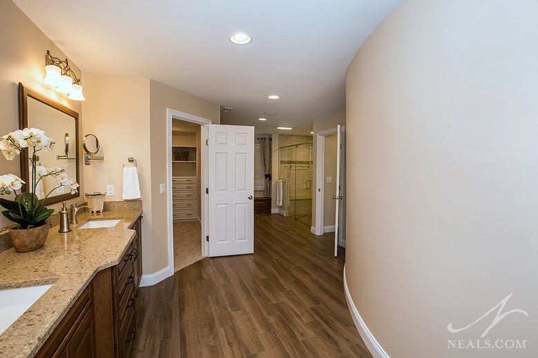
The room was dominated by a wide angled wall on one side and a long curved wall on the other. While the curve, the backside of a stairwell, could not be adjusted, these walls added to the awkwardness of the room. Since the homeowners wanted to keep one of their walk-in closets accessible from the bathroom, the solution for the awkward angled wall came in the form of moving the door. By turning that wall into a doorway, it now acts as an architectural feature instead of a blank space. The closet itself was rearranged to work with the new entry, and is outfitted with a custom closet system suited to the homeowner’s needs.
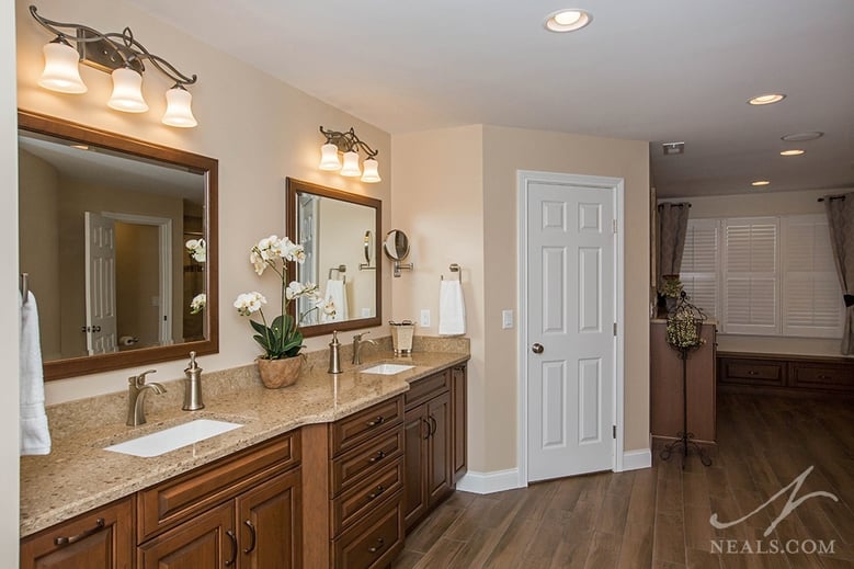
The his and her vanity lacked the right kind of storage. Lots of little drawers gave the impression of lots of room, but were mostly unusable, leaving most daily items to find a home out on the counter instead. Low quality materials and a bland style also felt wrong for the room. A new double vanity was designed by first assessing the couple’s day-to-day needs. How they used the sink area helped determine the exact types of storage needs they each had. The new cabinets are mirrored on either side, but interior fittings are suited to their individual routines, such as a place for her blow dryer, and interior electrical outlets. Since the new vanity utilizes the entire wall by filling in the previously open space with more functional drawer storage, the vanity appears larger in the room, helping tame the bathroom’s scale.
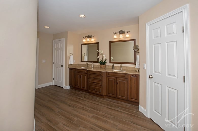
The homeowners wanted a stylish and practical flooring solution that would require special considerations around the room’s curved wall and to avoid making the long room feel like a bowling alley. To give the room a sophisticated look, and to tie it into the style of the rest of the home, a tile was chosen that mimics the look of hardwood. The tile lengths were varied and placed in a random staggered pattern to avoid the tiles from looking like continuous runs along the length of the room. Each tile that would sit against the curved wall was custom cut to abut the wall as seamlessly as possible, even down to the smallest tile size. This eliminated any large gaps to be filled in with grout, and helps to retain the wood-look of the floor.

