
Changing up the interior room color in your home is a great way to bright up the walls and bring a much needed light to the dreary feel of winter. Choosing colors selected by the interiors and paint industry is also an easy way to add designer style without a huge commitment. The interior colors for 2015 trends lend themselves extremely well to the long term, so while the hottest interior colors may be “hot picks” now, there’s bound to be one or two that look and feel timeless to you.
Marsala, color power-house Pantone’s pick for 2015 Color of the Year, is a deep wine hue with heavy brown undertones that manages to be a neutral color while still being sophisticated and bold. Pantone calls it “complex and full-bodied” without being overpowering, and we’d have to agree. In fact, we’ve seen a recent interest in these types of heavy browns in our remodeling projects.
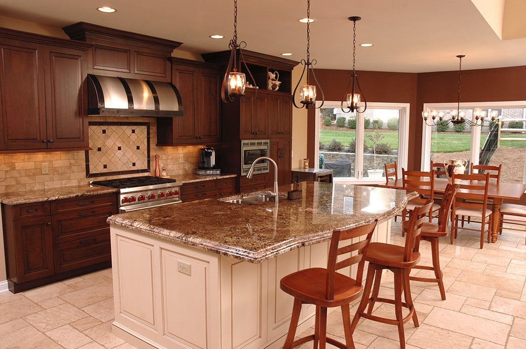
In this recently remodeled kitchen, a rich brown color, similar to Marsala, spices up the bay window around the kitchen table.
Barely-There Neutrals
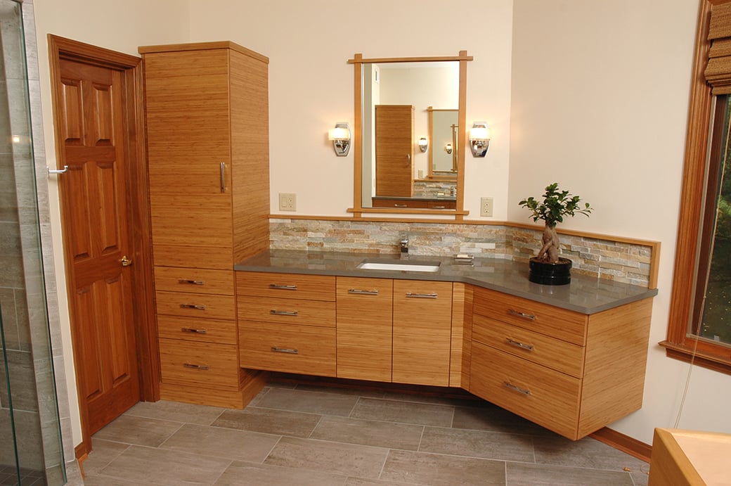
A color like Pink Damask provides a complimentary neutral field for beautiful bamboo cabinetry.
Hot colors aren’t necessarily always as bold as Marsala. Sometimes the barest hint of color in a pale neutral can win the trend race. Any one of these subtle interior room colors would be a wonderful, inconspicuous addition to your home.
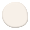 |
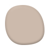
Pink Damask (Benjamin Moore OC-72) An off-white shade with a very soft pink cast brings a feeling of tranquility and serenity. |
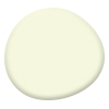 |
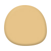
Seahorse (Benjamin Moore 2028-70) The light yellow tone that will brighten any room without making you feel like you suddenly live on the surface of the sun. |
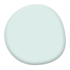 |
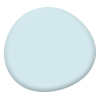
Crystal Clear (Sherwin Williams SW 6756) This soft teal blue will easily inject an airy quality to any room and can pair perfectly with a huge range of other colors. |
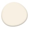 |
Cotton White (Sherwin Williams SW 7104) You usually can’t go wrong with off whites. In this case, an antique, vanilla-colored white adds just the right amount of color. |
Classic Mid-Tones
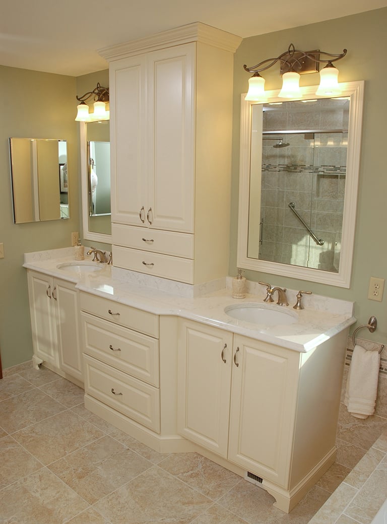
A light green, like Guilford Green, works behind the mirrors in this bathroom remodel.
If neutrals aren’t your thing, but you aren’t interested in the commitment required of colors like Marsala, there is a very wide range of hot colors showing up for 2015 that offer a solid, statement-making backdrop that won’t steal the show.
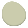 |
Guilford Green (Benjamin Moore HC-116) Benjamin Moore named this calming shade of silvery green from their Historic Colors line their pick for color of the year. |
 |
Bona Fide Beige (Sherwin Williams SW 6065) A classic, simple beige to satisfy every style from classic to contemporary. |
 |
Hubbard Squash (Sherwin Williams SW 0044) A gold tone that can be treated as a neutral or a color. |
 |
Harbor Fog (Benjamin Moore 2062-70) This youthful, light blue would work equally as well in a child’s room as it would in a kitchen. |
Stand-Out Shades
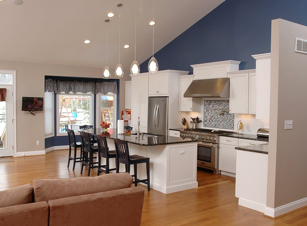
A statement-making blue similar to Oxford Gray is a great way to make white cabinetry stand out in a kitchen.
What are hot color forecasts without a few surprising, bold shades? Here are some of the rich and deep paint colors that feel at home in a 2015 interior.
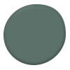 |
Jack Pine (Benjamin Moore 692) An evergreen color that works with each season and can be combined with neutrals in a variety of ways. |
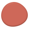 |
Coral Reef (Sherwin Williams SW 6606) Named Sherwin William’s Color of the Year, this upbeat and bright color can add a bit of unexpected spunk to your walls. |
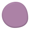 |
Baroness (Sherwin Williams SW 6837) This playful purple is perfect for a splash of color that isn’t just fit for royalty. |
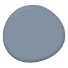 |
Oxford Gray (Benjamin Moore 2128-40) More blue than gray, this fun, bold watery color is also a calming tone. |
Don’t Forget...
Everyone’s style is different, and luckily colors come in many shades to help you find what’s perfect for you and your home. Remember, paint colors can look different under different lighting situations. Test paint samples in your home before you make a final decision.
Now for the big question…. Which colors will you choose?


