While perfectly serviceable, the original kitchen in this kitchen renovation in Indian Hill lacked one important thing- the homeowners’ taste. Looking to create a kitchen that would then inform the design of the rest of their home, this project focused on reworking the space into a modernly-design traditional kitchen that was as beautiful as it was efficient. This project is a 2017 NARI Contractor of the Year Local and Regional Residential Kitchen winner.
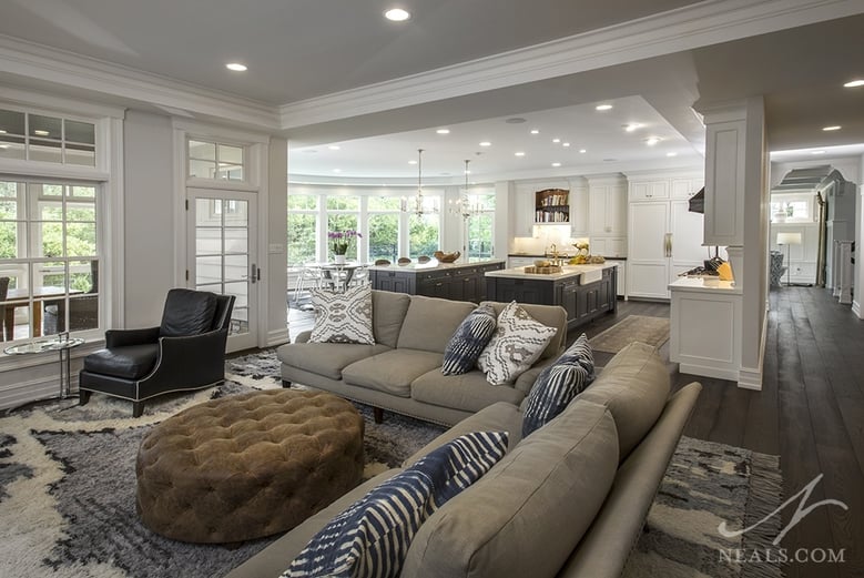
With this kitchen renovation, the homeowners hoped to achieve a stylish space that highlighted a mixture of masculine and feminine design aesthetics. A driving consideration was greater efficiency in the layout and working areas as well as a better relationship with the adjacent family room, and back stairs. In order to have better storage solutions for their needs, it was necessary to rework walls and cabinetry. The design looked to create a more open-feeling kitchen with fewer visual obstacles.
Obstacles & Challenges
The first challenge to the remodel was to address the walls and entries around the kitchen. A built-in desk had been installed between two columns in the space between the kitchen and living room. This created a bottleneck traffic flow between the two rooms. The original design of the house situated a butler’s pantry between the kitchen and dining room with a pass-through in the kitchen’s primary wall. A hallway connecting the formal living room and family room on opposite ends of the house cuts through this area. Not only was this not the way the family used the spaces, the pass-through took up valuable wall space, making it more decorative than functional. The layout needed adjustments to pull the working triangle closer together. Different appliances, with a different arrangement from the existing kitchen’s appliances would also need to be worked into the new cabinet design.
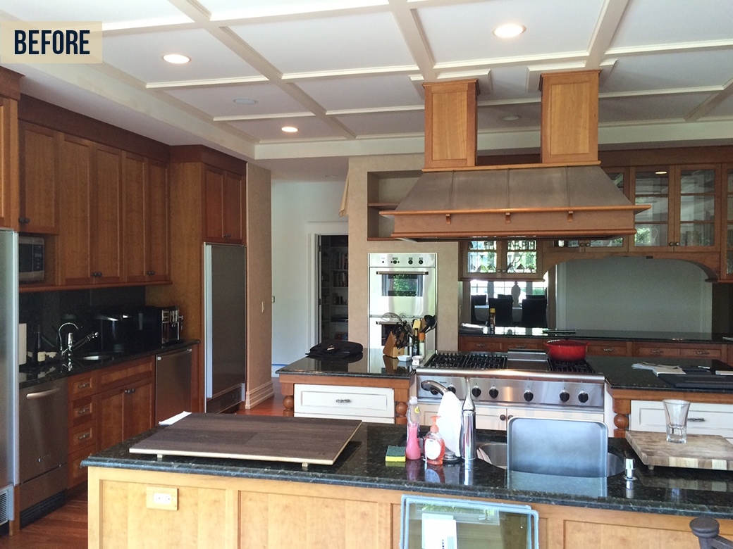
The entire kitchen, including the butler pantry and back staircase needed aesthetic improvements. None of the old cabinetry would work with the new design. The trim, ceiling, and floor would all require replacement. This included plumbing and hood venting to align with the new kitchen’s layout.
Solutions
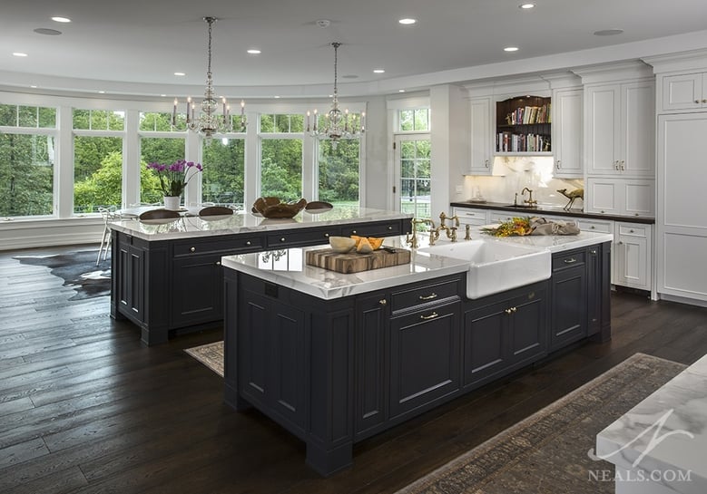
The first step in opening up the space to create a more visually clear view was to relocate the site of the cooktop. The accompanying hood would no longer take up a significant visual proportion of the ceiling at the center of the room. This particular change created a domino effect with the design solutions. In order to create a new location for the cooktop that would keep the room feeling open, wall space was needed. The solution was to sacrifice the pass-through wall, creating a new feature wall for the new stove and custom hood.
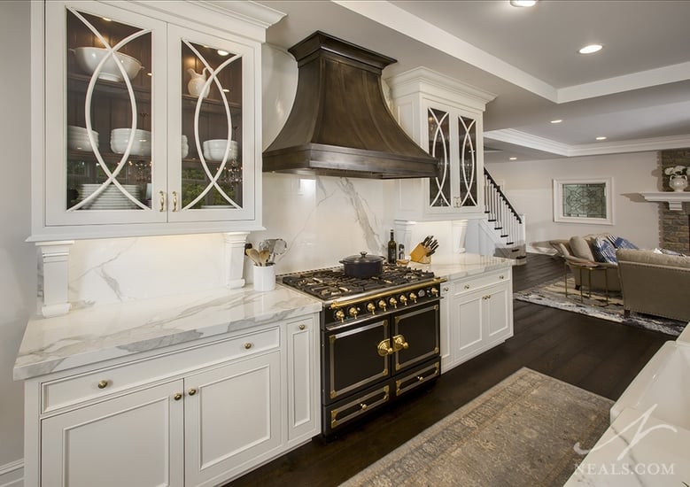
Removing the cabinetry at the pass-through created a new challenge by eliminating the existing display-style dish and glassware storage. The solution was to include glass-front cabinetry in the kitchen for some of the pieces, as well as to upgrade the butler’s pantry cabinetry for the rest. This design pairing helps tie the butler’s pantry back into a functional area of the kitchen despite the removal of the pass-through.

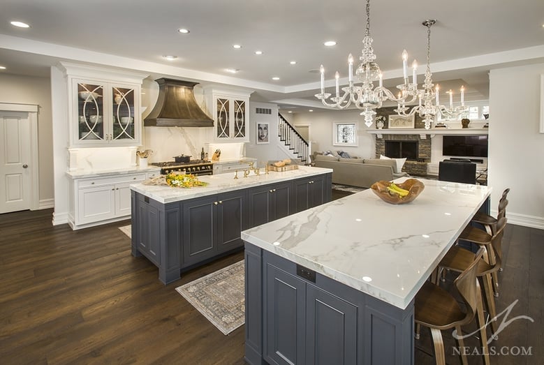
Moving the cooktop also shifted the primary working zone in the kitchen. Originally, the two islands acted as the center, with the space between them functioning as the main work zone. In the new design, this zone is shifted to the back wall and the first island. The plumbing was shifted over to the first island for a new farmhouse style sink.
With the kitchen’s view less cluttered, the next solution involved clearing the view and traffic flow from the kitchen into the living room. In the way originally was a built-in unit composed of a desk on the kitchen side, a counter on the living room side, and two thick columns with shelves in them. These columns were decorative, rather than structural, so their removal was fairly straight-forward. The wiring housed in one column, feeding all the electricity available on the 2nd floor, was moved to the new solid wall.
With the loss of the kitchen desk, a new solution was needed to capture the family’s needs for a central space for device charging, in-home communication, important papers, etc. The niche just behind the back staircase in the new open intersection between living room and kitchen, was upgraded to serve this purpose. An underused bench was replaced with floor and wall cabinets that create a convenient dropping point that also leaves that type of clutter out of the kitchen.

Materials and Design

A driving factor for the look of the new kitchen was the homeowner’s desire to create a space that would direct the aesthetic of the rest of the home. The look is a modern take on traditional design, with a mixture of masculine and feminine styles that create a space that’s comfortable for both. The homeowners had a preference for a white, gray and navy color palette for their entire house, so it made sense for those colors to come together in the kitchen.
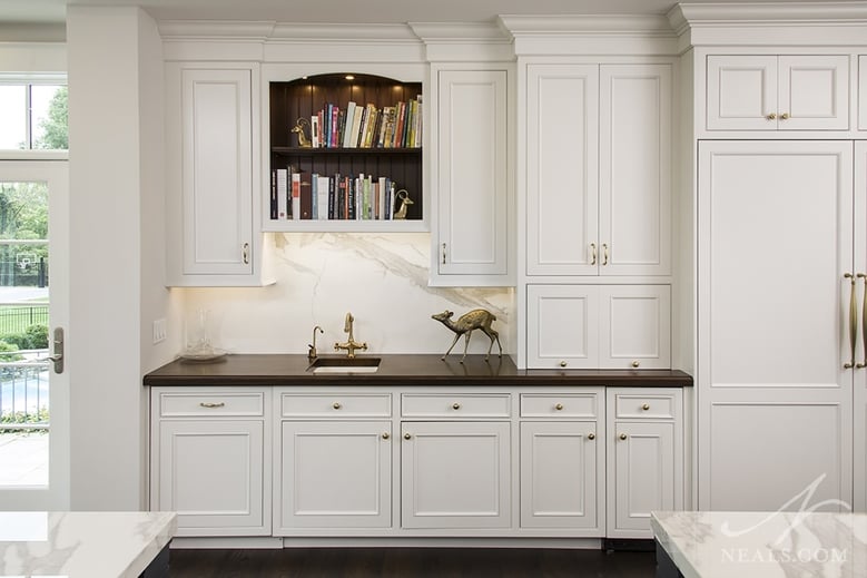
Except for the glass-fronted doors, all the cabinets in the kitchen, butler pantry and garage entry are the same style, a subtle, traditional recessed panel design. White was used on the perimeter cabinets to align with the pale wall color and white trim used on the rest of the first floor. This keeps the room feeling lightweight, feeding into the desire for little visual clutter.

The glass-front doors feature a custom mullion design. The vent hood is also a custom piece. It is a metal hood that utilizes finishing techniques to look like worn, antique pewter.
The islands are finished in a navy blue glaze-like coating, which allows the woodgrain underneath to slightly show through. Depending on the light, the navy can look near-black or slate-blue, adding a richness of color that works well with the homeowner’s love of various shade of blue. The islands also create a dark element to go with the dark navy blue Le Cornu range.

The main countertop material is a porcelain product called Neolith, that provides the look of a polished marble counter. For the counter at the prep sink, a wood block countertop was selected as a contrasting element. It also mirrors the walnut interior of the open and glass-front cabinets.
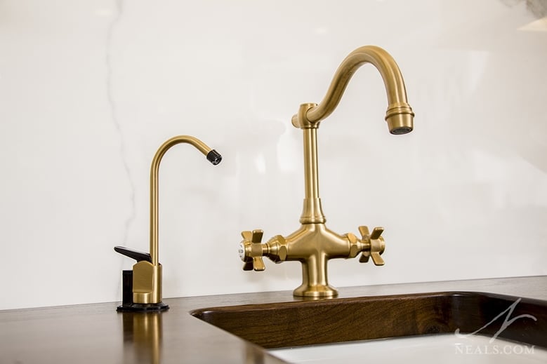
Newport brass hardware and faucets in a satin bronze finish were selected that also matched the range, and contrasted against the white and blue for a more interesting design. The faucets are highly stylized fixtures that work to keep the space feeling more traditional.
All the appliances, other than the range, are cabinet-fronted to blend them seamlessly into the cabinets. The microwave is concealed behind a door that lifts up. The refrigerator and freezer are a pair of single units that suit the scale of this large kitchen. Additional appliances include two dishwashers and an ice maker. The water is delivered via a reverse-osmosis filtering system.

The original flooring was replaced with oiled oak prefinished hardwood. This darker floor is consistent with walnut used elsewhere throughout the new space.
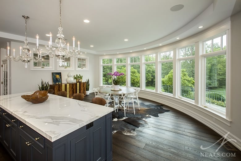 Photo Credit: Robin Victor Goetz