One of the best parts about remodeling your home is the opportunity to reflect on the changes you made by comparing before and after photos. In rooms like the kitchen, with a lot of parts and details, sometimes the differences between what it used to look like and what you changed it to are staggering, even when the transformation itself was simple. We've combed through our library of kitchen images and pulled out 6 Before and After kitchen transformations that best exemplify the common changes Cincinnati home owners look for in their remodels.
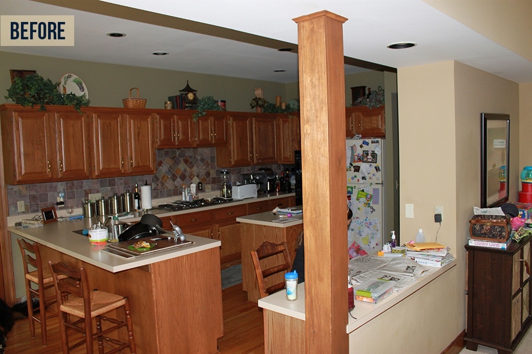
Boring cabinets are one thing (and you'll see several of them in the before photos on this post), but add in an awkward built-in desk and crowded island/peninsula combo, you you have the perfect recipe for claustrophobia. This growing family needed their new kitchen (below) open to the family room for more light, space and a better view. Traditional design and details, a large, accommodating island, and better storage solutions for the family's needs did the trick.
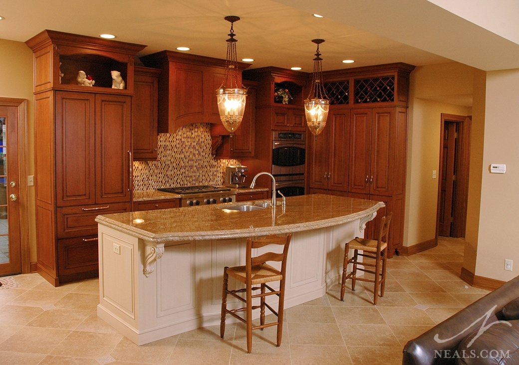
View more photos from this project on Houzz.
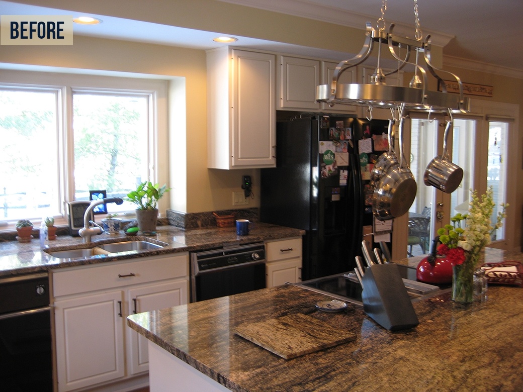
Sometimes, the layout of a kitchen is great, but the aesthetics feel out-of-sync with your style, or that of the entire home. In this aesthetic transformation (below), the changes begin with the removal of a soffit. The added vertical height accommodates taller cabinetry, and gives the kitchen a grander scale. New counters, a natural stone backsplash, and improved lighting complete the job.
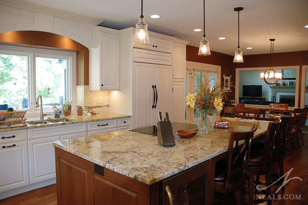
There are additional photos of this project available here.
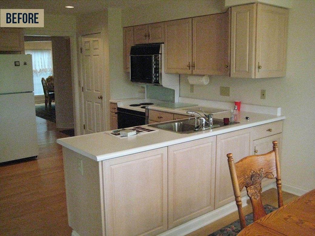
A little too pale, sterile and awkward, the homeowners here felt like this kitchen needed not only a new layout, but also an injection of personality. A contemporary kitchen with a bold, black and white redesign (below) also took advantage of the kitchen space by removing the pantry and breakfast nook, and reworking them into a larger space that made room for an island. Using the entire available space, and exploring new ways to use it, without having to move walls or lose functionality in other areas is the hallmark of a great room transformation.
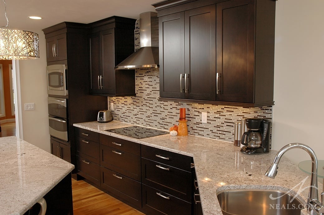
Click here to see more images from this contemporary kitchen.
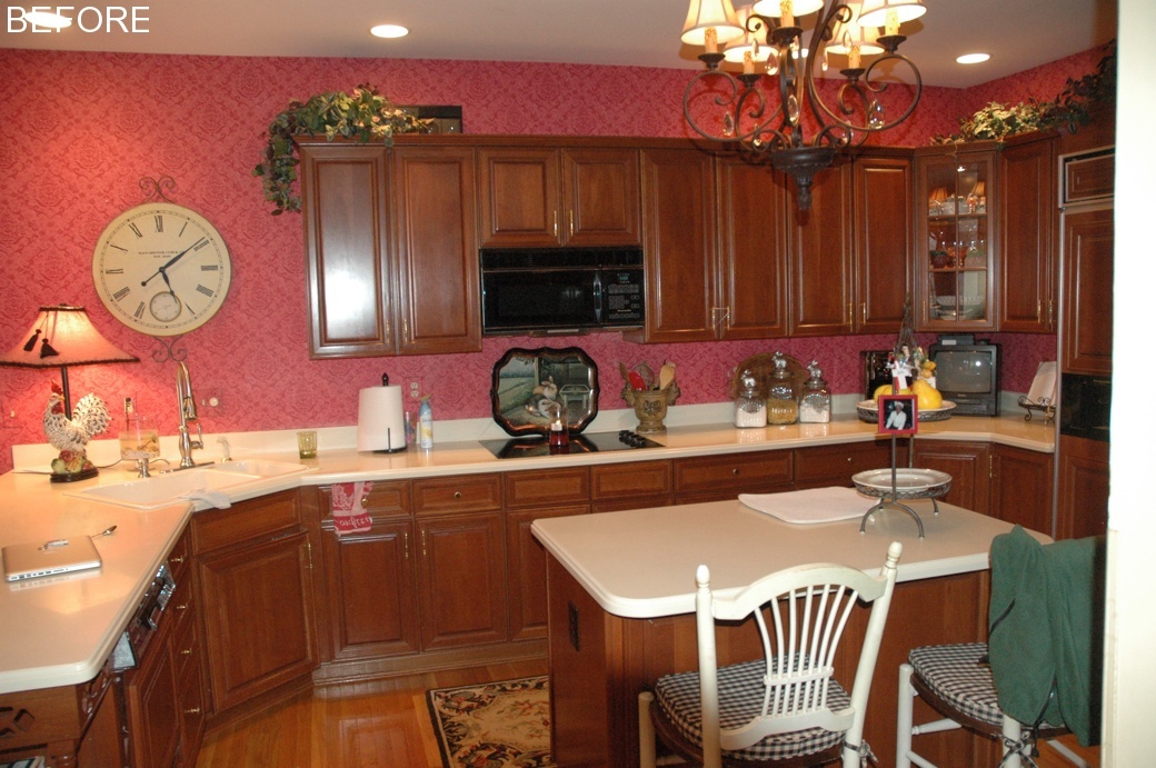
Sometimes, when the opportunity to change one thing about our kitchens presents itself, it's a great opportunity to make more drastic, long-earned changes. In this case, a broken appliance was the doorway to updating this dark and enclosed kitchen into an open, traditional showpiece (below). In the grand scheme of this remodel, the layout of the kitchen remained nearly the same, but a simple adjustment from a peninsula to an island, and a major overhaul of the cabinetry and color scheme, make this before and after kitchen rather stunning.
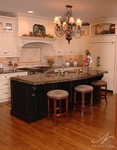
More photos from this project can be seen on Houzz.
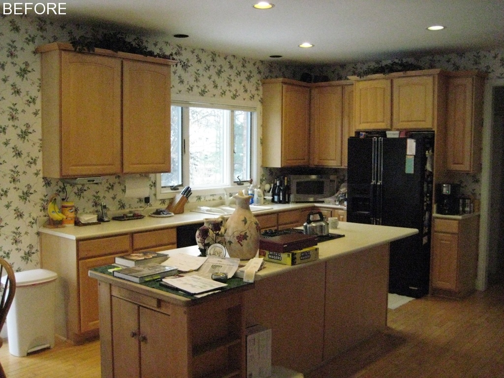
We've encountered a number of kitchens in our 40+ years of remodeling homes in Greater Cincinnati in which builder-grade cabinets and countertops have lived on long past their prime. Here, boring yellow cabinets and an island just small enough to not actually function as intended hid the good parts about this space. With an ample square footage, great natural light, and a highly effective work triangle, all this kitchen needed was upgraded materials. In the new kitchen (below), a transitional design gives this great room the attention it deserves. This before and after is a great example of how swapping what the builder thought was a good choice with your own style can dramatically improve your home.
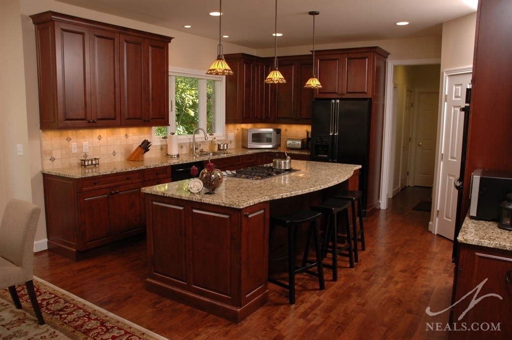
Click here to see more of this project.
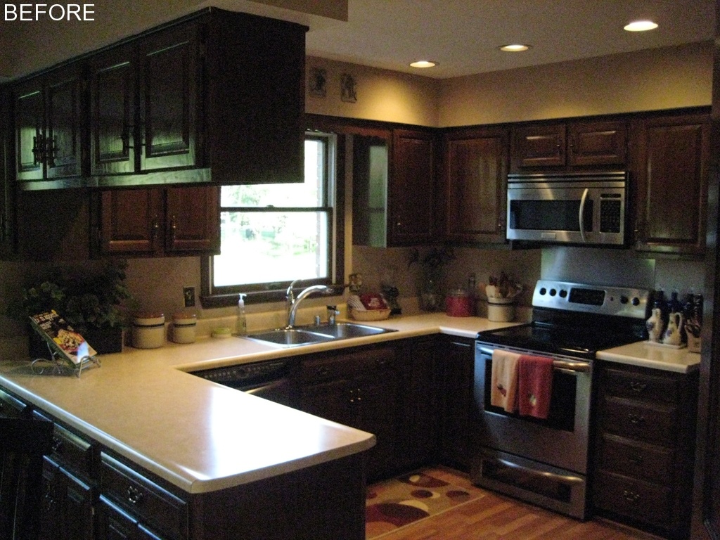
Kitchens from the 70's and early 80's are fairly easy to spot. Back then, we had this hair-brained ideas that dark cabinetry, heavy hardware, and tiny floor plans made for the best kitchens. In order to improve this space, the kitchen needed more than just a face lift. By pushing the kitchen into the breakfast nook, removing the soffits, updating the appliances, and swapping the 70's style with a straight-forward contemporary one, this before and after (below) leaves the past in the dust. This project is also a NARI Contractor of the Year Local Winner (Residential Kitchen, 2012).
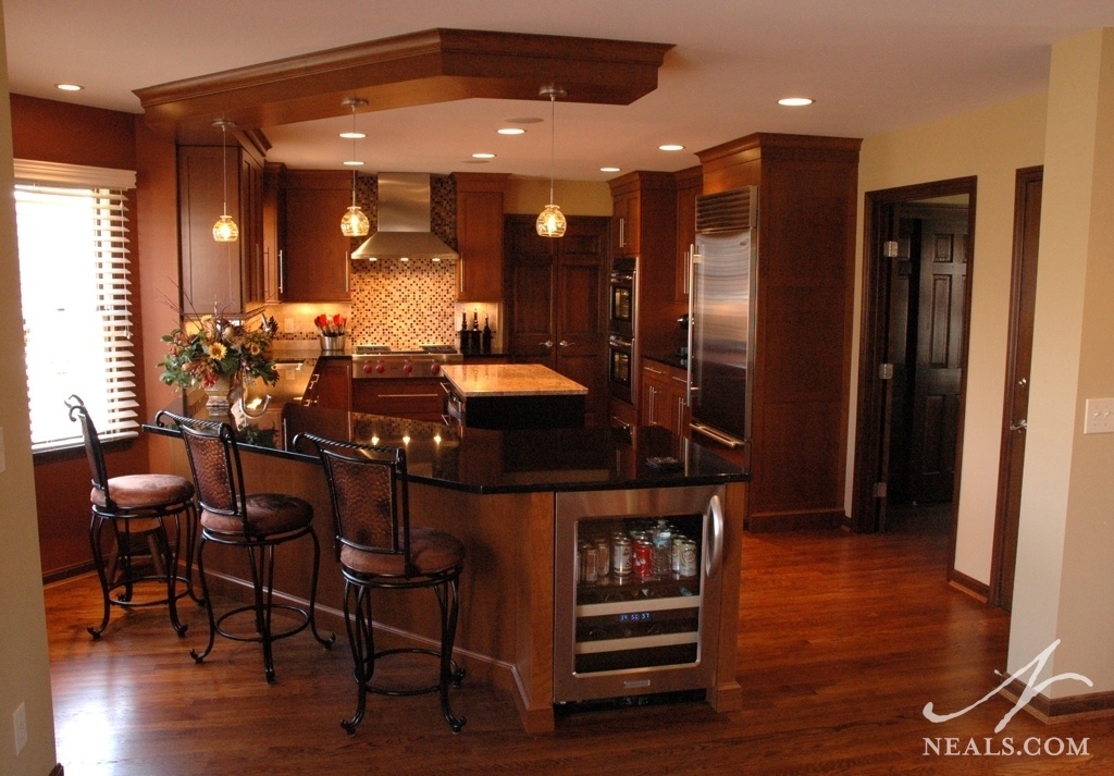
To see more of this project, click here.


