One of the best parts about remodeling your home is the opportunity to reflect on the changes you made by comparing before and after photos. When it comes to bathrooms, which typically look radically different with even minor changes, the differences between what it used to look like and what you changed it to can look like completely different homes. We've looked through our library of images and found 6 Before and After bathroom transformations that show just how much a bath can be changed.
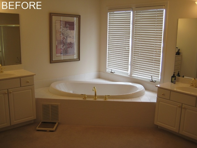
It's anyone's guess as to why we all once thought that bland white cabinets, blah cream walls, and boring brass fixtures made for a good bathroom design, but there are many of these snore-worthy baths out there. In this case some adjustments to the layout to move and enlarge the shower, and some major changes to the cabinet, finishes, and fixture choices created a sophisticated master bath with a lot more character. The greatest beauty about this transformation is that the new design is neutral and transitional, which will not be as easily dated as its predecessor.
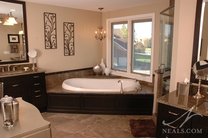
See more of this bathroom project.
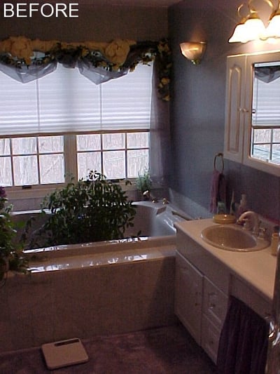
Sometimes in order to get what you need out of your bathroom, you need to steal space from adjacent rooms. In this bathroom remodel, the extra bedroom next door was sacrificed to add space for a more luxurious shower and a new walk-in closet. This remodel also included a see-through fireplace shared with the master bedroom, wood floors, a tempered glass leaded window, and custom-cut Corian walls in the shower that eliminated the need for grout without sacrificing the look of tile.
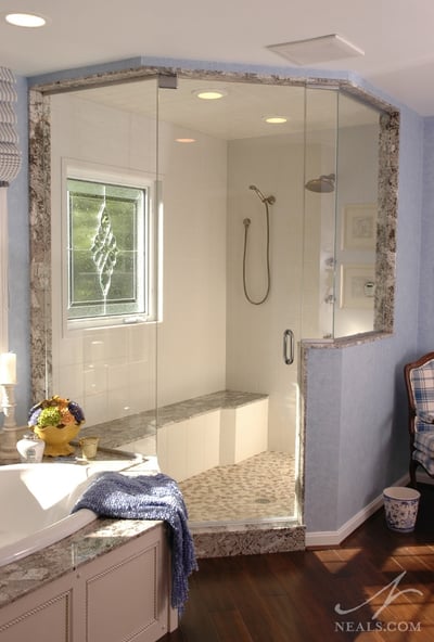
See more images from this bathroom project.
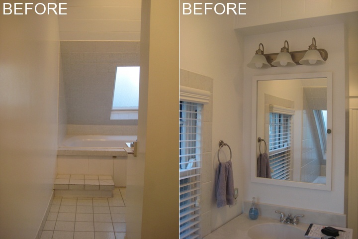
Sometimes it's hard to understand the choices of previous remodels. In this Hyde Park home, an area known for fantastic historical home design, this bath felt like something out of a bad science fiction movie. The floor had been raised up so that a set of stairs greeted you when you came through the door. This also made the angled exterior wall a little too close for comfort in the tub. The solution was a complete gutting, including the floor, and lowering everything back down to where it belonged. This allowed the end of the room to be converted into a spacious and stylish walk-in shower, and the single tiny sink to be swapped for more functional vanity.
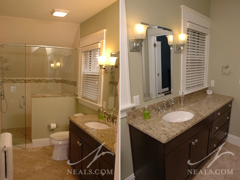
See more images from this project.
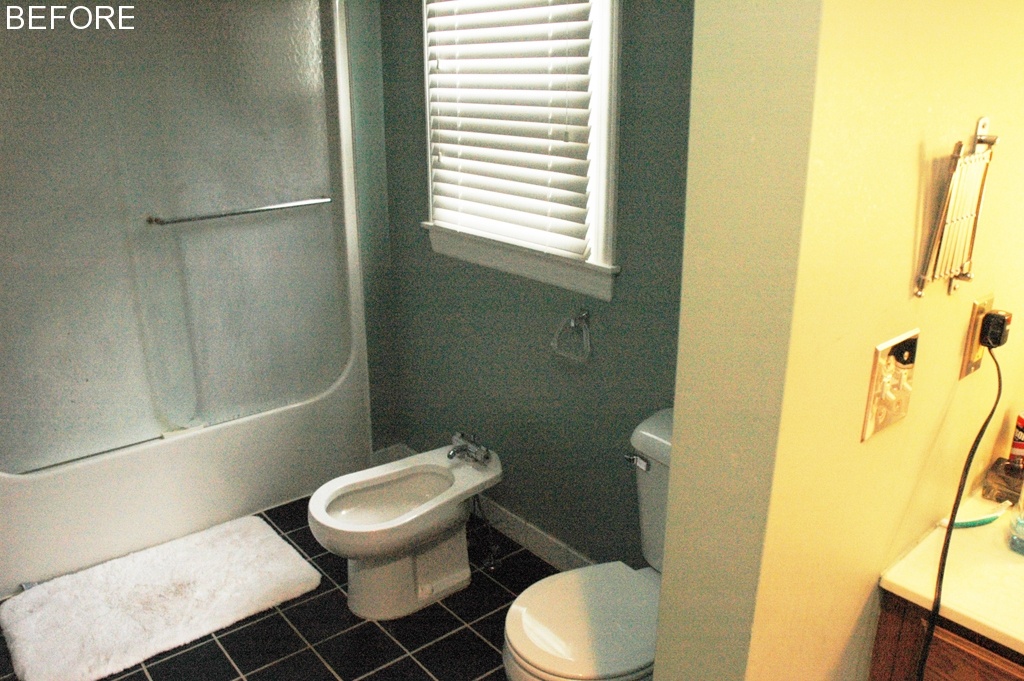
This bathroom, also in Hyde Park, was a bit difficult to truly capture in the before photos. Walking in from the master bedroom, the homeowners were confronted by an overly-lit vanity that lacked any type of stylish appeal befitting the home. To the left, an ugly shower, bidet and toilet. To the right, an awkwardly long closet. Plus, with just one sink, the whole weird space was left hopelessly inefficient. Treating the entire long space as one, the room was rearranged to accommodate a new private commode room, a turn-of-the-century inspired soaking tub, a shower, and a double vanity worthy of the home's pedigree. Not to mention that they got to keep the walk-in closet.
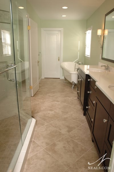
See more images from this bath project.
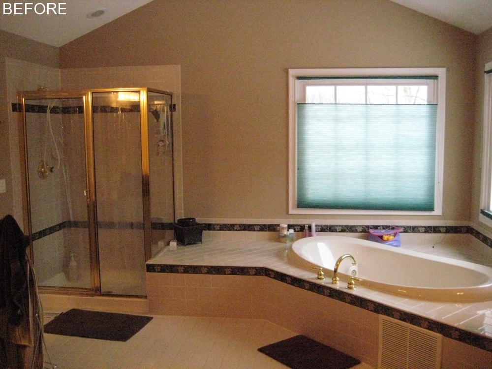
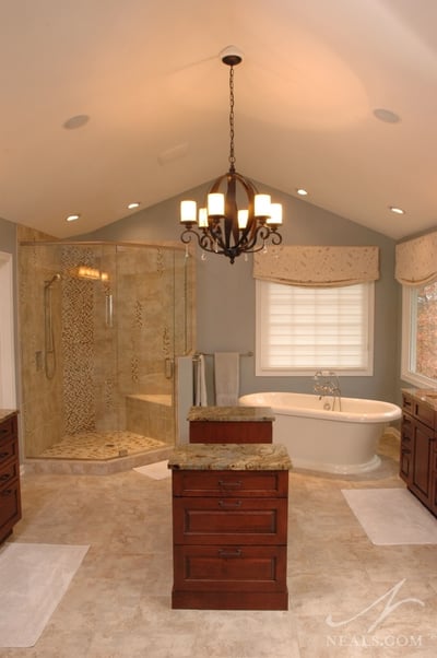
Occasionally we come across bathrooms with a bit too much room to spare. While a spacious bath is a luxury, finding the right combination of elements to fill it properly can be difficult. In this case, lackluster fixtures with odd proportions for the room made the space feel unwelcoming and dated. The new design takes advantage of all the square footage by scaling everything more appropriately, leaving room for some custom considerations, and allowing a gorgeous free-standing tub to become a much-needed focal point. This new master bathroom can now boast being both spacious and cozy.
