A good way to understand the impact a kitchen remodel can have on a home is to take a look at before and after transformations. When we can see the differences between old and new, it's easier to spot why a certain kitchen design might be due for a change or why it isn't as functional as it could be. To help you get that kind of view on your own kitchen, take a look at five of our recent kitchen renovations.
Cluttered to Accommodating
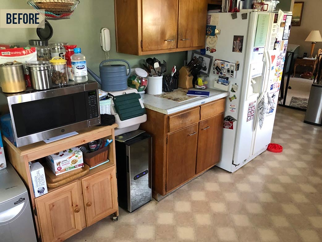
The kitchen's of today's home cooks require storage space that older kitchens never accounted for. More appliances, a greater number of specialty cookware and more food storage are just some of the things this original kitchen simply didn't have room for. To compensate, the homeowners brought in additional storage, but even with the additional space, the lack of proper storage left this outdated kitchen feeling cramped and cluttered.
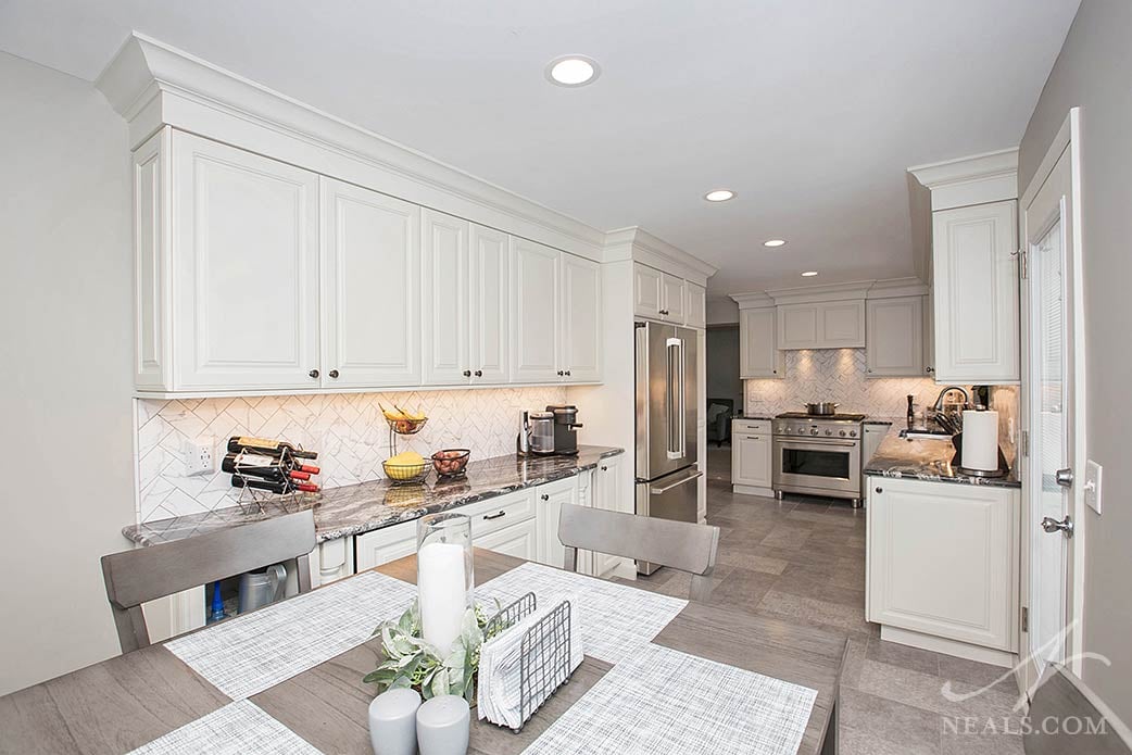
The new design focused on two necessary changes. First, cabinetry was installed that accounted for what the original kitchen was missing. This change allows the room to be enveloped in cupboards to provide a variety of storage options. Second, was to ensure that counters were available to maximize the kitchen's smaller scale. The standout solution was a new buffet-style built-in that nearly doubled the kitchen's counterspace and extended the kitchen's official footprint. The updates to the kitchen's style come with knock-out results. A bright palette of white and gray blankets the space. The style is traditional, with raised panel cabinets doors, crown molding, granite counters, and a marble-like tile backsplash done in a classic herringbone pattern. Stainless steel appliances complete the fresh design.
To see more images from this Monfort Heights remodel, click here.
Typical to Classic
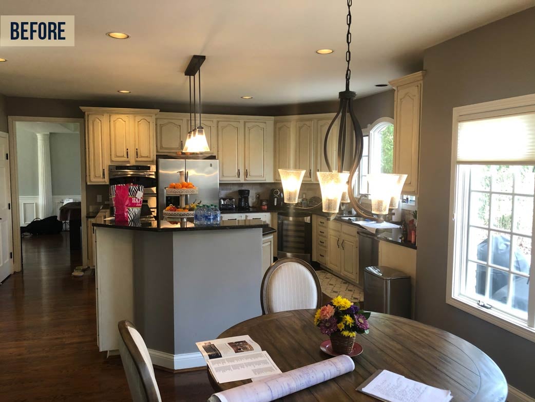
Traditional white cabinets combined with black counters were a trending style at one point, but the odd couple pairing of country-classic cabinets and contemporary counters wasn't a design scheme set to last. Joining this combination was an awkwardly substantial island with multiple levels and sides, making the kitchen feel like a heavy space that wasn't clear on what style it was meant to be.
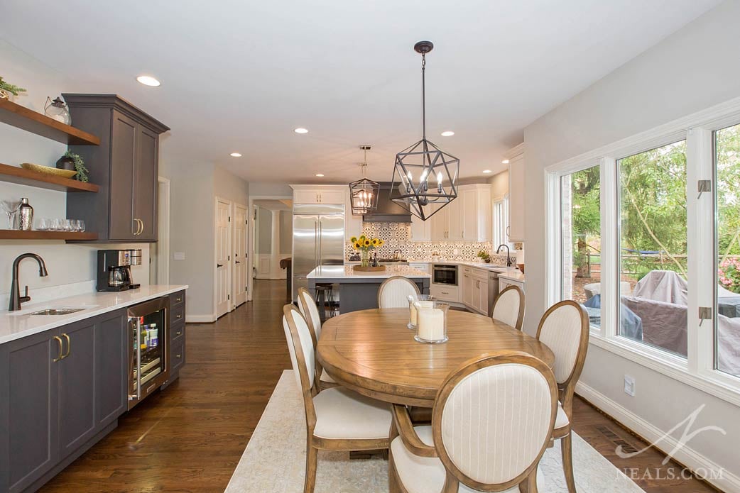
A new design was created with touches of modernization, some traditional formality, and pops of chic trendiness overtop a solidly neutral foundation- the building blocks of a successful transitional style kitchen. A pairing of white and dark gray cabinets adds interest throughout the room, defining the kitchen's different zones. Bringing them together is a new printed tile backsplash that adds a special detail that prevents the kitchen from feeling like the old cookie-cutter kitchen it once was. The simplified island adds much-needed counterspace. The new sidebar adds additional functionality but also provides a space to add a touch of natural wood, pulling the color or the floor upward to create a more cohesive design.
To see more from this Symmes Township kitchen remodel, click here.
Small to Sprawling
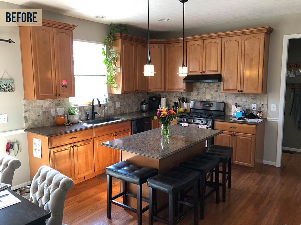
A typical layout for a moderately-sized kitchen, this original space did not provide much space for the whole family to gather together. The island was undersized for the amount of seating, and the style of the space was an eclectic mix of finishes with a confusing overall look. Adjacent to the kitchen, an eating area provided room for a kitchen table in front of the sliding patio doors, which added seating, but did not expand the kitchen in any functional way.
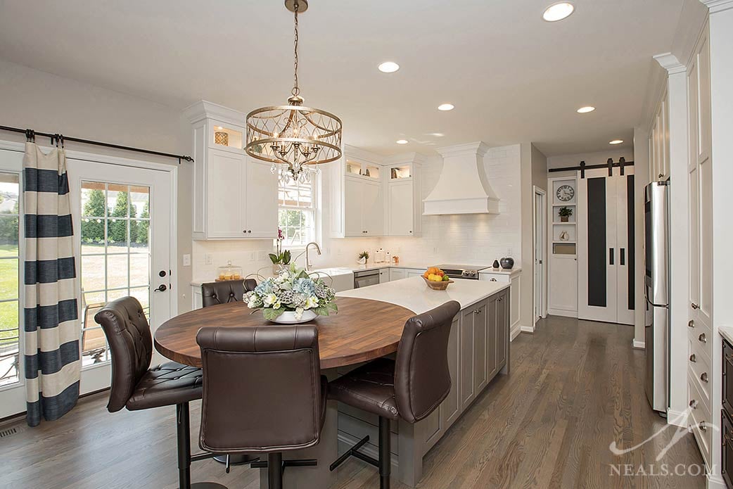
By considering the entire space as a whole the kitchen was able to expand into the area in front of the doors with the addition of a new custom island. The restructured island added storage and shifted the seating to a circular counter, which eliminated the need for a separate kitchen table. This configuration also provides more counterspace in the kitchen. Surrounding this island is a new design of primarily white cabinetry with a versatile recessed panel door that conveys a transitional style. The kitchen also features accents of gray and black so that the kitchen feels grounded.
To see more images from this Monfort Heights kitchen remodel, click here.
Cramped to Welcoming
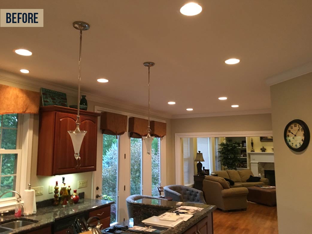
A quirk of this kitchen was that the back wall of the home was constructed at the wrong location, resulting in an awkwardly narrow kitchen that didn't leave much space for the family to gather and cook together. A configuration of walls and doorways around the kitchen also added to this crowded design. Dark cabinetry and counters created a visual sensation that the space was not large enough. To top it all off was a lack of storage and seating in the kitchen.
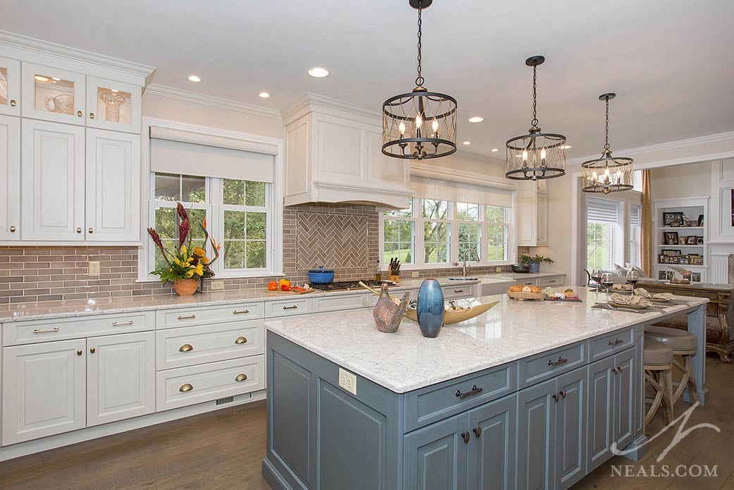
In order to fix the space issue, this kitchen remodel included a full re-working of areas around the kitchen in order to add more square footage to the kitchen without having to rebuild the home's back wall. The kitchen was also expanded to take advantage of an empty spot between the kitchen and living room, where the original doors were replaced with new windows. In the new open space, a substantial island was installed with storage on both sides as well as an integrated table to seat four. The new design is immediately classic- white raised panel cabinetry in a traditional style paired with a stylish blue island with a vintage finish appropriate to the kitchen's homage to Arts and Crafts style.
To see more photos from this Williamsburg kitchen, click here.
Featureless to Spectacular
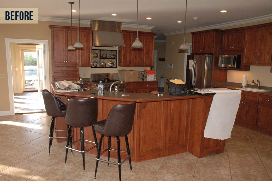
One thing this original kitchen had going for it was its size. However, that benefit was nearly encompassed by large horseshoe shaped island that made the entire kitchen appear and feel like it was stuffed to one corner. The style was also uninspiring, with cherry stained cabinetry offset by low-quality counters and stainless steel backsplash details. The lighting, frosted pendant lights over the island, didn't feel like a match to the finishes. Multiple doors surrounding the kitchen added complexity to the room's design.
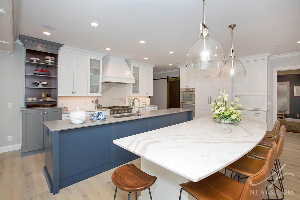
The new kitchen is inspired by the simplicity of Scandinavian design, particularly with the combination of Shaker-style cabinetry and the pale wood flooring. The design doesn't shy away from color, though. Richness is added to the space with both a stand-out blue island and a gray accent cabinet that gives the look of an old farmhouse hutch. The kitchen's main feature is the use of two islands which fit comfortably in the large space. Both islands provide a lot of new storage. The lightweight style of the space accommodates a variety of cabinetry solutions, all held together with the unified color scheme.
To see more images from this Indian Hill project, click here.

