Sometimes the best way to appreciate the impact of a kitchen remodel is to compare the before and after photos. We enjoy taking a look back at the transformations we've made to kitchens throughout the Greater Cincinnati area. Here are five favorites we hope you'll enjoy as well.
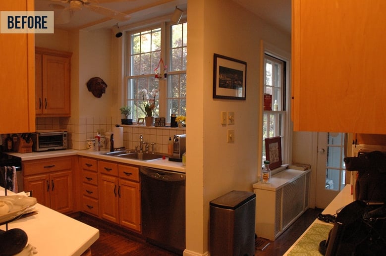
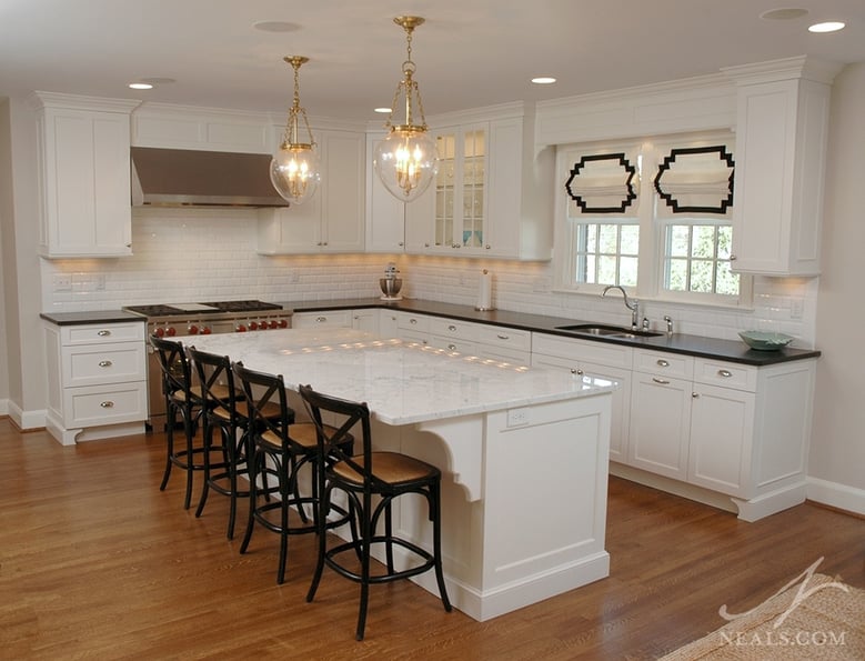
This Hyde Park kitchen was crammed into an awkward L-shaped space between the garage and a hallway to a second back door. Not only did it completely lack a functioning working triangle, it was too small and cramped for this family that enjoyed hanging out together in the kitchen. The remodel included a small addition to convert the space into a rectangle, in addition to converting the adjacent garage into a den and joining the two spaces into one large room. In the new kitchen, a modern take on turn-of-the-century style led the way in the design. An island takes full advantage of the new, open space.
Click here to see more photos from this project.
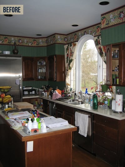
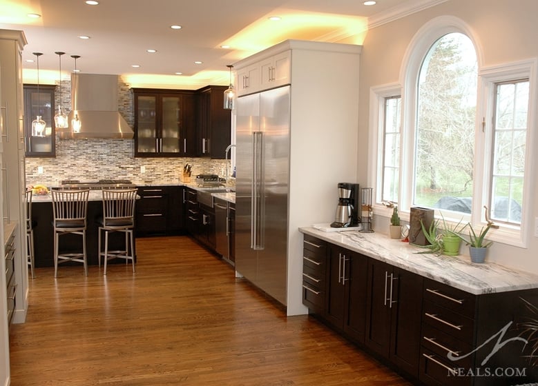
In this Glendale home, the dark kitchen was maxed out. Lacking enough useful storage for the family's needs, and missing the types of "chef's kitchen" amenities the homeowner's desired, the space fell massively short. The adjacent dining room, on the other hand, was an underused space that only acted as a passageway to the living room. To fix these issues, the two rooms were combined. The previous kitchen became a storage-focused galley, with solutions catering to the kid's needs. In the previous dining room, a new kitchen was installed with a contemporary style that matched the new professional grade appliances. Around the corner, the kitchen is open to the living room, with no wasted space in between.
Click here for more photos from this project.
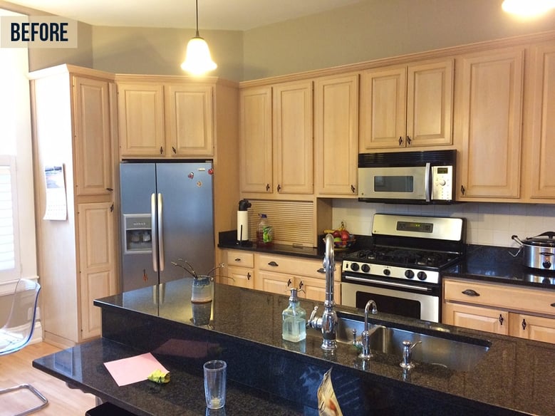
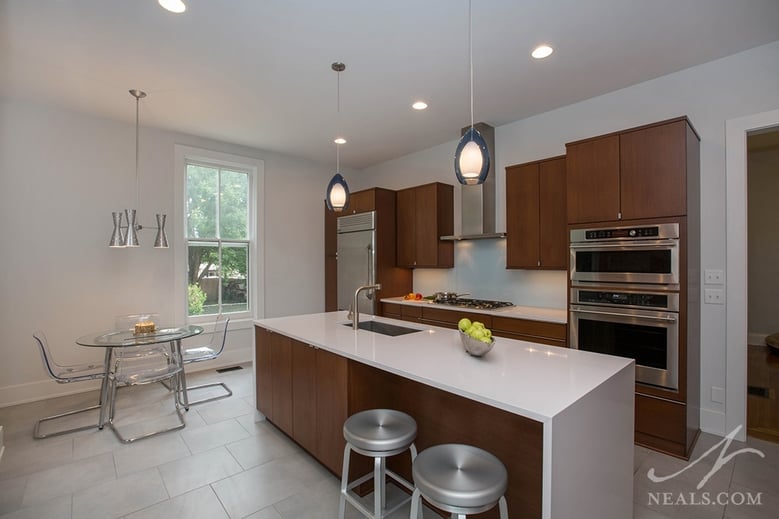
This kitchen in this historic home in Oakley had been previously remodeled with blonde wood cabinetry and black counters that were too bland and dated for the homeowner's contemporary taste. Since the original kitchen was already long gone, it was time to make a daring move. A modern design was created for the kitchen that fit the homeowner's style. The sleek new island features a waterfall counter (the countertop continues off the end of the island and goes to the floor.) The minimal aesthetic also includes a painted-glass backsplash and European-style tabs on the doors instead of more traditional handles.
Click here for more photos from this project.
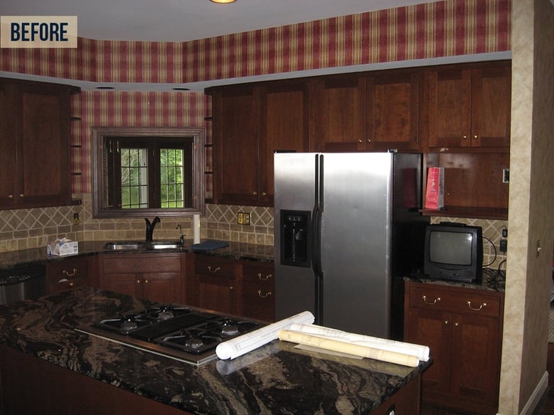
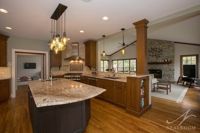
Dark, dark, and more dark is the best way to describe this Western Hills kitchen before the remodel. Even granite with fantastic movement wasn't enough to redeem this space. To lighten things up, a new light-colored granite counter was used to balance new cabinets in brown and black. The pass-through to the neighboring family room (which has a good amount of natural light) was moved from a narrow opening in the corner to a long expanse that helps marry the two rooms together. A brand new lighting scheme offers even more opportunity to keep this new kitchen out of the dark.
Click here for more photos of this whole house project.
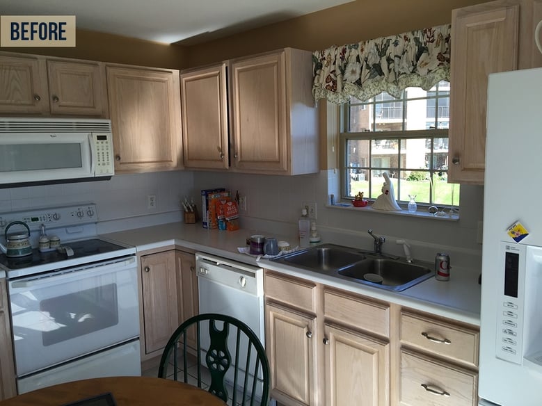
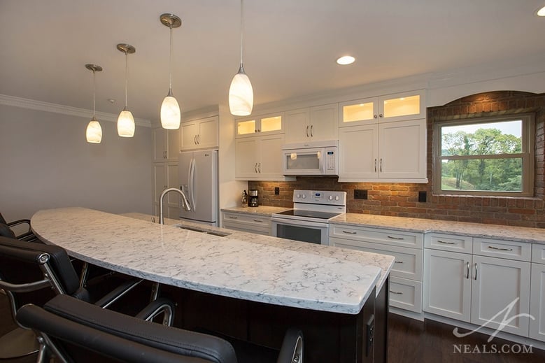
The kitchen in this Delhi condo was carved out of a small corner in the larger main room. The natural cabinets and white laminate counter offered a pale style that wasn't that off for the homeowners, but the style was wrong and the room too small. Removing the walls around the kitchen not only provided space to expand, it let the kitchen's two windows bring natural light to the spaces beyond. The new kitchen is a single-walled solution with a dual-purpose island that's perfect for entertaining. For added interest with the white cabinetry, thebacksplash was completed with brick, giving the kitchen a fun, "industrial loft" look without going too extreme.
Click here for more photos of this project.

