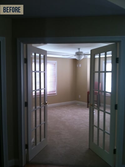
The homeowners were looking for a pub-inspired room, with casual, rustic finishes. They desired a space in which “peanut shells could fall on the floor, and they wouldn’t look out of place.” They wanted the room to feel masculine, and were looking to create a unique space within the home. A room at the corner of their home, originally an office space with no character, was the candidate for the transformation. They also wanted to convert the low ceiling to something with a grander design in keeping with the architecture of the house and the look they hoped to achieve in the new space. This project is a National Association of the Remodeling Industry (NARI) 2016 Local & Regional Contractor of the Year Residential Interior Winner.
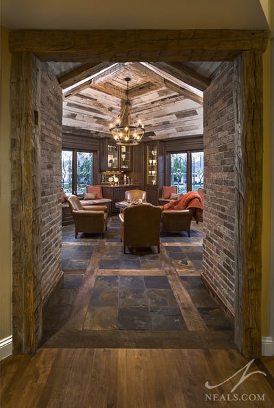
The primary style of the new space could be classified as an American-style pub, with the rustic quality of a prohibition-era speak-easy balanced by the masculine look of a Victorian-era men’s lounge.
Ultimately, the room was designed with no exposed drywall in order to create the most authentic look. Cabinetry and coordinating paneling cover large portions of the walls. Brick veneer covers the remaining walls. Two color-ways of brick were selected and randomly mixed to create a more aged look.
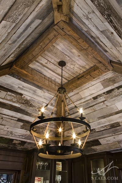
This room was one of only three in the house in which the ceiling was 8’. The original ceiling was a tray-style ceiling with a height of 7.5’ around the perimeter. The homeowners wanted the height to be raised so that the room was a better fit to the home. There was no living space above, so the ceiling was opened up to the existing roof trusses, and the new ceiling framing was worked within those to convert the vaulted space into a pyramid for a four-walled cathedral ceiling. The new ceiling peaks at 12’. The ceiling was finished with reclaimed wood. Reclaimed beams were added to frame the new pyramid ceiling.
Several of the bricks were also deliberately chipped, broken, or cracked. The mortar was applied somewhat unevenly to also appear aged (without compromising the integrity). Every few rows was placed in a rowlock pattern to add additional authenticity to the look.
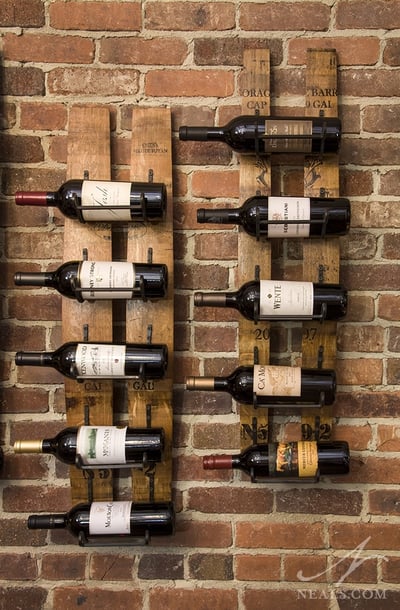
On the floor, colorful slate tiles were arranged within a grid of more reclaimed wood. When the boards arrived, it was discovered that there was more variation in the color of the boards than desired, so they were given a stain treatment to subdue the more severe variations, and create a more cohesive look without loosing all the character of each individual piece. The floor is centered on the angled doorway so that is runs diagonally across the space, mirroring the angles of the chunky beams on the ceiling.
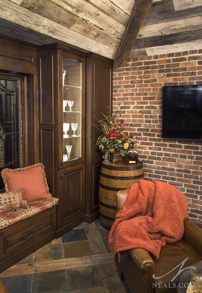
Additional reclaimed beams frame the room’s entry, replacing simple, white French doors. The beams create a quick transition into the themed space. The plain mullioned windows were replaced with leaded glass windows for a more vintage look.
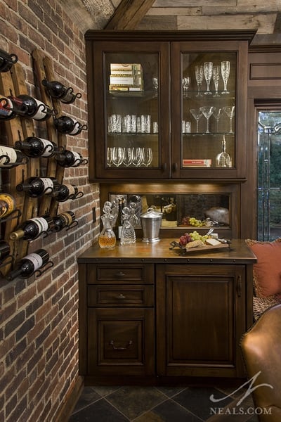
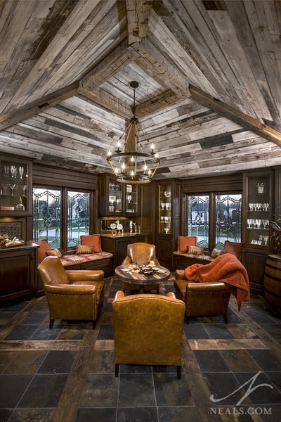
It was clear at the outset that a traditional bar arrangement, with a walk-up island, was not going to function well within the dimensions of the room. To leave as much floor space as possible, the bar was designed as three casual sections distributed along the two window walls. On the left, the bar is focused on wine. A purchased wine rack on the adjacent wall displays a selection wine. A wine refrigerator is housed in this section, and the display cabinetry holds some of the homeowners’ collection of wine glasses.
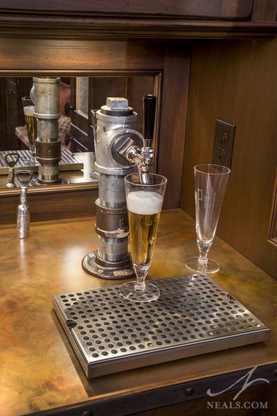
In the center, the focus is on more traditional pub drinks- liquor and beer. The base cabinets contain a liquor refrigerator and a keg-orator. The masculine tap on the counter above is a custom piece created from chunky iron pipe fittings. Flanking the right-hand window, two narrow display cabinets hold the remainder of the homeowners’ bar glassware.
The cabinet style was carried from one section to the next around each window with paneling, trim and window benches so that the two walls feel like a cohesive unit. The cabinetry is finished in a tobacco-colored stain, reminiscent of the carpentry found in a traditional men’s cigar room. To add more of the industrial look, custom counters were created by combining antiqued copper on the surface and riveted iron strapping on the edges.
The ceiling was designed for the inclusion of a featured chandelier, but the fixture needed to be large (to match the scale of the ceiling), but also airy in appearance. It also could not appear too feminine or modern. The selected fixture is an open, iron piece that allows the lights themselves to dominate.
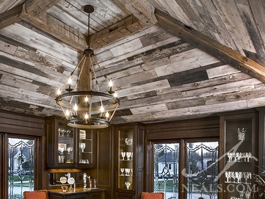
To gain additional lighting without adding recessed fixtures to the ceiling, the cabinets were outfitted with under-cabinet lighting as well as in-cabinet lighting, where the light reflects off the displayed glassware. The glass fronts of these illuminated cabinets are left plain to create no barriers to the light, and to help keep the space from feeling too visually cluttered.
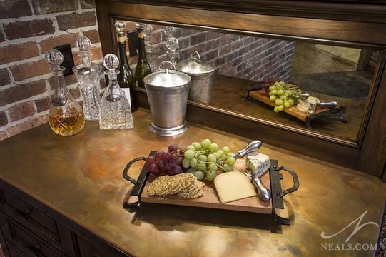
Antique mirrors were used under the wall cabinets to further reflect light into the space.


