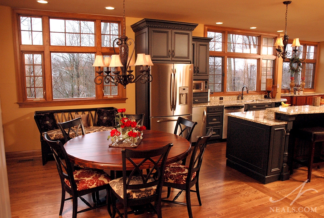
While relatively spacious, the original area in this Project Spotlight did not allow for much ease and flow when entertaining, especially near the island area. The clients desired a more open space that combined the kitchen and dining room, more natural light, and attention to carpentry details. The result is a new kitchen with a dramatic old-world quality.
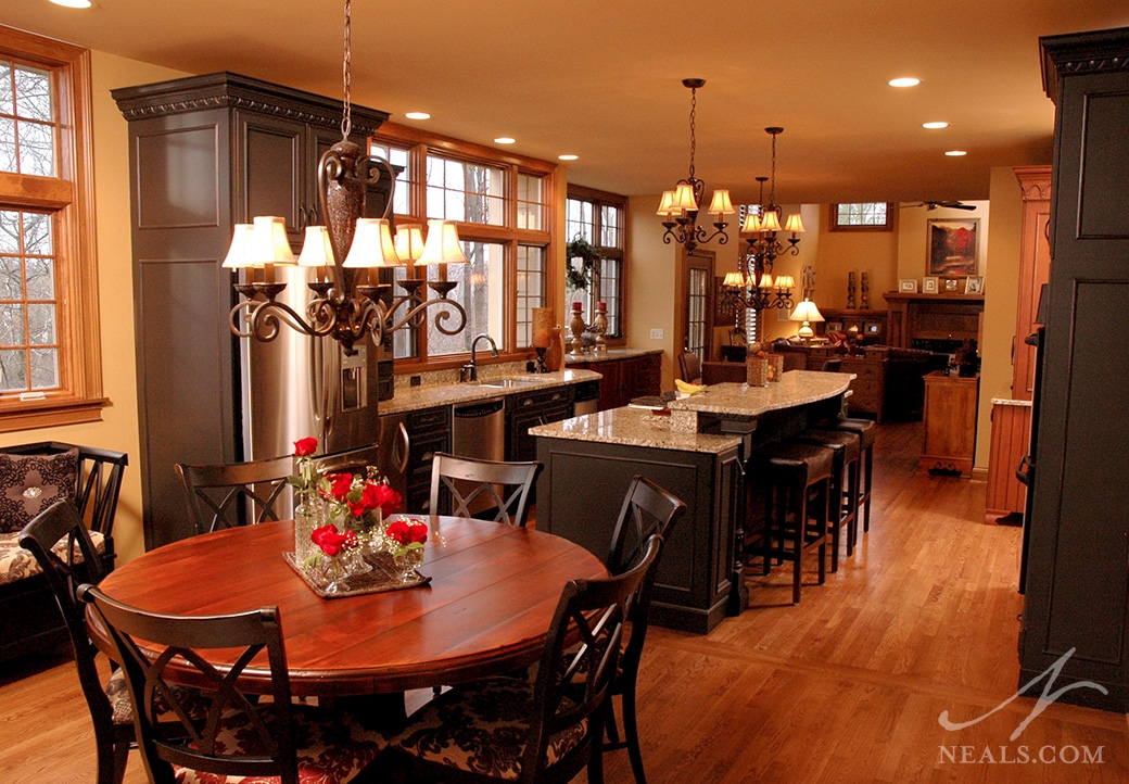
Homeowners’ Objectives
- More open space between kitchen and dining room.
- More natural light to help open up the entire space.
- A more accessible, usable island.
- More detail trimwork to compliment home.
- Updated cabinetry and appliances.
- Overall aesthetic enhancement.
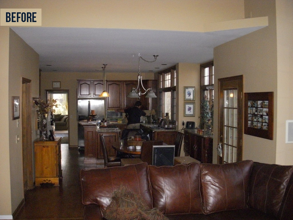
Existing Issues
- The cantilevered header framing above the new dining room window had to be concealed, but still carry the second floor load before the aesthetic enhancements could get underway.
- It was also imperative that much of the home’s existing materials be artistically blended to any new materials/structures introduced in the new design.
Solutions
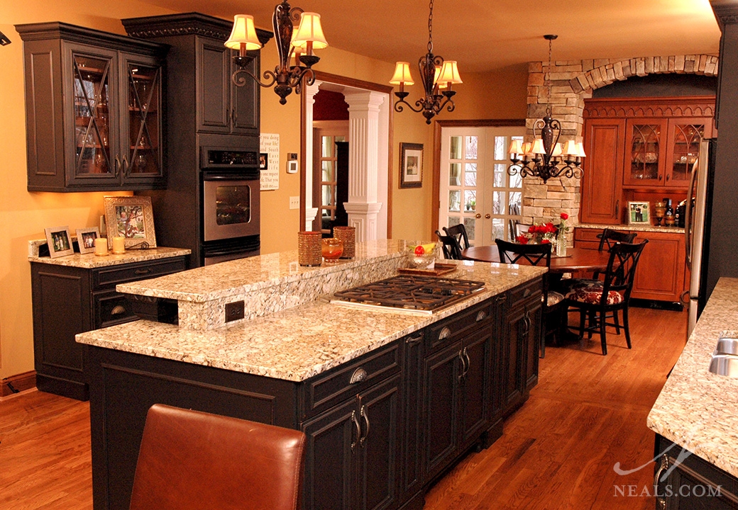
1. Combine the dining room and kitchen for more space.
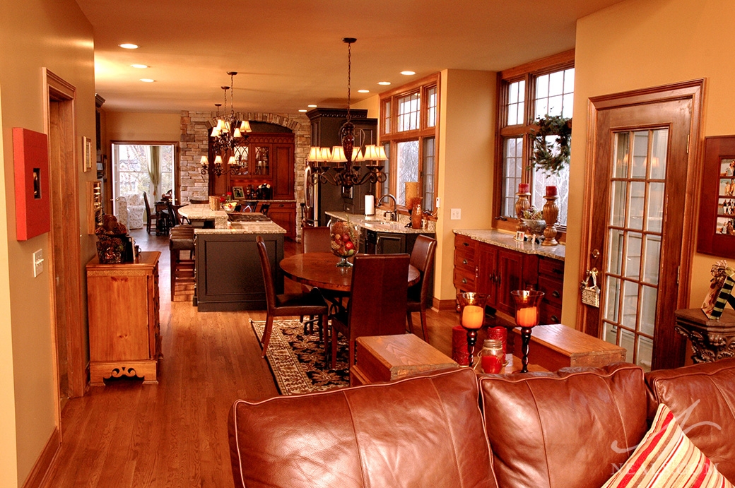
By far the most significant element to the remodel was the removal of the wall separating the kitchen from the formal dining room. This change allowed two solutions to the homeowner's goals. First, it provided a significant improvement to the room's overall flow since it removed bottlenecking and dead ends. Second, it allowed the windows in the dining room to feed into the overall natural light for the entire space.
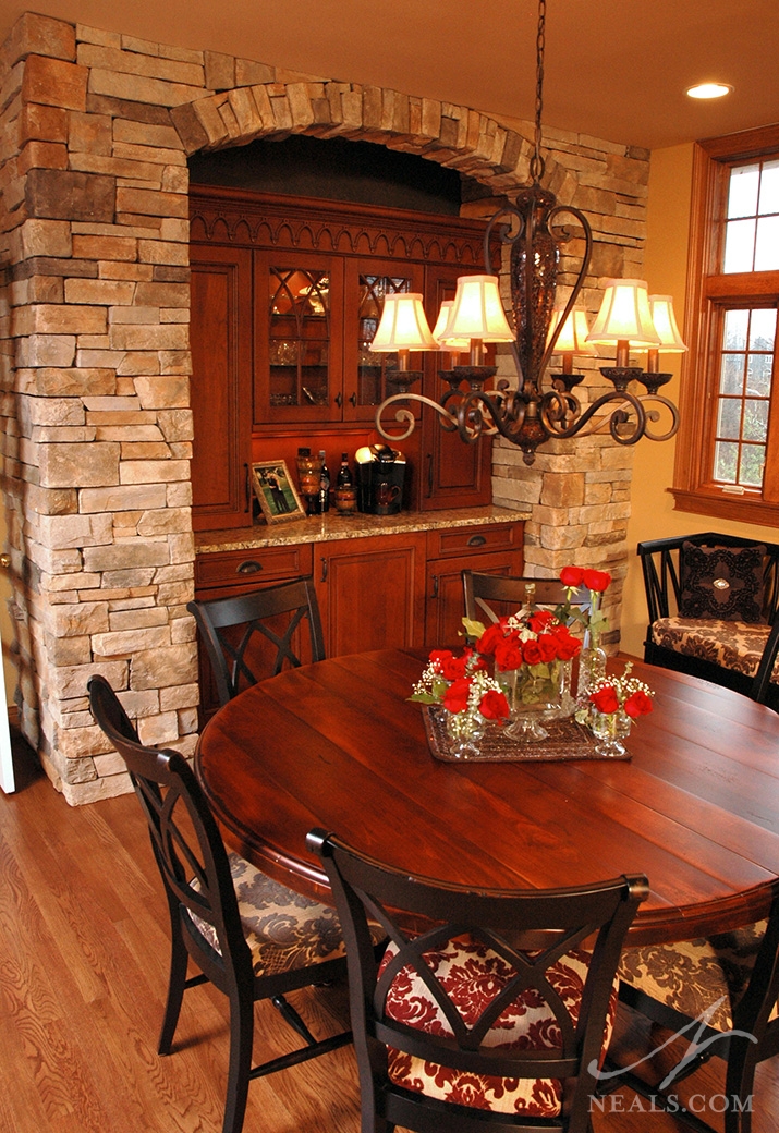
2. Add furniture-like storage with plenty of aesthetic interest.
In several areas throughout the new opened space, cabinets were designed with traditional furniture pieces in mind, such as the china cabinet style buffet nestled into a stone arch in the new dining area. These pieces are both beautiful and functional, hiding clever internal storage and appliances. The center cabinet on the base of the buffet is actually a beverage cooler. Highly detailed trimwork, which changes according to the specific cabinet style you're looking at, help to elevate the overall traditional style of the new kitchen.
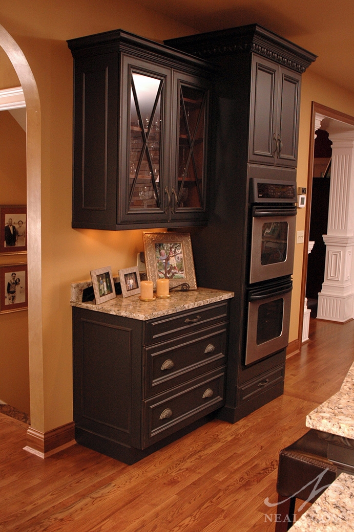
3. Combine finishes and textures to create an eclectic yet traditional space.
Rather than stick with a single cabinet finish, the design scheme called for a mixture of rich, red cherry for the furniture-style pieces, and distressed black for those elements that were more cabinet-like in nature. The glass cabinet doors here by the double wall ovens are different from those on the cabinet in the dining area to create a new layer of interest in the space. All the finishes and cabinet designs, however, rely on traditional concepts in keeping with the home's overall style.
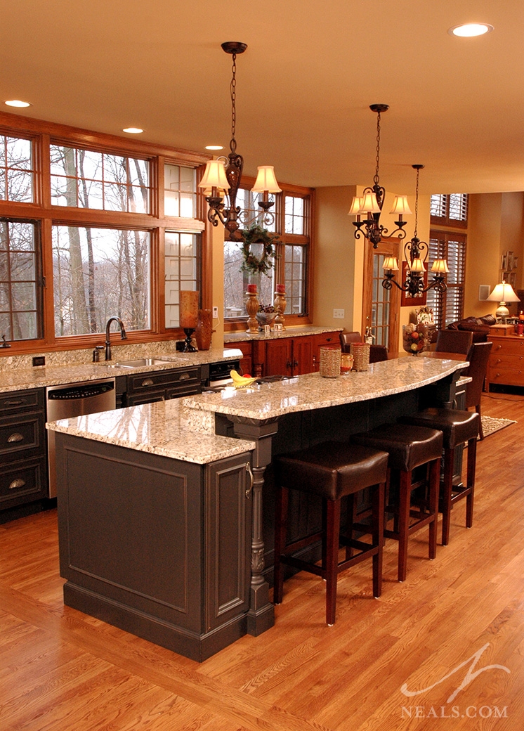
4. Create an entertaining-friendly environment.
The kitchen's work triangle (the area between the range, sink and refrigerator) is only a small portion of the entire room. The rest of the space is devoted to clever pathways and surfaces that lend themselves pefectly to larger crowds. The double-height island, buffet, dining table, and even a counter under the window on the way to the living room provide a huge number of permutations of possibilities for presenting food and beverages regardless of the type of event the homeowners host.
