
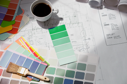
Is painting a room or several rooms in your home one of your resolutions for 2013? Are you checking out the latest trends? Are you looking for something fresh and having trouble deciding?

One resource used by designers and fashion experts is the Pantone Color Institute which helps define and match colors for various industries. Honeysuckle and Tangerine Tango were the 2011 and 2012 Pantone Colors of the Year that showed up in fabrics, paints, ceramics, clothing, accessories, furniture design and many other products. Pantone’s pick for this year is Emerald. You’ll be seeing a lot of this color. Would you choose these colors for the walls of your home or as an accent?
We are passionate about room colors. The right color combinations can enhance a room’s features and add a personal touch to your surroundings.
Here are our picks for the hottest interior colors for 2013:
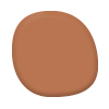
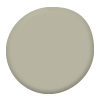
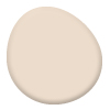 Beige. Benjamin Moore’s “Latte”2163-60 is a beige color with a hint of peach. Complementary colors are off-white, brown and coral. Shaker Beige HC-45 is a mid-tone color that looks like the wet sand of a beach. “Meditation” AF-395 is darker beige that was a recent addition to the Benjamin Moore palette. We love the name and the color.
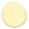 Yellow. We like yellow. It is an optimistic color. Benjamin Moore’s 2013 Color of the Year is “Lemon Sorbet” 2019-60, a soft yellow that pairs well with blues, blue-greens, grays and whites. We also like their classic yellow wall color San Mateo Beaches 924. It works well as a neutral and complements a host of accent colors.
 Orange. Benjamin Moore’s “Firenze” AF-225 is an orange color that you can live with and love. This color actually works as a neutral, grounding cream and wood finishes. Try it with “Aplomb” (see Violet below) as an accent.
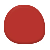 Red. “Million Dollar Red” 2003-10 from Benjamin Moore is a vibrant red color that brings life to dark woods as well as white painted cabinetry and trim. It was Pottery Barn’s choice for its Summer 2010 Colors.
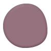 Violet. Love purple? We’ve picked two. “Misty Memories” 2118-60 from Benjamin Moore is a versatile color that works with deep blue, coral, brick and gray. A deeper color purple “Aplomb” AF-625, also from Benjamin Moore, looks fantastic with creams and oranges.
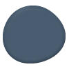 Blue. Blue is definitely a color you will be seeing a lot of in 2013. Sherwin Williams “Carefree” 6777 and the range of hues on its color strip are the colors of the sea and sky. Benjamin Moore’s “Van Deusen Blue” HC-15 is a deep blue with a green-gray undertone that looks great with gold, red, white, or gray and is one of our favorites.
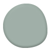 Jade. The soft blue, gray and green tones of jade complement wood, white painted cabinetry, tile, granite and browns, beiges, grays and purples. It is a calming color. “Wythe Blue” HC-143 was Benjamin Moore’s 2012 Color of the Year and is still hot in 2013.
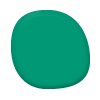
Green. Emerald is a bright vivid color that can accent gray, yellow, beige, brown and white. Sherwin Williams “Ionian” SW6754 will provide a pop of color to any room. Lime green complements light natural wood and looks great with white trim. We really like Pittsburgh/Porter Paints Voice of Color “Lime Green” 209-5 and the other shades of green shown with it.
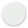 White. Whites often have a tinted undertone. One white that works with a wide array of colors as a trim color, or stands on its own as a wall color, is Benjamin Moore’s “Decorators White” CC-20. This white has a subtle gray undertone. It is a standard for Pottery Barn’s designers and others.
 Gray. Pick up any magazine on decorating and you will find rooms with gray wall colors. Why? Gray is a color that makes architecture and furnishings stand out. A warm gray that works with yellows, greens and creams is Farrow and Ball’s “French Gray” 18. Depending on the light exposure in your room, this gray has olive or sage undertones. A light gray with a hint of blue that grounds blue, purple, yellow, orange, red, brown and charcoal is Benjamin Moore’s “Bunny Gray” 2124-50.
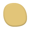 Gold. “Marblehead Gold” HC11 is a bright versatile color that complements blues, corals, grays and purples and rounds out our list of hot interior colors for 2013.
What are your thoughts about our color selections for 2013?