
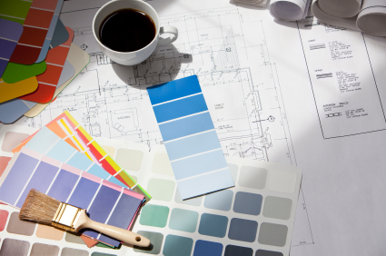
Helping our clients select colors for their remodeled room is a fun aspect of the design process. Colors reflect not only the latest trends, but are also a very personal statement and choice. To us, the latter is more important for the homeowners to more comfortably define their space. Although there are many ways to add color to any interior space, the easiest is through paint color.
How to Select Interior Wall Colors
Just as your home’s rooms flow from one to the other, the colors within your home should flow. The key to using wall colors is to coordinate the hues of your various rooms. Each room within your home is another color on your home’s color palette, and it’s important to identify what you want that palette to be when making your paint choices. People are often afraid of experimenting with color and are unsure of what will be pleasing within their homes. Here are a few tips to help you select interior colors:
-
What colors do you like? Look at your wardrobe for the colors you are drawn to. Are there similar colors to be found in images or products that you like? Are all your inspirational images made up of the same colors?
-
What does your furniture look like? What is the dominant color on your upholstered pieces? Is there a complimentary color that would make a good wall color?
-
Remember the Color Wheel. Your elementary school art teacher probably didn’t have paint colors in mind when teaching you about the relationship between colors, but it’s a great tool for selecting complementary wall, trim and accent colors within a space.
-
For more helpful tips, check out HGTV’s list of "7 Color Mistakes to Avoid".
Online Tools for Paint Selection
Several quality paint manufacturers have tried to do some legwork for you and have put together complementary palettes from their larger color offerings. These palettes can greatly simplify the process of selecting colors for your home and make it more fun. We like both Benjamin Moore’s “Historic Colors” palette, a range of 174 classic colors found in homes of the 18th and 19th, and Pittsburgh Paint’s “Historic” Voice of Color collection, which offers colors from the Federal, Greek Revival and Victorian eras.
If interactive color palette creators are your style, Sherwin Williams has a great website that allows you to experiment with color before you invest in paint. Upload a photo of your room, or select one of the site’s photos to represent your room, then play with wall color to help choose what is ideal for your home.
Our Picks for the Hottest Interior Room Colors in 2012
If you are still not sure what colors will have the best impact in your home, or if you’re just having trouble deciding, here are our picks for the hottest neutrals and colors for 2012:
Neutral Colors
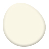 Off-White: Soft & off-whites are very popular as a neutral for any type of space and design style. Interior designers often note that this is one of their favorite colors. Try Benjamin Moore’s “Mayonnaise” or Sherwin Williams’ “Whitetail”.
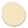
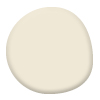 Beige: Once considered boring, warm, pale beige is now a classic color that can be used for walls and trims. Beiges often show up in popular interior product catalogs. Try Farrow & Ball’s “Clunch” or Porter Paint’s “Bamboo”.
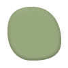 Sage Green: Popularized by high-profile decorators, like Martha Stewart, soft greens with gray and olive undertones are now a common choice for kitchens. Try Benjamin Moore’s “Sherwood Green” or “Georgian Green”.
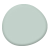 Blue: Pale blues, including some light teals, are now being used as neutrals for kitchens, baths and bedrooms. It especially looks great with browns and tans, as well as purples. Try Benjamin Moore’s “Palladian Blue” or Pottery Barn’s “Woodlawn Blue”.
 Yellow: Yellow can be tough to pull off as a neutral, but the key is choosing subtle, creamy tones. It makes a basic backdrop to red, blue, green, coral, peach and black. Try Sherwin Williams’ “Optimistic Yellow” or Benjamin Moore’s “Montgomery White”.
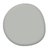 Gray: As far has “hot” colors go, gray is very popular as a neutral to dark wood furniture. Jewel colors, like red, blue and purple, pop against warmer grays while yellow stands out with cooler grays. For a middle of the road gray, try Benjamin Moore’s “Coventry Gray”.
Bold Colors
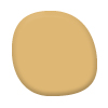 Gold: Yellow-orange, rich gold tones work very well with deep colors, like dark wood finishes, blacks, and dark reds & blues. Any type of soft gold color instantly adds richness to the space. Try Porter Paint’s “Gold Buff” or Farrow & Ball’s “Print Room Yellow”.
 Dark Blue: Deep blues can be bold choices when paired with bright colors like yellow and especially white. Blue can be more neutral, however, if paired with other, paler blues, greens or browns. Try one with a touch of green, like Benjamin Moore’s “New York State of Mind”.
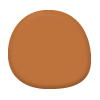 Orange: Though it’s easy to get too peachy when looking at oranges, look for Southern-inspired, warm oranges with terracotta qualities. Pair it with blacks and browns with creamy accents for a really bold space. Try Sherwin Williams’ “Marigold” or Porter Paint’s “Gingerbread”.
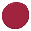 Red: A jewel-like red with a pink or purple cast will make a huge, bold statement in any room. Pair it with grays or white, blues and blacks for a room with a lot of oomph! Try Benjamin Moore’s “Cherry Burst” or Sherwin William’s “Tanager”.


